Comments
How we designed a lightweight climate map to help mountain guides share effective climate action and giving, and how we hope to inspire the EA community to explore new audiences and engage with visual design.
A huge thank you to the team at Giving Green for their valuable input throughout the project, and to Hannah Ritchie and Our World in Data, whose resources were indispensable in creating the map. We are also deeply grateful to the British Mountain Guides Association, whose advocacy was instrumental in getting the map designed, and whose endorsement gave us the credibility to engage with other stakeholders.
TL;DR:
- Jennifer Stretton, co-founder of Mieux Donner and an international mountain leader, was already delivering training courses to guides on effective climate action and effective giving.
- However, surveys showed that even after training, most guides didn’t talk about climate change with their groups. They felt unconfident, lacked the facts, and didn’t have a structured way to lead the conversation.
- To address this, Jennifer teamed up with designer Martina Pepiciello to create a lightweight climate map that guides can carry on the trail to present effective climate action to their groups. The map launched in July 2025 and is now in the hands of approximately 400 mountain guides.
- Three companies have co-branded the map and handed them out to all of their clients. Two of them now donate 1% of their revenue to effective charities.
- The map has also been a valuable way for Jennifer to build credibility in the outdoor community, leading to invitations to present to key associations.
- So far, we haven’t seen individual clients make donations after being exposed to the guide, but it has been a strong way for Jennifer to build credibility in the outdoor community, leading to invitations to present to key associations.
- We don’t yet know the full impact, as the map launched late in the guiding season and many promising meetings are scheduled for this autumn, since outdoor companies are very busy in the summer.
- We hope this work inspires the EA community to explore new audiences through their own networks and to use visual design to make effective giving accessible and engaging.
- This post shares our design process and lessons learned.
- You can view our climate map infographic and in-depth guide here.
1. Identifying and Engaging New Audiences for EA
Effective giving orgs are on a mission to make effective giving a cultural norm. To do this, we need to engage more audiences than just the traditional EA aligned circles. We think that as a community, we can all do better at identifying and engaging new audiences.
When thinking about how to reach new audiences, it helps to start with communities you’re already part of or familiar with — places where your values overlap with theirs and where you can have credibility. For us, the outdoor community was a natural choice as Jennifer is also an international Mountain Leader and well connected/respected in the community.
For this project we specifically created a guide for people who go on adventure holidays in the Alps.
Why focus on people who go on adventure holidays in the Alps?
- Jennifer is a guide in the Alps and has lots of established connections.
- People who go on trips to the Alps — skiing, climbing, and trekking — are typically very wealthy, care about the climate, and often feel guilty about their emissions to reach the Alps.
- For example, a week-long hiking trip in the Alps with the companies we’re targeting can cost between $2,000 and $7,000.
- Guides are well-educated, values-aligned, and trusted by their clients, making them ideal messengers for climate action and effective giving.
- Our surveys showed that guides rarely led conversations on climate change with their groups, despite it coming up often in conversation. They lacked confidence, quick access to facts, and a structured way to lead the conversation.
- By creating a resource that guides can use to present on effective climate action, we can disseminate the information widely through a network of influential and engaged clients.
- Focusing on this audience allows us to reach people outside the usual “EA-aligned” circles, leveraging guides’ credibility and the outdoor community’s values.
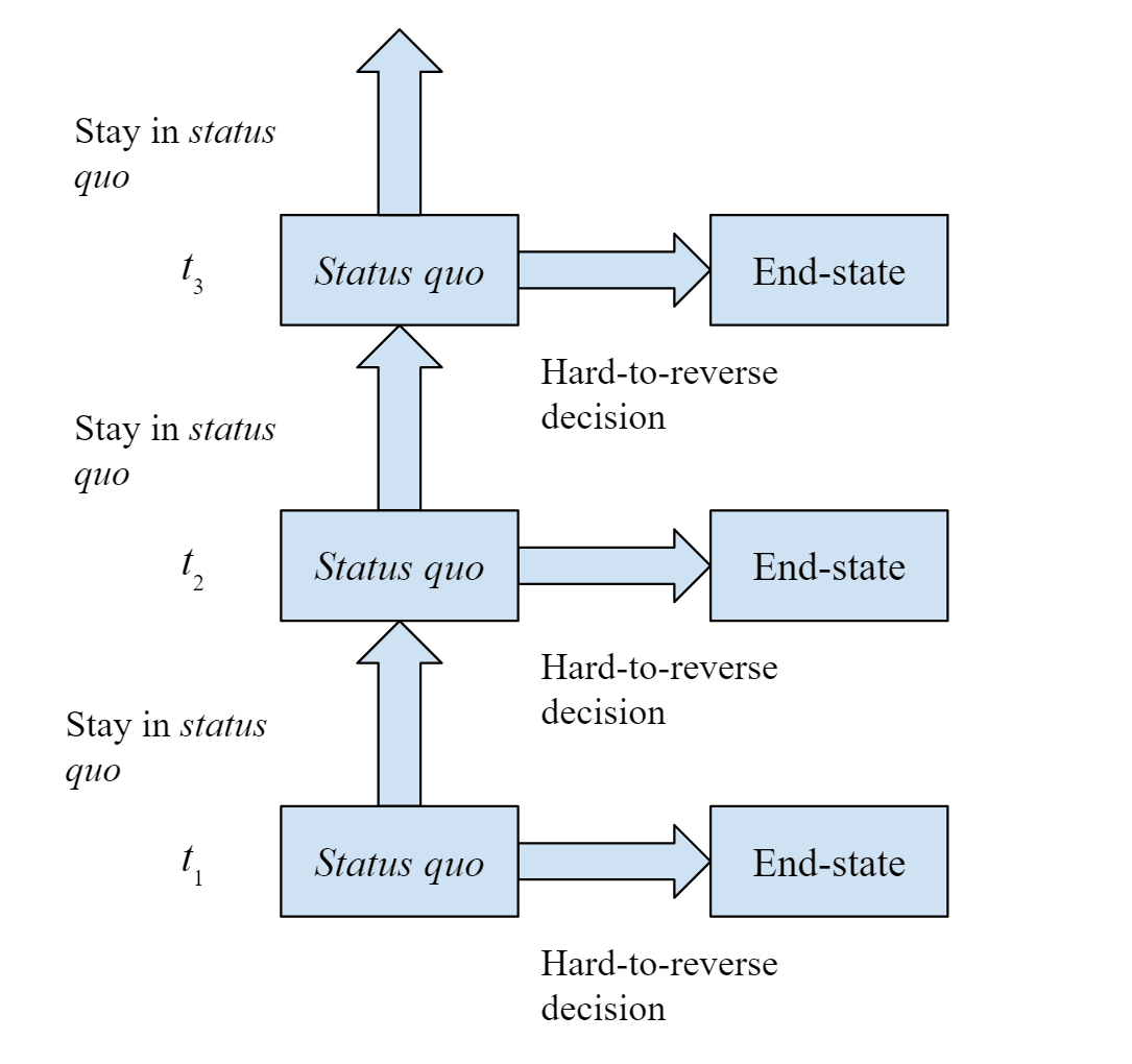
2. Our Theory of Change
In essence, our theory of change is that when people learn about effective climate action, they don’t just feel guilty or overwhelmed, they feel inspired and empowered to act, with a clear sense of what they can do. Too often, conversations about climate focus on the scale of the problems, leaving people feeling helpless and leading to avoidant behaviors. By emphasizing actionable solutions and showing how even small contributions can make a tangible difference, we aim to shift the focus from despair to agency.
In an ideal world, people would be exposed to our effective climate map and immediately make a donation to an effective charity. In reality, the pathway to donation is longer and more complex, requiring multiple nudges to translate inspiration into tangible giving. This is likely why our greatest success with donations has been with individual guides and the companies we have worked closely with on the maps, as we engage with them more regularly and can support them along the process. This is discussed in more detail in the Impact part of this blog post.
Our TOC focuses on three audiences:
Guide-focused TOC – Guides delivering the presentation
Guides are increasingly distressed by the impact of tourism on the Alps and the climate and want to make a difference → Guides receive training on effective climate action → Guides use the climate map → Guides gain confidence and knowledge → Guides incorporate climate presentations into their tours → Guides feel empowered and see the impact of their presentations → Guides share feedback and engage with Mieux Donner resources → Guides speak to the companies they work for, creating new contacts → Guides become champions for effective climate action in their networks and start donating.
Client-focused TOC – Clients on a trip to the Alps
A client is on holiday in the Alps, sees how much the glaciers are receding, and initially feels guilty or overwhelmed → During the tour, a guide gives a presentation on effective climate action → After the presentation, the client feels inspired rather than hopeless → Clients scan the QR code on the guide to learn more → Guides follow up by emailing a copy of the guide → Clients make a donation and adopts effective climate behaviors
Company-focused TOC – Outdoor companies
Companies want to take meaningful climate action but lack time or resources → They want to demonstrate their commitment → Companies co-brand the map for their guides to use → Companies engage with effective climate action → Companies begin making regular donations to climate charities → Companies reinforce their values with clients and staff, expanding their impact
3. The Design Process
What is the need?
The main goal of this project is to inform people that hike or practice outdoor sports about climate and empower them to act in meaningful ways. More specifically, we wanted to present a clear picture of the state of climate change in the past century and current forecasts, addressing common misconceptions and misinformation while also connecting to people emotionally to drive home the importance of this cause area. At the same time, we wanted to inform people about actions they can take to help that are truly effective. This is because the media generally focuses on bad news and anger-provoking headlines without providing clear action ideas, which makes people demotivated to act, and because people’s assumptions about the most effective actions tend to be poorly calibrated.
Our resource also needed to be accessible to people without a technical background and with varying levels of engagements or attention spans. For this reason, we created a “dual-layer” resource:
- The first “layer” is an infographic, printed on both sides of a foldable map, presenting all the key information in a mostly visual format, which we call The Climate Map. This helps catch people’s attention and spark conversations; it also drives home the most important messages in a memorable way. The map format makes it easy for hikers and mountain guides to carry it around during their trips. It also helps mountain leaders have conversations with clients about the climate, which can be challenging because the topic is vast, there are a lot of stats to remember, and conversations can get awkward if one isn't well prepared. A conversation that covers the full map takes about an hour.
- The second “layer” is a mobile-friendly written document, which expands on the information presented in the map and provides additional details and context, which we call The Climate Map Guide. This is for people who want to dive deeper and get a better understanding of the subject to take more informed actions, or a reference for guides who want to facilitate a discussion using the map. It is also meant to be a summary and reference for effective climate action in general. Since the guide is rather long and also most likely viewed on mobile, we made sure to include summaries and navigation links to help readers reach the information they are most interested in.
This structure allows to easily engage people with the map, without overwhelming them with information or long-form text, but also to invite and make space for a deeper understanding of the subject and how to take action.
Both resources were developed with the aim of informing people, not of changing anyone's mind.
Storytelling and visualisation
To make information more memorable and engaging, we decided to use a storytelling approach, with a clear starting point, development and resolution. Our story takes people from understanding the current state of climate change to discovering actions they can take to make real positive change, so that they are more motivated to act.
To present information in a more accessible way and to improve memorability, we used a lot of data visualisation and kept text to a minimum in the map. Since visuals are processed much more quickly and easily than text or audio, having a collection of data visualisations organised in a clear narrative arc is a great way to spark and guide meaningful conversations: people can see what we are talking about and engage more easily with data that is presented in an accessible format. Visuals can also help address scope insensitivity and grasp real-world impact of data (e.g. showing the amount of transatlantic flight emissions that can be offset with a donation by displaying the corresponding number of plane icons).
What we included and why
Climate Map - front
The front side of the map aims to present a clear picture of the current state of climate change.
We start with an overview of climate change in past geological eras vs. after the industrial revolution to address the misconception that the shifts in climate that we are experiencing now are part of natural Earth phenomena. We also include three temperature projections for 2100 to give a clearer picture of where we’re headed under different scenarios.
The rest of the front side of the map contains more specific information about how climate change is affecting the Alps. This helps tailor the message to our target audience and make it emotionally resonate with things they are likely familiar with: temperature raises, decreases in snow cover and depth, glaciers retreating, climbing routes collapsing and loss of biodiversity. We include before-and-after photos to help visualise changes over time and strike the emotional side of readers.
Climate Map - back
The back side of the map aims to give a data-driven overview of the most effective climate action people can take.
We start by addressing the feeling of powerlessness people often experience when faced with climate issues, despite a vast majority of the population being concerned about them.
We then present the measured effectiveness of different types of climate action compared to common perceptions, and include ideas about influencing other people to reach beyond oneself.
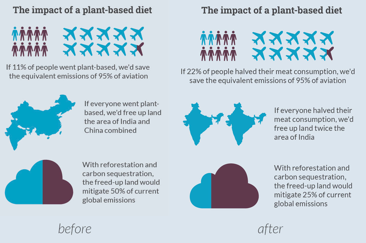
We have a section about reducing meat consumption for the climate, since it’s a fairly popular topic that people have likely heard about before. Here, we made sure to address the common misconception that eating locally produced meat is much better, in terms of emission, than eating meat that comes from far away.
We finally present climate donations as a very effective action that people can take, compared to personal lifestyle action. We explain the limitations of popular carbon credits and introduce cost-effective charities as the go-to solution, with the example of Clean Air Task Force and its impact.

A PDF of the map is available here.
Climate Map Guide
The structure of our guide follows very closely that of the map, expanding and providing more context on the different diagrams and data visualisations. We made a few additions including:
- A starting section that gives a more hopeful perspective on the climate situation, which is often perceived as very negative. This should encourage viewers to read on and inspire them to take action.
- Sections on the two most effective lifestyle choices other than reducing meat consumption—going car-free and avoiding flying—to avoid being too biased towards meat and to address our target audience’s potential concerns about travelling to reach their hiking destinations.
- A section on the Good Food Institute as an additional example of effective charity.
- Quotes and testimonials from people involved in the project to make the guide feel more human and relatable.
The guide also includes call-to-action buttons with links to donation forms, newsletter subscription forms and information about donation pledges.
A PDF of the guide is available here.
4. The Impact
Measuring impact
We knew from the start that measuring the impact of this project would be challenging. It was unlikely that people would donate immediately upon learning about effective giving; many would likely donate directly to the charities rather than using the links on our guide to visit the Mieux Donner website.
To track donations from the guide as best we could, we created tracking URLs for the QR code linking to the deep-dive guide. We also added a dropdown to the Mieux Donner donation form asking, “Where did you hear about us?”
The impact
Client donations
As far as we can tell, client donations traced through our website are currently zero.
Company donations
We think the most valuable thing about this project will be company engagement
Company A
- Learned about our work through the climate map and have switched their 1% for the Planet donations from cookstove and tree-planting offsets to the Clean Air Task Force (CATF). This represents a €5,000 donation in 2025, which is conservatively 25x more effective in terms of emissions saved compared to their original climate contributions.
- They have ordered 1,000 climate maps to give to all of their clients, and we are delivering training to their guides on how to use the maps.
- They are also introducing us to the Dutch Adventure Travel Association, which will expand our reach to more companies.
- We have recommended that these maps are cobranded with Doneer Effectief, not Mieux Donner, as the clients are all Dutch. We are currently in discussion with Bram about this.
Company B
Had been in discussions with us about climate donations for half a year, and the map appears to have encouraged them to start donating. They ordered 500 co-branded maps to give to all of their clients and have committed to donating 1% of their turnover to effective climate charities, to be disbursed by November 2025.
British Mountain Guides Association
While the direct financial contribution is small - 0.5% of member subscriptions (around €500 per year) now goes to CATF - the British Mountain Guides (BMG) have been far more valuable in terms of credibility. As discussed later under lessons learned, having BMG on board has served as a gateway for us to engage with companies, get their brands involved, and significantly strengthen our standing in the outdoor community.
Other company engagement
- Company C ordered 500 co-branded maps to give to all of their self guided guests and we expect more engagement with them next year.
- Two other companies ordered maps for all of their guides. We will pick up the conversation with them about further action and donations this autumn/winter.
- Since the map was released in July and summer is a busy season for companies, we expect further engagement and donations over autumn and winter as companies have time for these conversations.
Volunteers and ambassadors
Jen has hosted several online talks on how to use the climate map, which connected her personally with many people in the outdoor community. One of these connections has since become a high-value volunteer for a new project we’re launching in the coming months. Guides have been very enthusiastic about the initiative and are proactively reaching out to the companies they work with to get them involved.
We expect connections from this to bear fruit in the coming months.
Building Jen’s credibility in the community as the ‘go to person’ about climate change
Perhaps one of the biggest impacts of this project has been to build Jen’s credibility in the community which we expect will gain fruit in the coming year:
- Mountain Training England has asked us to create a UK-specific version of the map. This association trains all guides in the UK and has roughly 9,000 members. They
We have also been asked to create an online CPD course for all members, which will include company engagement and donations. We expect this to generate high-value outcomes in terms of additional company pledges. - Austrian Alpine Club: Has a membership of over 500,000 people. We are in conversation with them about their climate donations and making maps available for all of their guides.
What we think has reduced our impact
- Launching late in the season – We had hoped to launch the maps in June, but finding a printer took longer than expected. As a result, we didn’t have time to train all guides on how to use the maps effectively or reach out to as many organisations as we would have liked to. We expect uptake to increase significantly next summer.
- Branding – The current “Mieux Donner” branding may be limiting this project. Many anglophone audiences don’t understand / can’t pronounce / can’t remember the name, which reduces retention and recognition. We believe a brand like “Leading for Climate” could better support this project and our broader outdoor engagement. However, creating a new brand isn’t currently our highest-value use of time and would require a volunteer to help develop it.
- Limited engagement from international associations – Distribution of the maps has so far relied heavily on Jennifer’s personal contacts. As we engage more with larger international associations, they will be able to share the content more widely, increasing reach and impact.
5. Lessons learned and suggestions for the community
Gain credibility with at least one trusted stakeholder. When engaging new audiences, having the support of a trusted stakeholder makes approaching others much easier. For us, the British Mountain Guides Association (BMG) was key. Their endorsement of the map — purchasing and distributing it to all their guides — opened doors across the community. Jen secured this partnership by offering to speak at their Annual Meeting for free and supporting their climate initiatives. The connection came from hosting a free webinar for mountain guides, which their Environmental Director attended. Jen had doubted the value of these online webinars, but it turned out there was a real need. The BMG’s respected reputation meant their endorsement carried weight, and this credibility has paid off hugely.
Small gestures of collaboration and engagement can generate outsized impact over time. Sometimes, saying yes and helping others creates opportunities you can’t predict. For example, having the British Mountain Guides (BMG) on board early gave us huge credibility in the outdoor community. By offering to speak at their Annual Meeting for free and supporting their climate initiatives, we gained their trust, which made it much easier to engage other guides and companies.
I’m also reminded of Rob Mather, founder of AMF, who replies to every email he receives. Last year, we hosted a tiny private event in Chamonix with just 30 people. Rob attended to support us, even though the payoff was uncertain. That one act gave us huge credibility and eventually led to an introduction to a company interested in making a major donation—expected to materialize a year later.
Rob calls this approach “creating ripples in ponds,” and it works.
Use visuals where possible to convey information. Since we kept text at a minimum on the map for easier engagement, we had to put extra thought on conveying information as clearly as possible through visuals alone. For example, to highlight the human drive on modern climate change in the first section, we highlighted in red the rising temperature trend after the industrial revolution, as opposed to the slower oscillations before the 1800s. As a community, we think that we could do better at using visuals to convey complex points, particularly to immediately capture attention and encourage people to read more.
Design for multiple levels of engagement. We structured the map so that even a quick glance provides the essential information. For those who want to explore further, a detailed guide offers deeper insights. This layered approach supports both casual and in-depth engagement.
Stick to the essential. We stripped information down to what was essential to make our point. For example, we reduced the temperature projections trend lines to just 3 to avoid overwhelming readers with unnecessary details.
Break down information into easy to digest chunks. For the guide, we were especially mindful of how its length might discourage readers. To address this, we included a minimalistic table of contents, a general summary at the beginning of the guide, more specific summaries at the beginning of each section, and visually appealing “navigation menus” in title pages for each section.

Meet your audience where they are, not where you want them to be. Originally, we were going to call the meat consumption section “Going vegan for the climate”. However, initial feedback from varied people showed that meat eaters felt hostility towards the word vegan and it undermined the degree to which they engaged with the effective climate action suggestions. For this reason, we decided to present all the data in terms of halving or reducing meat consumption instead.
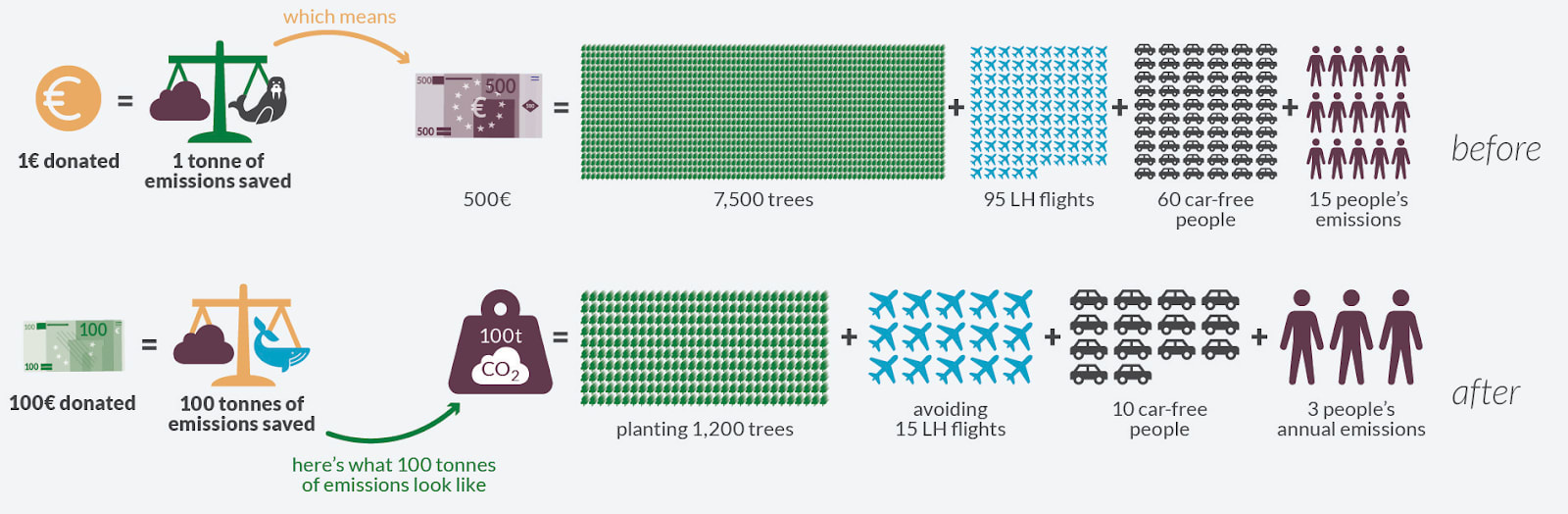
It’s hard to strike the balance with messaging on donations for the climate. Some of our early reviewers felt like we were emphasising donations too much or being a little pushy. We addressed this feedback by reducing donation amounts in data visualisations on the back of the map, namely from €1000 to €100 for the section on the effectiveness of climate donations and from €600 to €100 for the section on Clean Air Task Force. This should help readers see how even small amounts can make a big difference without feeling pushed to donate large sums if they don’t want to.

Another feedback we got about our way to present donations is that it might look like we were encouraging people to offset their emissions through donations. We addressed this by adding some wording about donations being a way to do more, not a replacement for lifestyle choices.
We still aren’t sure if we’ve perfectly hit the right balance — it’s tricky to communicate about climate donations without making it feel like “everything you’re doing is pointless, just donate instead.” Our aim is to inspire action while keeping the message supportive and empowering.
6. How You Can Help the Impact Go Further
- Translate the map – Volunteer to translate the climate map into other languages. A French or German version would be especially helpful, given the Alps-specific content.
- Connect us with outdoor companies and guides – If you know companies or guides who might be interested in effective climate action, introductions are hugely valuable.
- Use our content for your own work – If you’re an effective giving organization, you’re welcome to adapt our content and reach out to companies in your own country. Get in touch with us, and we can provide the design files so you can edit them to suit your needs.
- Volunteer to help build the “Leading for Climate” brand – We are considering creating a brand to unify this project with our broader outreach to outdoor companies. The goal is to build a cohesive identity for company engagement. We don’t currently have the capacity to pursue this, so we’re looking for a volunteer—ideally a web designer or someone with project leadership experience—to help develop and lead this initiative alongside Jennifer.
- Volunteer for our upcoming World Climate Relay global fundraiser - Our goal is to raise $1 million for the Giving Green Fund through a peer-to-peer campaign next June. Participants from around the world will be invited to swim, run, walk, or move in a wheelchair as far as they can over the course of one week. If you are passionate about effective climate action and have skills in web development, social media, design, videography, marketing, or simply have strong connections, we’d love to hear from you. Stay tuned, a full post with all the details about the World Climate Relay will be coming soon!
Get in touch
If you have a similar project you would like to realise - contact Martina at [email protected]
If you want to volunteer, have company contacts that would be interested in the project or want to use our content for your own org, contact Jennifer at [email protected]
Thanks for reading and we hope it’s useful!
Martina and Jennifer