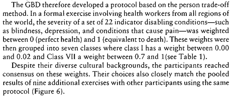
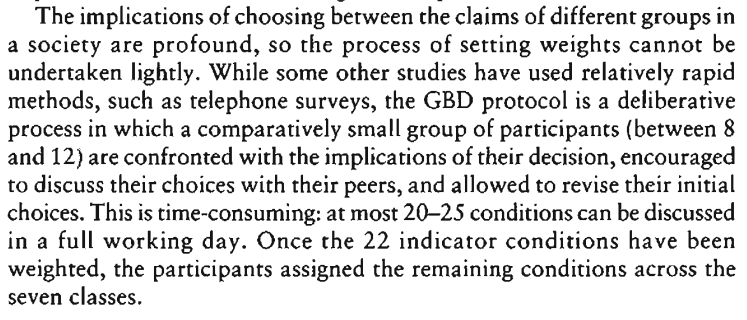
I recently tried to figure out where DALYs come from.
After a bit of searching, the best I could find was this report on the origin of the metric (the first Global Burden of Disease assessment). The report includes this explanation:

And:

But I'm left with many other questions:
- How many health workers were consulted?
- Were people other than health workers consulted, especially people who have themselves experienced the relevant health issues?
- Were DALY values updated in successive instances of the GBD?
- Are transcripts of any of these "formal exercises" available somewhere?
Ideally, I'd love to find a document/video that covers DALYs in the style of a factory tour video; I want to know what goes into them, who is involved, and what the creation process looks like.
Does anyone know of such a resource, and/or the answers to any of my questions?

Yes, for the YLL estimates they combined different datasets to find accurate causes of death disaggregated by age, sex, location, and year. There should be little bias since data is objective and 'cleaned' using relevant expert knowledge. The authors
expectancy at age of death"[3]
For YLD estimates, where subjectivity can have larger influence on the results, the authors also compiled and cleaned data, then estimated incidence[4] and prevalence, [5] they severity, using disability weights (DWs) (Section 4 intro, p. 435 the PDF)
DALY = YLL+YLD (p. 1431)
The GATHER checklist (pp. 1447–1449) includes methodology transparency, stating known assumptions, sharing data (in easily understandable formats), and discussing limitations.
In short, for each of the listed causes, researchers added the years lost and a relatively arbitrary disability burden value to gain the DALY burden. The data does not report wellbeing, does not include health-unrelated situations, and focuses on an objective assessment of respondents' relative abilities to perform tasks rather than subjective perceptions. The ratios of disability weights should be accurate but their valuation relative to death is arbitrary. Thus, it can be that the data is missing the priorities of populations entirely.
I tried figuring out how an adjusted life-year method can be used to estimate population priorities more accurately, and came up (by a series of conversations with EAs and an enumerator in a Kenyan slum and 3 trial surveys) with soliciting sincerity and using the Visual Analog Scale method (the time trade-off and standard gamble methods (source) were rejected since people had difficulties with the math).
"vital registration (VR) mortality data — anonymized individual-level records from all deaths reported in each country’s VR system occurring between the years of study" (unrelated IHME citation for definition). Page 1445 of the PDF includes a map of data quality (correlates with GDP/capita).
Also specified in (GBD Compare FAQ): "an adjustment acknowledging that the VR data are biased compared to other sources of data" However, for "non-VR sources, ... data quality can [also] vary widely" (p. 45 the PDF).
Even though life expectancy increases with age (England and Wales data example - see maybe 1918), the rate of life expectancy increase should be lower than that of age increase, since YLL "highlights premature deaths by applying a larger weight to deaths that occur in younger age groups" (p. 56 the PDF).
Incidence: number of new cases or rate of new cases occurrence (IHME terms)
Prevalence: number of total cases that occurred so far (IHME terms)
For example, for HIV/AIDS (severity: Symptomatic HIV), the sequelae are "Has weight loss, fatigue, and frequent infections" (p. 485)
"DWs used in GBD studies before GBD 2010 have been criticized for the method used (ie, person tradeoff), the small elite panel of international public health experts who determined the weights, and the lack of consistency over time as the GBD cause list expanded and additional DWs from a study in the Netherlands were added or others were derived by ad-hoc methods" (p. 472). So, the 1996 source that you cite may be biased.
The design implies that computers were accessible in the study locations. In my small-scale survey in a Kenyan slum, the local enumerator refused to take a smartphone to collect data (instead used paper) due to security concerns. (Also, enumeration by a computer can motivate experimenter bias 'how they would be judged by (a traditional) authority' rather than responses based on inner thoughts' and feelings' examination.) Further, non-response attrition rate was not specified but "as many as three return visits [or up to seven calls] were made to do the survey at a time when the respondent was available" (p. 472). If attrition is relatively high, selection bias can occur. So, the sample may be not representative and data biased.
“A person’s health may limit how well parts of his body or mind work. As a result, some people are not able to do all of the things in life that others may do, and some people are more severely limited than others" (p. 473). This can further bias people to give objective answers on the extent to which their activities compare to that of others rather than focus on their subjective perceptions or share what they think about health.
A probit regression that estimated if the health state was the first (value: 1) or second (value: -1) (I imagine that the probit curve would lie between y=-1 and y=1) in a pair was used to get the relative distances among the health states (p. 474). The probit coefficient associated with each cause were linearly regressed onto the logit transformed intervals and then numerical integration was used to get the 0–1 DW values (p. 474). Since no logs of either the dependent or independent variables were used, the calculation was not skewed by converting to percentages. It is possible that the range of DW spread (where the relative distances should be accurate) is 'stretched' arbitrarily across the 0–1 range, since no comparisons with death (DW=1) were used. Maybe, all of the DWs should be actually multiplied by 0.1, 10, 0.001?