In an (intentionally somewhat silly) effort to increase reasoning transparency, when listing items that have different weights it may be valuable to illustrate those weights accordingly by changing font size, by listing items multiple times, or presenting percentage weights (doesn't escape scope insensitivity) in parentheses next to each item. 

Or if audibly listing to someone, be sure (mostly jokes) to modulate the volume of your voice according to the weight of each item in a list, say each a number of times, or present them in tiers (though again, heuristic, not completely representative).

You could also just not be as silly and present some sort of infographic that does the weights justice, like this one inspired by The Precipice. (https://forum.effectivealtruism.org/posts/GGoFCzMM4kigEZike/new-infographic-based-on-the-precipice-any-feedback (sorry I can't figure out linking nicely))

Anyway, here's an example (noting that I don't necessarily subscribe to these probabilities):

First version: 
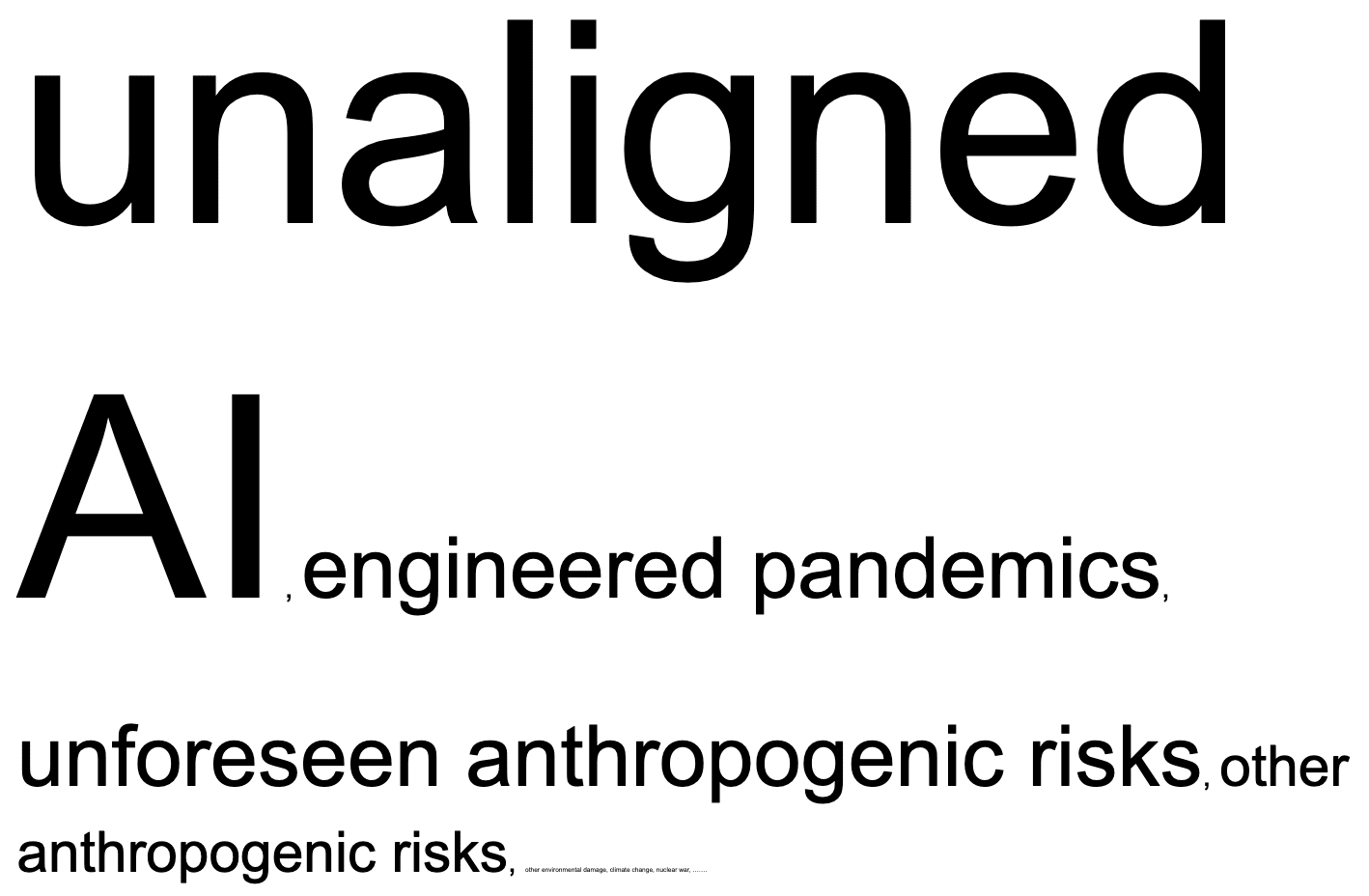
"Some existential risks include AI, Nuclear warfare, climate change, supervolcanos, cosmic events..." (see my bias in even how I remember and present these!)

Incredible, upgraded versions:

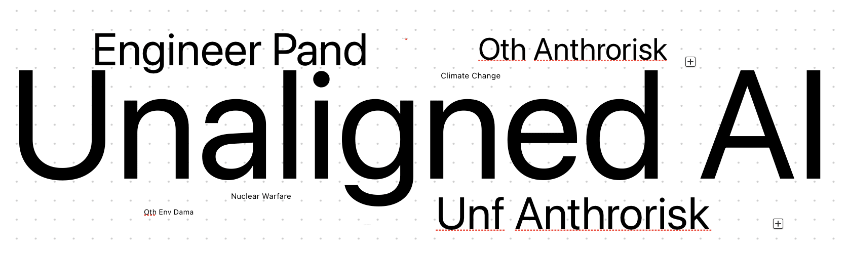
I kinda cheated, couldn't type in <1 font, so a bunch were cut off, so I tried again


Version 2 using mac's freeform. I tried to make all the entries similarly sized, hence the unreasoning untransparency.


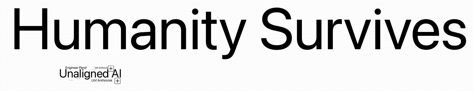
Version 3 with Humanity Survives, this is not necessarily to scale (hahaha)

(though this doesn't take into account neglectedness/tractability)

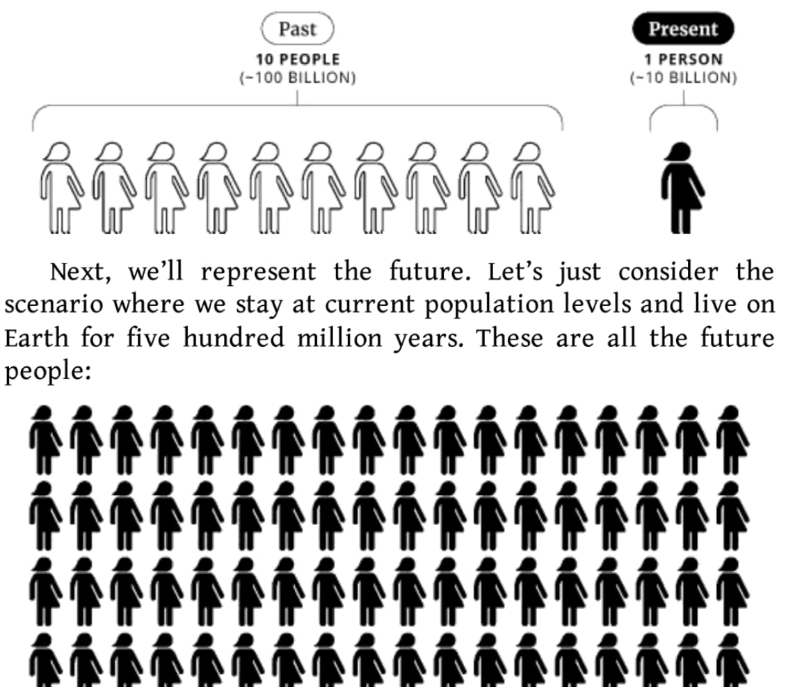
Rather similar infographic vibes as any of the to-scale cosmic scale portrayals, or this illustration from What We Owe the Future, I cut off the individual's legs at the bottom as an effective 'ellipses', since I didn't want to actually portray this (how hypocritical of me).

But anyway, it's great because this model of elaborating lists and this example of x-risks actually, in certain vocal situations, encourages you to yell at people about AI risk (not necessarily encouraging this), and whisper to them about climate change. Meanwhile, stellar explosions accurately represented should hardly receive a flow of air (then why do I keep bringing them up!)

It seems another result of this model is that we should have 100,000x AI risk representations in media (e.g. movies, frequency of discussion, of papers etc.) than we do asteroid impacts (my impression is that there are quite a lot more asteroid risk movies than AI risk; though two additional thoughts, AI risk is much more discussed now, vs Don't Look Up's 'success'). I think the 100,000x (accurate to Ord's estimates) is pretty shocking to me, in seriousness, when done in comparison with how conscious (per popular culture representations) we are of each. Of course, I think this is a pretty cold take, but the number is rather new to me and the scale is... well I'm insensitive to the scope anyway, I guess.

7

0
0

Reactions

0
0
Comments4


Sorted by Click to highlight new comments since:

I like the intent and I love the silliness, but the reasons we bring up alternatives include...

  1. So we seem less biased and less like we've only considered a single option.
  2. To cooperate with people who prioritise differently than us.
    1. It seems better if e.g. when someone asks what the best religion is, Christians, Muslims, Buddhists, all agree on providing a list of options while also making clear that they themselves consider their own religion best for XYZ reasons.

And accurately representing our beliefs about the relative merits of focusing on each risk will to some extent negate 1 and 2, especially 1.

Casual comment on my own post here but - even the x-risk tag symbol is a supervolcano, imagine we just presented over and over again such symbols that… aren’t actually very representative of the field? I guess that’s my main argument here.

(I think it's a mushroom cloud, not a volcano.)

This is very fair hahaha

Curated and popular this week
 ·  · 12m read
 · 
Economic growth is a unique field, because it is relevant to both the global development side of EA and the AI side of EA. Global development policy can be informed by models that offer helpful diagnostics into the drivers of growth, while growth models can also inform us about how AI progress will affect society. My friend asked me to create a growth theory reading list for an average EA who is interested in applying growth theory to EA concerns. This is my list. (It's shorter and more balanced between AI/GHD than this list) I hope it helps anyone who wants to dig into growth questions themselves. These papers require a fair amount of mathematical maturity. If you don't feel confident about your math, I encourage you to start with Jones 2016 to get a really strong grounding in the facts of growth, with some explanations in words for how growth economists think about fitting them into theories. Basics of growth These two papers cover the foundations of growth theory. They aren't strictly essential for understanding the other papers, but they're helpful and likely where you should start if you have no background in growth. Jones 2016 Sociologically, growth theory is all about finding facts that beg to be explained. For half a century, growth theory was almost singularly oriented around explaining the "Kaldor facts" of growth. These facts organize what theories are entertained, even though they cannot actually validate a theory – after all, a totally incorrect theory could arrive at the right answer by chance. In this way, growth theorists are engaged in detective work; they try to piece together the stories that make sense given the facts, making leaps when they have to. This places the facts of growth squarely in the center of theorizing, and Jones 2016 is the most comprehensive treatment of those facts, with accessible descriptions of how growth models try to represent those facts. You will notice that I recommend more than a few papers by Chad Jones in this
LintzA
 ·  · 15m read
 · 
Introduction Several developments over the past few months should cause you to re-evaluate what you are doing. These include: 1. Updates toward short timelines 2. The Trump presidency 3. The o1 (inference-time compute scaling) paradigm 4. Deepseek 5. Stargate/AI datacenter spending 6. Increased internal deployment 7. Absence of AI x-risk/safety considerations in mainstream AI discourse Taken together, these are enough to render many existing AI governance strategies obsolete (and probably some technical safety strategies too). There's a good chance we're entering crunch time and that should absolutely affect your theory of change and what you plan to work on. In this piece I try to give a quick summary of these developments and think through the broader implications these have for AI safety. At the end of the piece I give some quick initial thoughts on how these developments affect what safety-concerned folks should be prioritizing. These are early days and I expect many of my takes will shift, look forward to discussing in the comments!  Implications of recent developments Updates toward short timelines There’s general agreement that timelines are likely to be far shorter than most expected. Both Sam Altman and Dario Amodei have recently said they expect AGI within the next 3 years. Anecdotally, nearly everyone I know or have heard of who was expecting longer timelines has updated significantly toward short timelines (<5 years). E.g. Ajeya’s median estimate is that 99% of fully-remote jobs will be automatable in roughly 6-8 years, 5+ years earlier than her 2023 estimate. On a quick look, prediction markets seem to have shifted to short timelines (e.g. Metaculus[1] & Manifold appear to have roughly 2030 median timelines to AGI, though haven’t moved dramatically in recent months). We’ve consistently seen performance on benchmarks far exceed what most predicted. Most recently, Epoch was surprised to see OpenAI’s o3 model achieve 25% on its Frontier Math
Omnizoid
 ·  · 5m read
 · 
Edit 1/29: Funding is back, baby!  Crossposted from my blog.   (This could end up being the most important thing I’ve ever written. Please like and restack it—if you have a big blog, please write about it). A mother holds her sick baby to her chest. She knows he doesn’t have long to live. She hears him coughing—those body-wracking coughs—that expel mucus and phlegm, leaving him desperately gasping for air. He is just a few months old. And yet that’s how old he will be when he dies. The aforementioned scene is likely to become increasingly common in the coming years. Fortunately, there is still hope. Trump recently signed an executive order shutting off almost all foreign aid. Most terrifyingly, this included shutting off the PEPFAR program—the single most successful foreign aid program in my lifetime. PEPFAR provides treatment and prevention of HIV and AIDS—it has saved about 25 million people since its implementation in 2001, despite only taking less than 0.1% of the federal budget. Every single day that it is operative, PEPFAR supports: > * More than 222,000 people on treatment in the program collecting ARVs to stay healthy; > * More than 224,000 HIV tests, newly diagnosing 4,374 people with HIV – 10% of whom are pregnant women attending antenatal clinic visits; > * Services for 17,695 orphans and vulnerable children impacted by HIV; > * 7,163 cervical cancer screenings, newly diagnosing 363 women with cervical cancer or pre-cancerous lesions, and treating 324 women with positive cervical cancer results; > * Care and support for 3,618 women experiencing gender-based violence, including 779 women who experienced sexual violence. The most important thing PEPFAR does is provide life-saving anti-retroviral treatments to millions of victims of HIV. More than 20 million people living with HIV globally depend on daily anti-retrovirals, including over half a million children. These children, facing a deadly illness in desperately poor countries, are now going