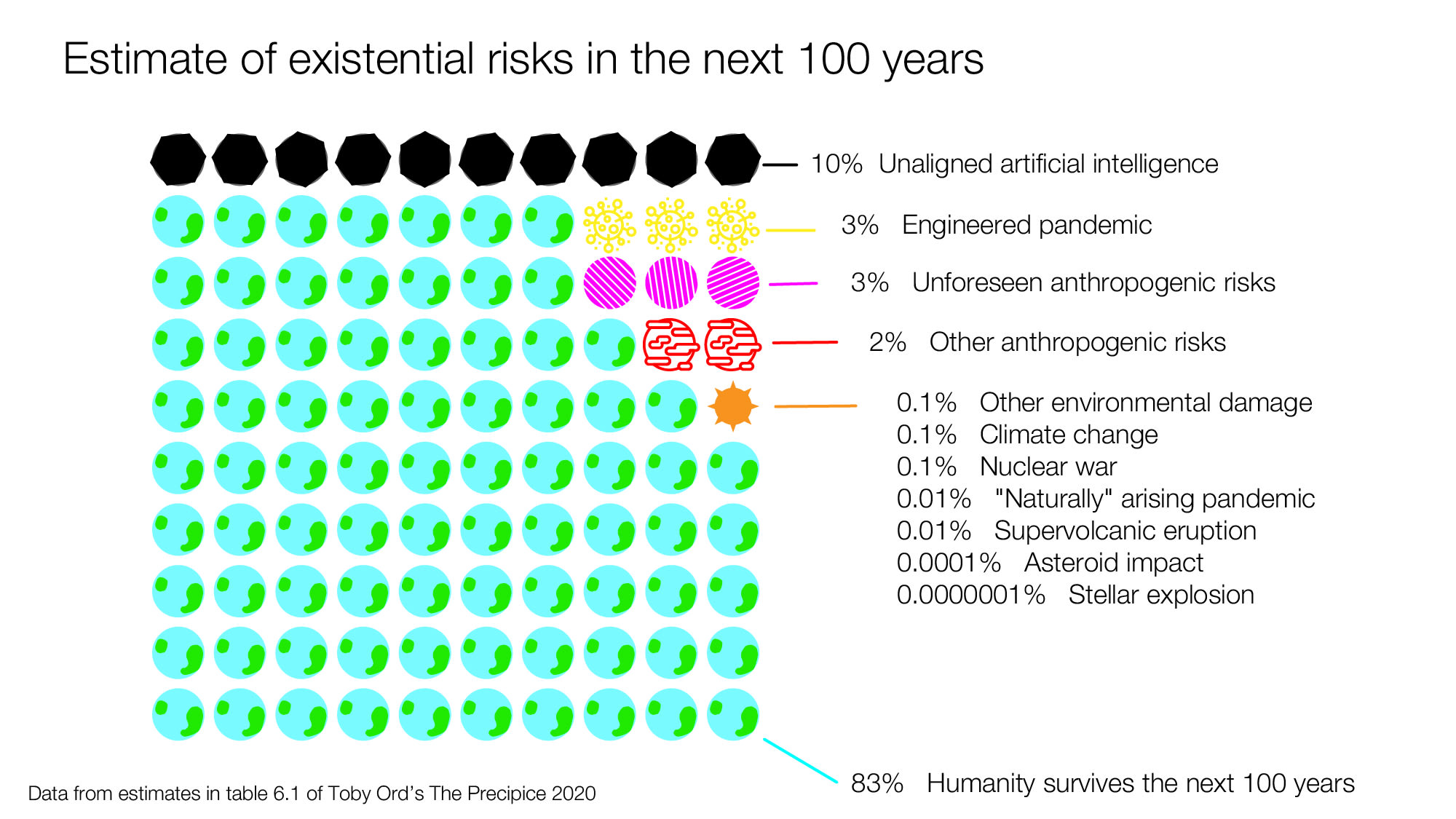
I suggest making clearer that these are one researcher's rough estimates. Otherwise I think it gives a false sense of precision. Maybe by titling the infographic "Rough guess at global catastrophic risks from The Precipice" or similar.
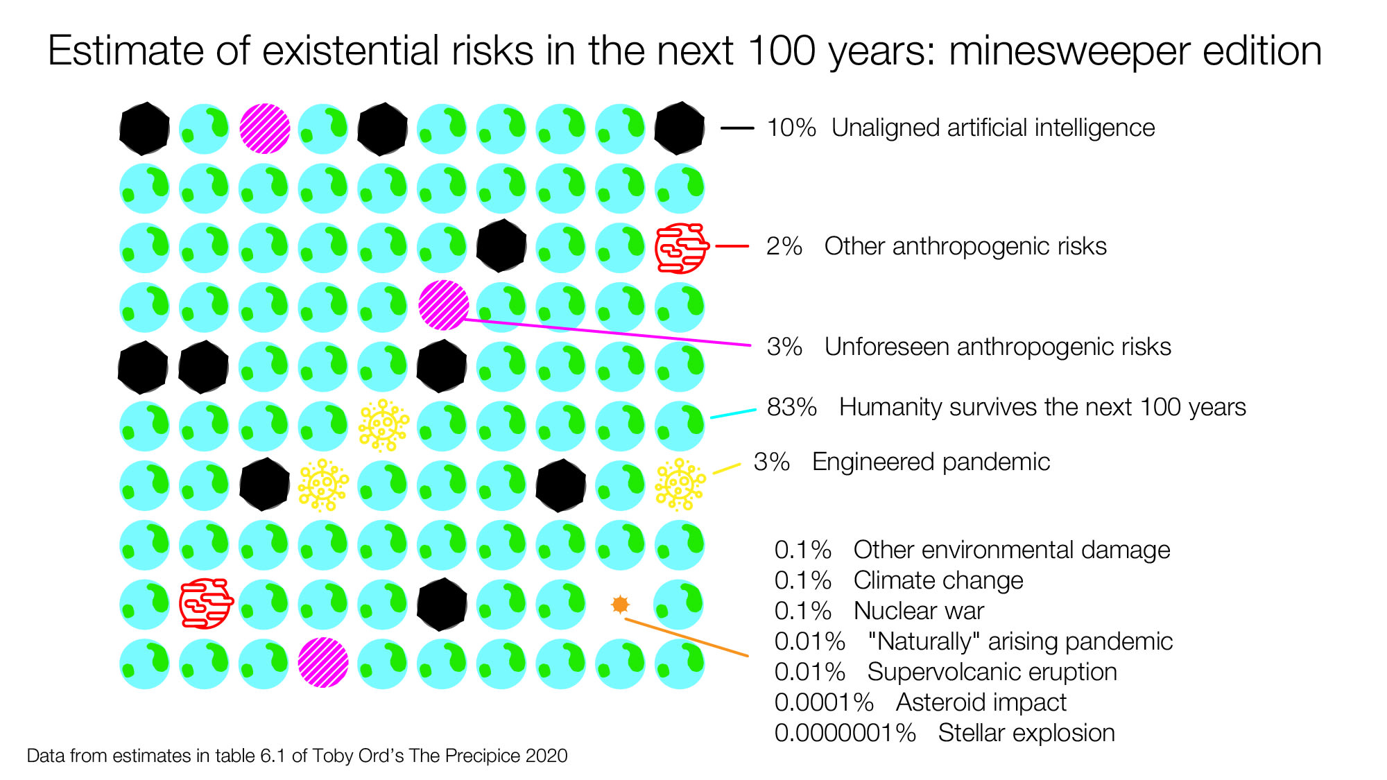
This looks great! And I agree with Aslan that the minesweeper edition feels very different and I am glad you created it.
One note: existential risks are a distinct concept to both extinction risks and global catastrophic risks. Table 6.1 in Toby's book describes existential risks which is what you are depicting here - existential risks include extinction risk but also the risk that humanity will turn into a permanent dystopia as well as permanent civilisational collapse (but humanity lives on).
Global catastrophic risks are different again: they are risks that kill at least 10% of the human population.
I've been reading Toby Ord's thoughtful book, The Precipice. In it, he estimates there's a 1 in 6 chance of humanity not surviving the next century. He has a table that summarizes the main sources of risk as he sees them that I thought could be more sharable and comparable if it were put into a diagram. So I made the following diagram in Illustrator (here's the file if you want to play with it). If this seems like a useful thing to do, I'd love to get feedback on how it can be improved:
Here's another version, that I set up more like minesweeper with 100 possible futures:
There is a lot of research and data that went into Toby's estimates, so the downside of making a diagram that's less accurate since it will not be wrapped in all of the context from the book, but the upside is that it's potentially more sharable. (this seems to be an unanswered question) But it could still work as a good conversation starter for those thinking about cause prioritization and longtermism.
Note: This post was crossposted from the Coefficient Giving Farm Animal Welfare Research Newsletter by the Forum team, with the author's permission. The author may not see or respond to comments on this post.
Subtitle: On vegan advocacy, effective altruism, and FIFA
I turn 40 today. Here are some hot takes.
On factory farming
1. Our biggest challenge is salience. If factory farming led the evening news, it wouldn’t last lo...
Impressions from the 21st Annual U.S. Cluster Headache Patient Conference, organized by Clusterbusters.
On the morning of the last day of the conference, E. was hanging out with other “clusterheads” outside the conference hotel when he started having a cluster headache attack. Before he could go back to his hotel room, J. offered E. his DMT v...
TL;DR:
The movement has an evidence problem. To solve it, for each intervention we need to know:
* What types of evidence that intervention needs
* What types of evidence different sources can give us
In this post, we outline a framework for evidencing an intervention through five stages:
...

I suggest making clearer that these are one researcher's rough estimates. Otherwise I think it gives a false sense of precision. Maybe by titling the infographic "Rough guess at global catastrophic risks from The Precipice" or similar.