electroswing
Posts 7
Comments24
Question about timing of program: This program is during the school year rather than during summer break. It is also meant for EU/UK students, who may not have slack during the school year because EU/UK university admissions often specifically require very high grades with little room for error. Do you think your application pool would be stronger if this were a summer program instead?
(pointed) Questions about "puzzle quiz":
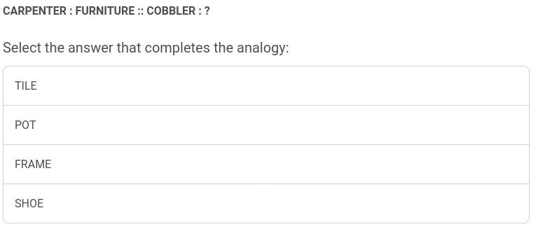
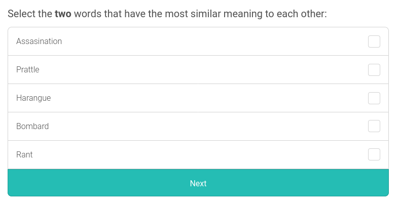
- These synonym questions (and to a lesser extent the analogy questions) are dramatically easier for native English speakers. What about EU students who are non-native English speakers?


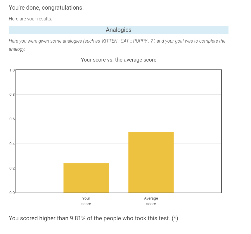
- The test displays your results at the end (below is an excerpt of my results from clicking randomly). If you give students a number, that's going to give them much more reason to Goodhart the shit out of it, speculate about cutoffs, etc, etc. Also a person might simply feel inadequate looking at the results of what is essentially an IQ test heavy on English vocab and probability theory. Do you have a reason for displaying these results?

https://www.aeaweb.org/articles?id=10.1257/aer.20141734 Gender Differences in Accepting and Receiving Requests for Tasks with Low Promotability "
"We examine the allocation of a task that everyone prefers be completed by someone else (writing a report, serving on a committee, etc.) and find evidence that women, more than men, volunteer, are asked to volunteer, and accept requests to volunteer for such tasks."
Promotability isn't exactly the word that applies to EA. Instead here I mean a more nebulous term like "low promotability = grunt work, lack of prestige, lack of career capital outside of EA, lack of intellectual labor, lack of leadership displayed, lack of skills built..."
The people who do operations, event planning, and personal assistant work in EA are disproportionately women+nb. And then roles on the opposite end of the spectrum like "Independent AI Safety Researcher" are disproportionately men. Anecdotally, I see university-aged women+nb taking time away from their studies to do community building, and university-aged men taking time away from their studies to do upskilling or research.
There's nothing wrong with ops, event planning, and personal assistant work, but I worry highly qualified women+nb are selling themselves short.
Short productivity videos. For example: "what is a TAP", "what is Murphyjitsu", "what is goal factoring", etc.
This, alongside your current "worldview expanding" content, curates an audience who is interested in tackling big questions and also cares about optimizing their personal impact.
Expanding on the "big questions" side, I would like to see more content which inspires altruism (example).
There is a relevant Rob Miles Computerphile video. It does not have a demo component like you are planning, but it does seem to click with laypeople (1M views, top comments generally engaged).
Perhaps one source of downvotes is that the main idea of this post is unoriginal. Anyone putting on an intro fellowship has put some amount of thought into:
- Do I call it a "fellowship" to give it prestige, or do I call it a "seminar" / "reading group" to make it sound academic, or do I call it a "program" or a more neutral tone, ...
- Do I call it "Arete" to sound fancy, or do I call it "intro" to sound welcoming, ...
- Do I explicitly put "EA" in the title?
The one new thought here seems to be having the acronym "IDEA" stand for "Introduction to making a Difference through Effective Altruism". And this post isn't even a comprehensive exploration of the pros and cons of this acronym! OP leaves off one important downside: at other universities (e.g. Harvard, Brown), IDEA stands for "In-Depth EA". Another point OP doesn't expand on is why "fellowship" had religious connotations for so many people. (Could this be more of an issue in LSU / the US South in general, compared to other parts of US/Europe?)
Finding good names is important, but this post doesn't really do much in aim of this goal. The pros and cons here are exclusively supported by anecdotal evidence or OP's personal aesthetics. Stuff I would like to see in the "naming CB interventions better" space:
- More experiments such as “Should you use EA in your group name?” An update on PISE’s naming experiment
- A compendium of names used at different universities / regions, with attached retrospectives from organizers
- (Probably too high effort) Proper user testing on group names
Now that Rational Animations has the human capital, budget, and experience to make high quality videos like this one, I think they should develop a more consistent brand.
They should have a consistent single face or voice of the channel. Popular edutainment channels often take off when viewer connects with a likeable personality. Examples:
- Tom Scott, VSauce, Veritasium, Physics Girl, ...
- Channels which don't show their face in their typical format: Wendover Productions, 3Blue1Brown
- Even high-budget channels like Vox are starting to lean into this format by structuring their videos more like vlogs, where the viewer connects with the presenter. example
Also just look at the comments of these videos. People engage with the content, but they also feel connected to the person presenting, and write things like "Wow I liked how excited <presenter> got when <thing> happened".
They should mark as private or remake the old videos without Rob Miles as narrator. Personally, the old videos are a bit jarring to click on—sometimes you get a guy with an accent and a bad mic (one is ok, two makes a video difficult to understand), sometimes you get a generic overly cheery American "radio voice".
Maybe get rid of the dogs/cats? Looking at the last year of videos (there are 8), the top 5 most viewed do not have dogs/cats in their thumbnail, and the bottom 3 do. YouTube allows for extensive thumbnail A/B testing and so if they're not doing this already, Rational Animations really should prepare more kinds of thumbnails and optimize for getting people to click on their videos (in a truthful way). Personally, when I first visited the channel, I found the dogs/cats in the Bayes video off-putting ("why are dogs/cats here? did a 12 year old girl draw this?"), but I thought they were fine in the How to Take Over the Universe (in Three Easy Steps) because they were subtle and the animation felt cohesive overall.

On the EA forum redesign: new EAs versus seasoned EAs
In the recent Design changes announcement, many commenters reacted negatively to the design changes.
One comment from somebody on the forum team said in response: (bolded emphasis mine)
This feels like a crux. Personally I think the EA forum should be a place seasoned EAs can go to to get the latest news and ideas in EA. Therefore, making the EA forum more similar to "the internet [new EAs are] used to" should not really be a priority.
There are so many other spaces for new EAs to get up to speed. It's not obvious to me that the forum's comparative advantage is in being a space which is especially welcoming to new users.
To my knowledge, this tradeoff between designing UX for new versus seasoned EAs has not been publicly discussed much. Which is a shame, because if the EA Forum is a worse space to exist in for seasoned EAs, then seasoned EAs will increasingly retreat to their local communities and there will be less interchange of ideas. (e.g. think about how different Bay Area EAs are from DC EAs)