Comments
Interesting, thanks! Relative to results you plot, Epoch here gave more weight to Samotsvety and Metaculus, and less to Ajeya:
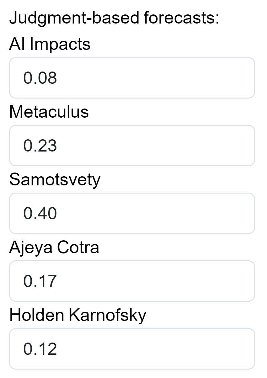
Interesting, thanks! Relative to results you plot, Epoch here gave more weight to Samotsvety and Metaculus, and less to Ajeya:
Crossposted to LessWrong.
In October 2022, 91 EA Forum/LessWrong users answered the AI timelines deference survey. This post summarises the results.
The survey was advertised in this forum post, and anyone could respond. Respondents were asked to whom they defer most, second-most and third-most, on AI timelines. You can see the survey here.
This spreadsheet has the raw anonymised survey results. Here are some plots which try to summarise them.[1]
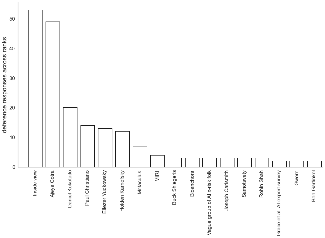
Simply tallying up the number of times that each person is deferred to:
The plot only features people who were deferred to by at least two respondents.[2]
Some basic observations:
One thing we tried was computing a “weighted” score for each person, by giving them:
If you redo the plot with that score, you get this plot. The ordering changes a bit, but I don’t think it really changes the high-level picture. In particular, the basic observations in the previous section still hold.
We think the weighted score (described in this section) and unweighted score (described in the previous section) are the two most natural metrics, so we didn’t try out any others.
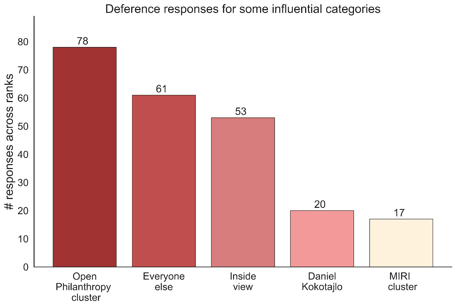
Yeah, we do think some people have highly correlated views, in the sense that their views depend on similar assumptions or arguments. We tried plotting the results using the following basic clusters:
Here’s what you get if you simply tally up the number of times each cluster is deferred to:
This plot gives a breakdown of two of the clusters (there’s no additional information that isn’t contained in the above two plots, it just gives a different view).
This is just one way of clustering the responses, which seemed reasonable to us. There are other clusters you could make.
Sam and McCaffary decided what summary plots to make. McCaffary did the data cleaning, and wrote the code to compute summary statistics/make plots. Sam wrote the post.
Daniel Kokotajlo suggested running the survey. Thanks to Noemi Dreksler, Rose Hadshar and Guive Assadi for feedback on the post.
You can see the code for these plots here, along with a bunch of other plots which didn’t make the post.
Here’s a list of people who were deferred to by exactly one respondent.
Arguably, Metaculus doesn’t quite fit with “everyone else”, but I think it's good enough as a first approximation, especially when you also consider the plots which result from the weighted score (see next section).
This cluster could have many other names. I’m not trying to make any substantive claim by calling it the Open Philanthropy cluster.





Things that surprised me about the results
Thanks for doing this survey and sharing the results, super interesting!
Regarding
Yes, I definitely think that there's a lot of potential for social desirability bias here! And I think this can happen even if the responses are anonymous, as people might avoid the cognitive dissonance that comes with admitting to "not having an inside view." One might even go as far as framing the results as "Who do people claim to defer to?"