We just launched a new version of our website!
We think the new design will make our content easier to navigate, so that readers have an easier time learning about our work and our thinking.
As part of the launch, we’ve updated language on a number of core pages to better reflect how our work has evolved in the years since our previous website was created.
This includes updates to our mission statement, which had been in place since our incubation as a project of GiveWell. The new statement is more concise, and we think it better reflects the breadth of our work:
“Our mission is to help others as much as we can with the resources available to us.”
Other updates include:
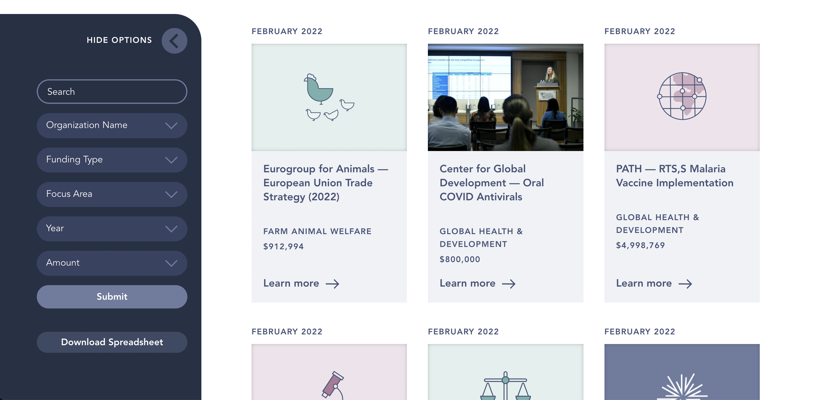
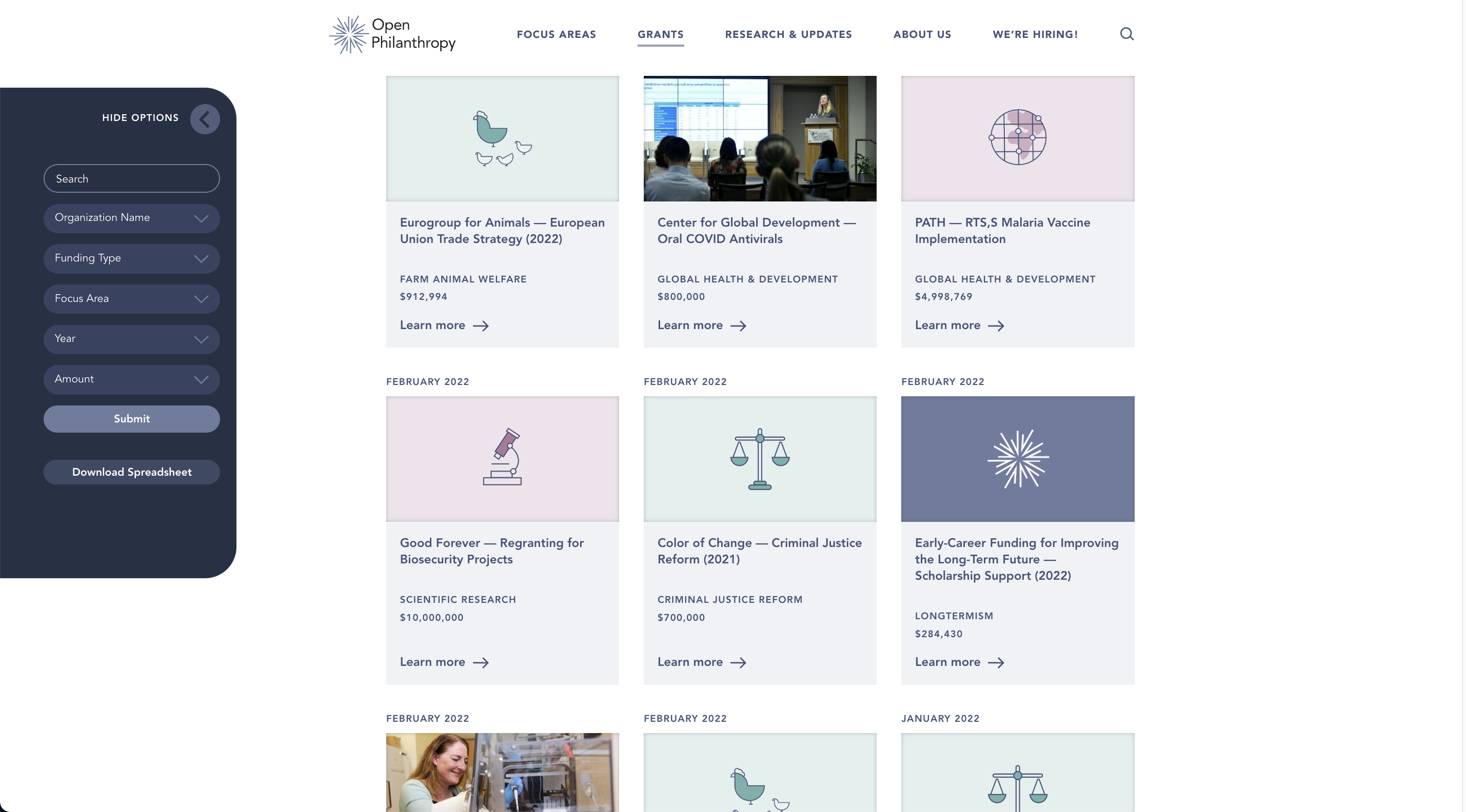
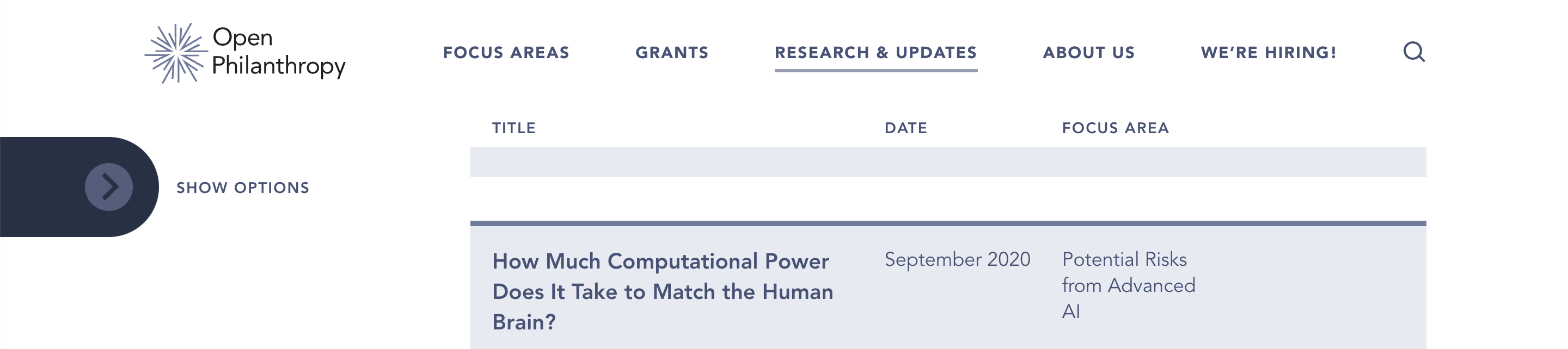
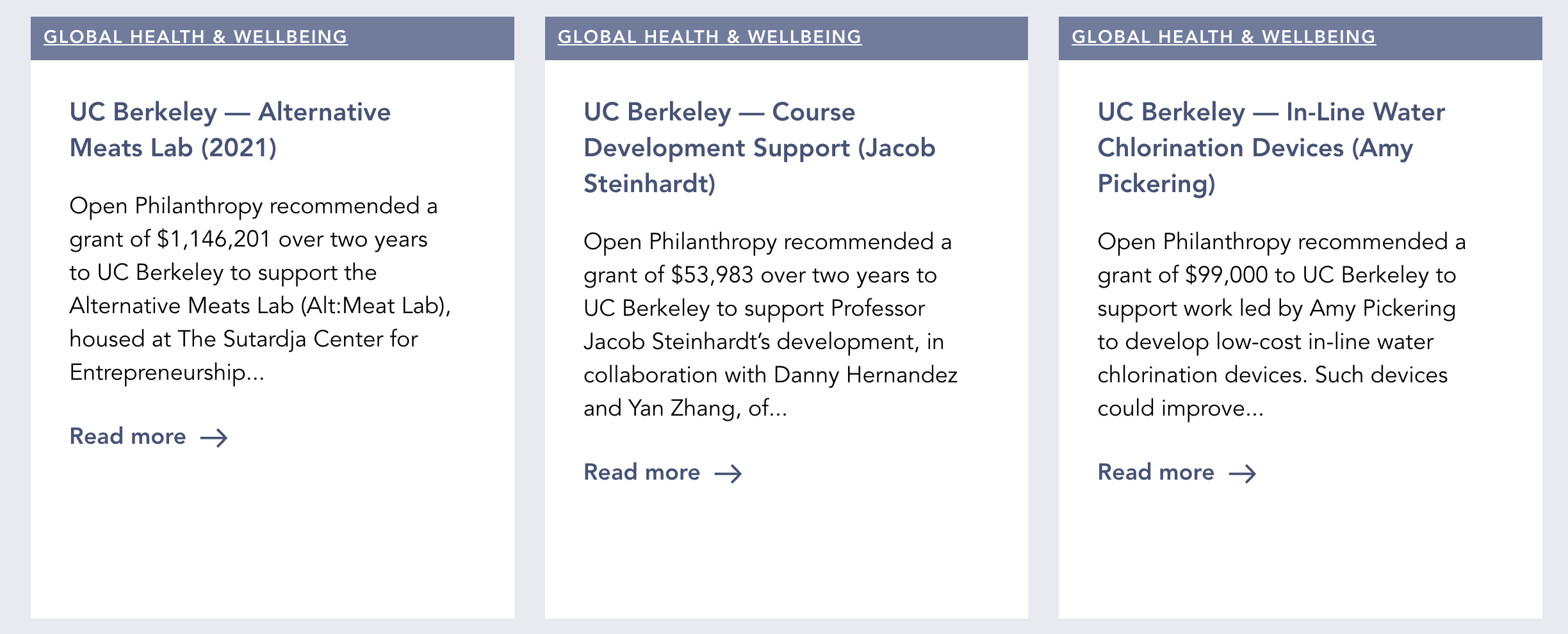
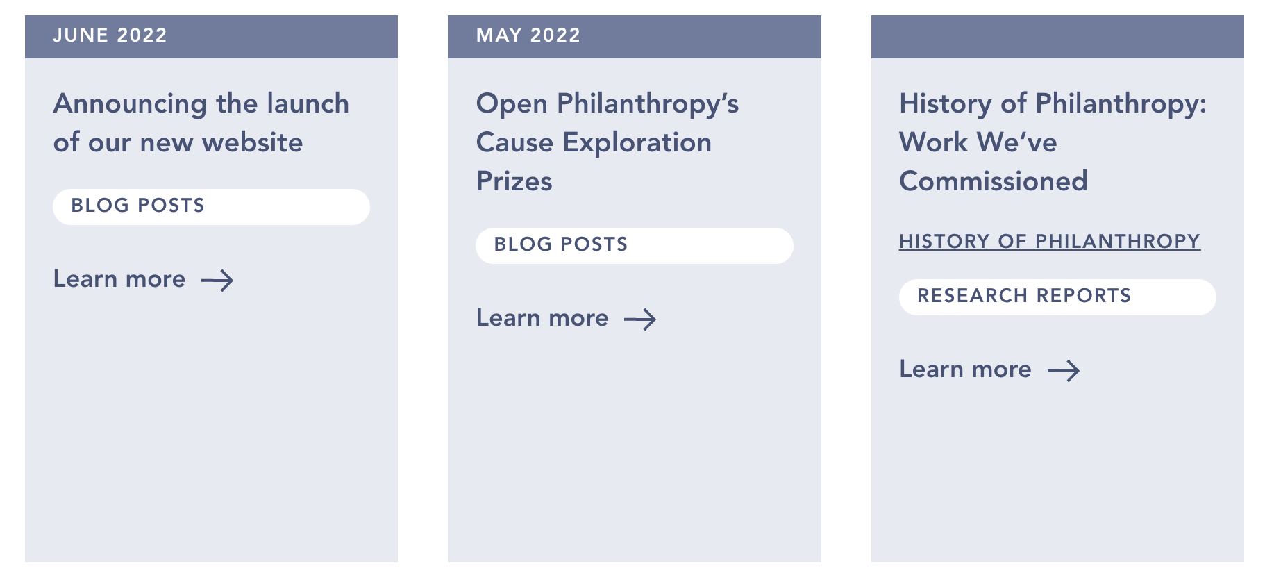
- The ability to sort and filter much of our published content, including blog posts, research reports, and notable lessons.
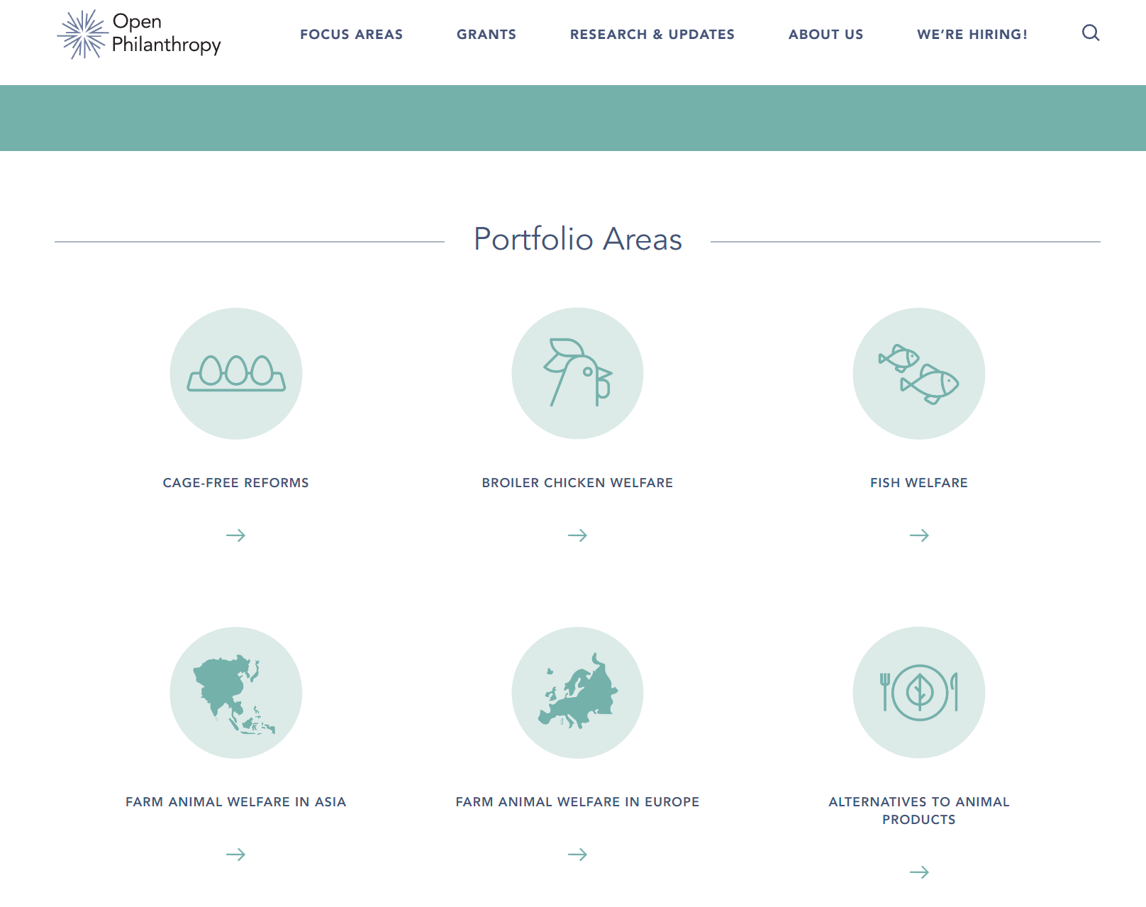
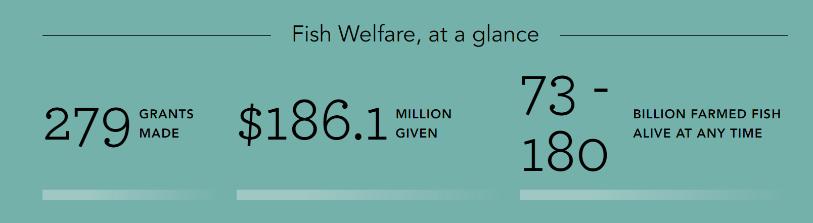
- Statistics on our giving in each of our focus areas.
- A new page explaining the difference between our two grantmaking portfolios (Global Health & Wellbeing and Longtermism).
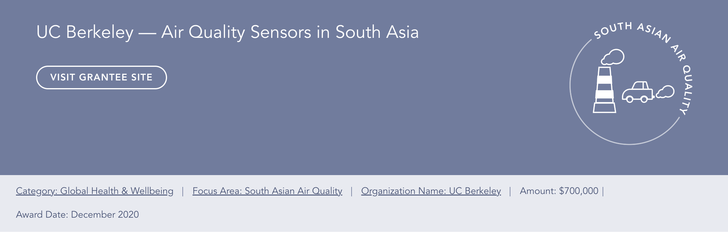
- Pages for our newest focus areas, South Asian Air Quality and Global Aid Policy.
If you experience any issues using the new site, or see something you think should be changed, we would appreciate your feedback. Contact webrequests@openphilanthropy.org (or comment on this post) to get in touch.


So, uh, I have comments below:
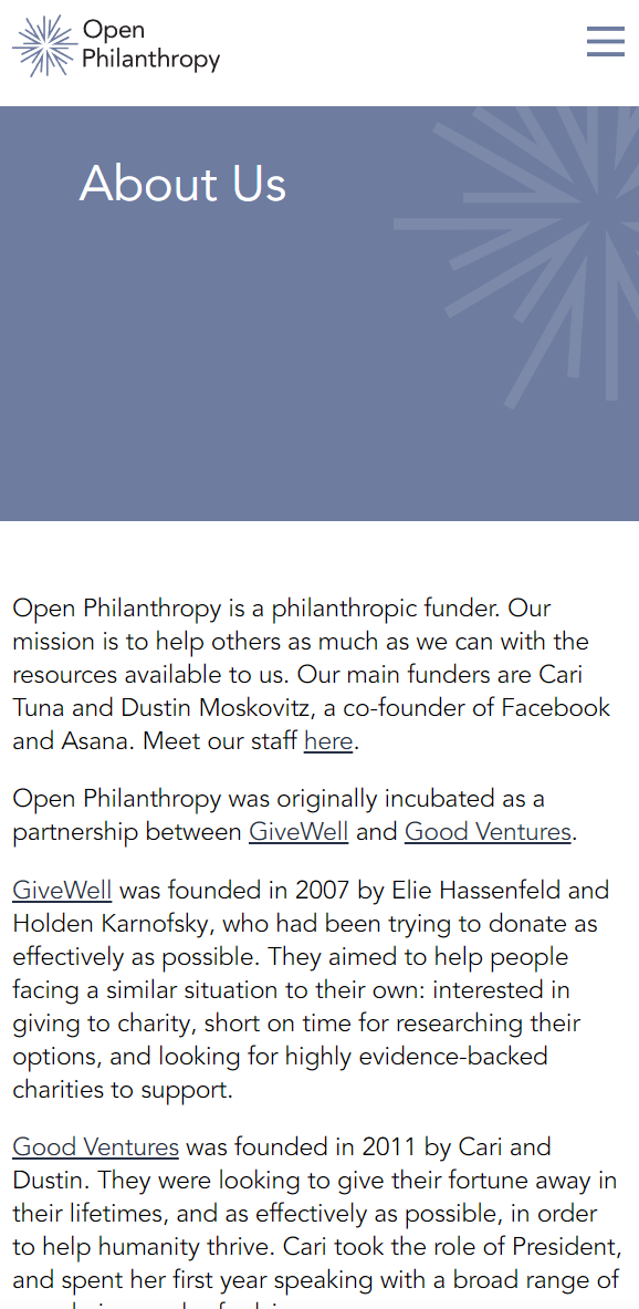
These comment on the intro page, and the about page, as they seem like natural places where a newcomer would try to come to "gauge credibility based on a website".
I think this comment is lower value and I sort of don't expect many people to read it, I'll just put it here for completeness.
I emphasize I’m not a designer. But it’s easy enough to just present these ideas to an actual designer and see what they say, so it’s low cost to be wrong and just have people read this.
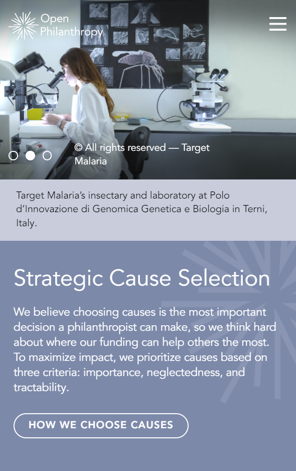
No header bar, front page content up against top of screen
For the front page, there's no header bar and that seems unusual.
As below, the image and content is right up against the top of the screen, with hamburger bar sharing the space space.
So the image with the scientist on a microscope, is in place of what often is the header image.
(By the way, the bright color in the image is slightly obscuring the logo and title.)
For contrast, see Oxford's site on mobile:
Room for scrolling seems like a desirable pattern
Many modern websites “give space” for scrolling on mobile. So a user loading a page, who often instinctively scrolls down, has a lot of content to see.
In contrast, the mobile site right now is pretty dense and there’s not much room to scroll down to find more content. For example, "cause selection" is right below the first section of content.
So I claim this is sort of fighting the “modern” tendency for people to scroll down a mobile website.
If you go on Square’s site and scroll down, you’ll see a long narrative with many pictures breaking up the text. This room seems desirable.
https://squareup.com/
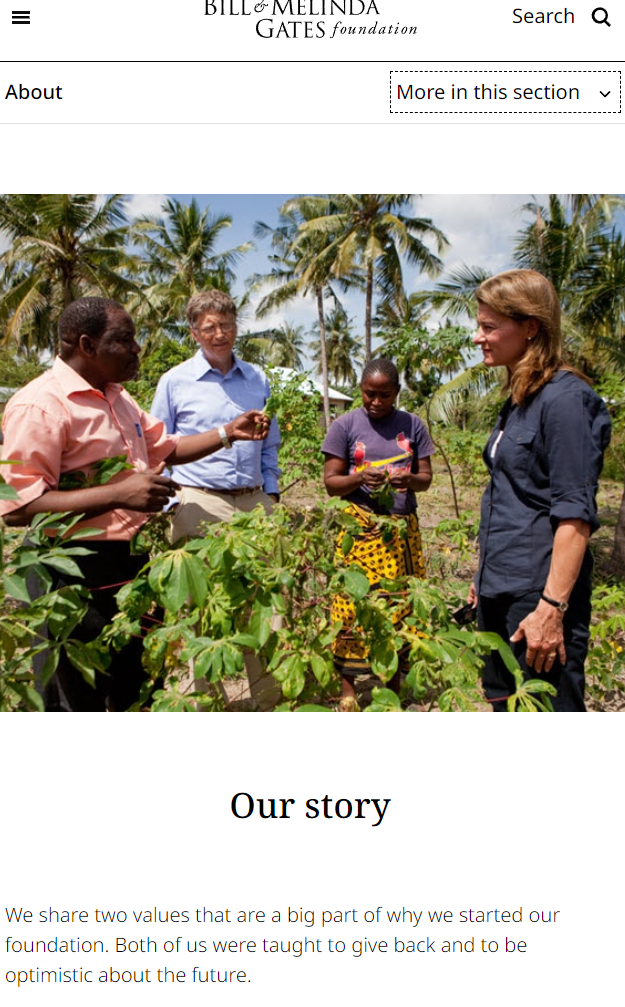
You can also see this with the Gate’s foundation:
https://www.gatesfoundation.org/
It’s true that the target audience isn't the same as the average TikToker, but I still think many people are familiar with mobile sites like this, and expect a roomy scroll.