Here is a demonstration without using code. If the probability density function (PDF) of the available expenditure for a given cost-effectiveness follows a Pareto distribution (power law), it is f(x)=αxmαx−(α+1), where x is the cost-effectiveness, xm>0 is the minimum cost-effectiveness, and α is the tail index. The total expenditure required for the marginal cost-effectiveness to drop to a given value x is E(x)=∫+∞xf(t)dt=αxmα∫+∞xt−(α+1)dt=−xmα[t−α]+∞x=−xmα(0−x−α)=(xm/x)α. So the marginal cost-effectiveness is x=xm(E(x))−1/α, which is an isoelastic function.
If the total utility U(x) gained until the marginal cost-effectiveness drops to a given value x is an isoelastic function of the aforementioned total expenditure, with elasticity −η, x=U′(x)=E(x)−η. Comparing this with the last expression above for xm=1, η=1/α.
What you wrote looks clean and correct and, indeed, i used the Pareto distribution α parameter incorrectly and will change that line of the post. Thank you!
[Warning: this comment is kind of thinking-out-loud; the ideas are not yet distilled down to their best forms.]
The only thing I want to quibble about so far is your labelling my model as more general. I think it isn't really -- I had a bit of analysis based on the bivariate distribution, but really this was just a variation on the univariate distribution I mostly thought about.
Really the difference between our models is in the underlying distribution they assume. I was assuming something roughly (locally) log-uniform. You assume a Pareto distribution.
When is the one distribution a more reasonable assumption than the other? This is a question which is at the heart of things, and I expect to want to think more about. At a first pass I like your suggestive analysis that (something like) the Pareto distribution is appropriate when there are many many ways to spend money in ways that are a little effective but not very. I still feel drawn to the log-uniform model when thinking about the fundamental difficulty of finding important research breakthroughs. But perhaps something like Pareto ends up being correct if we think about opportunities to fund research? There could be lots and lots of opportunities to fund mediocre research (especially if you advertise that you're willing to pay for it).
Actually the full version of this question should wrestle with needing to provide other distributions at times. In an efficient altruistic market all the best opportunities have been taken, so the top tier of remaining opportunities are all about equally good. Even if I dream up a new research area, it may to some extent funge against other types of research, so the distribution may be flatter than it would absent the work done already by the rest of the world. (This is something I've occasionally puzzled over for several years; I think your post could provide another helpful handhold for it.)
By the difference in generality i meant the difficulty-based problem selection. (Or the possibility of some other hidden variable that affects the order in which we solve problems.)
I was assuming something roughly (locally) log-uniform. You assume a Pareto distribution.
On a closer examination of your 2014 post, i don't think this is true. If we look at the example distribution
Assume that an area has 100 problems, the first of difficulty 1, and each of difficulty 1.05 times the previous one. Assume for simplicity that they all have equal benefits.
and try to convert it to the language i've used in this post, there's a trick with the scale density concept: Because the benefits of each problem are identical, their cost-effectiveness is the inverse of difficulty, yes. But the spacing of the problems along the cost-effectiveness axis decreases as the cost increases. So the scale density, which would be the cost divided by that spacing, ends up being proportional to the inverse square of cost-effectiveness. This is easier to understand in a spreadsheet. And the inverse square distribution is exactly where i would expect to see logarithmic returns to scale.
As for what distributions actually make sense in real life, i really don't know. That's more for people working in concrete cause areas to figure out than me sitting at home doing math. I'm just happy to provide a straightforward equation for those people to punch their more empirically-informed distributions into.
Of course you're right; my "log uniform" assumption is in a different space than your "Pareto" assumption. I think I need to play around with the scale density notion a bit more until it's properly intuitive.
This principle has seemingly strange implications:
If η≥1 and nothing has been done yet, then the first thing you do produces infinite utility (assuming you start by doing the best thing possible and then move to progressively worse things).
If η≥1, then a randomly-chosen opportunity has infinite expected utility.
For me this seems more useful as an implication in the other direction: economists generally treat utility functions as isoelastic[1], which implies that opportunities are Pareto-distributed.
But it's also useful as a sanity check: it's intuitive to me that utility is isoelastic, and also that opportunities are Pareto-distributed, so it's nice that these two intuitions are consistent with each other.
[1] Although this might be more out of convenience than anything else, since isoelastic utility functions have some nice mathematical properties.
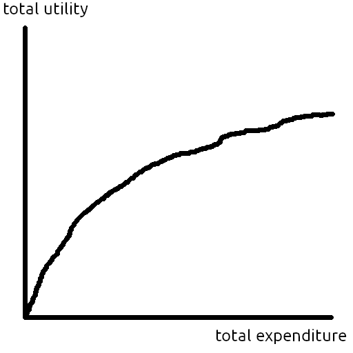
You've probably seen a curve like Figure 1 before: We can do more good by expending more resources, but the marginal cost-effectiveness tends to decrease as we run out of low-hanging fruit. This post is about the relationship between that utility vs. expenditure curve and the set of possible opportunities we can work on.
In 2021, OpenPhil wrote that they model GiveWell's returns to scale as isoelastic with η=0.375. In a recent blogpost, OpenPhil wrote that they "tend to think about returns to grantmaking as logarithmic by default"[1]. In the model they cite for logarithmic returns, @Owen Cotton-Barratt models opportunities as having independent distributions of cost and benefit and works out approximately logarithmic utility curves from some reasonable assumptions. What follows is a simpler but less general approach to the same problem.
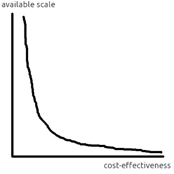
Think of the distribution of opportunities as a density curve with cost-effectiveness on the x axis and available scale at that level of cost-effectiveness on the y axis (see Figure 2). By cost-effectiveness, i mean the utils-per-dollar of an opportunity. And by available scale, i mean how many dollars can be spent at a given level of cost-effectiveness[2]. Equivalently, you can think of the y axis as the density of ways to spend one dollar at a given cost-effectiveness.
Figure 2: density of available scale at each level of cost-effectiveness
A univariate distribution of opportunities is easier to reason about than a bivariate one, but at the cost of losing information that might affect the order in which we fund them, so we can't represent something like difficulty-based selection in Owen Cotton-Barratt's model.[3]
Suppose that we start at the positive infinity cost-effectiveness end of the opportunity distribution and work our way left towards zero[4]. In reality, some low-hanging fruit has already been picked, but that's OK because it just means that in the final answer we shift our position on the utility vs. expenditure graph by however many dollars have already been spent.
Cost-effectiveness is the derivative of utility with respect to expenditure. And available scale density is the derivative of expenditure with respect to cost-effectiveness. Letting q be cost-effectiveness, S be the scale density function, and U be the utility function, we have the following differential equation:
S(q)=((U′)−1)′(q)
where U′ is cost-effectiveness as a function of total expenditure, (U′)−1 is total expenditure as a function of cost-effectiveness, and ((U′)−1)′ is the derivative of expenditure with respect to cost-effectiveness. Solving this differential equation lets us convert between two different pretty intuitive[5] ways of thinking about diminishing returns to scale.
I think it makes sense to model the distribution of opportunities as a power law:
First and foremost, it makes the math easy.
Rapidly approaching 0 at infinity makes sense.
Going to infinity at 0 makes sense because there's a kajillion ways to spend a ton of resources inefficiently.
A lot of stuff actually is pretty Pareto-distributed in real life.
And, of course, cost-effectiveness of opportunities having a Pareto-like distribution is EA dogma[6]
And so that the integral converges on the positive infinity side, the exponent must be less than negative one.
It turns out that if you work this out (see appendix) for a power law opportunity distribution S(q)=kqp, you wind up with an isoelastic U where
η=1−p−1
This seems like a pretty neat and satisfying result that hopefully will make it easier to think about this stuff. I suspect that some EAs have been, like me, explicitly or implicitly modelling the distribution of cost-effectiveness of opportunities as a power law and modelling diminishing returns to scale as isoelastic without thinking about both of those things at the same time and realizing that, when we do interventions in the optimal order, those two things are mathematically equivalent.
appendix
derivation
import sympy as sp

q = sp.symbols("q", positive=True)
eta = sp.symbols("eta", positive=True)
k = sp.symbols("k", positive=True)
S_tot_0 = sp.symbols("S_tot_0", positive=True)

# This needs to be written as -1 - something positive
# to enforce that p is less than -1 so that the integral converges
# and sympy is able to make some necessary simplifications.
# And then i went back and changed that something to 1 / eta
# once i worked out the answer and saw that it was an isoleastic utility function.
p = -1 - 1 / eta

S = k * q**p

q_0 = sp.solve(sp.integrate(S, (q, q, sp.oo)) - S_tot_0, q)[0]

# What we actually want to do here is evaluate this
# integral from q_0 to infinity, but sympy can't handle that.
# So, instead, we use the following trick:
# We know that the integral of f(x) from q_0 to sp.oo
# equals something - F(q_0), so define that something as a variable.
# And utility is a torsor, so adding some constant changes nothing.

C = sp.symbols("C", real=True)
U = sp.simplify(C - sp.integrate(q * S, q).subs({q: q_0}))
U = sp.simplify(sp.integrate(U.diff(S_tot_0), S_tot_0))

order = sp.O(U.args[0][0], S_tot_0).args[0]
assert order.equals(S_tot_0 ** (1 - eta))
assert sp.O(U.args[1][0], S_tot_0).equals(sp.O(sp.log(S_tot_0)))
But the information about the opportunities' cost and benefit is still there: *waves hands* If you zoom in on the scale vs. cost-effectiveness curve — that is, reduce the bin width on the histogram to epsilon — you'll see a bunch of Dirac deltas representing individual discrete interventions whose cost is their integral and whose value is their cost times their cost-effectiveness.
I think there's a case to be made that this assumption is less silly than it sounds: If, in everything here, you replace the words "cost-effectiveness" and "utility" with "expected cost-effectiveness" and "how much good we think we did", then all the math still works out the same and the result still makes sense unless there's learning or bias involved, which would both make things too complicated anyway.
AI Use Note: Main body text entirely human written. Claude (Opus 4.8) helped develop models of animal life histories in the appendix.
Cross-posted from Good Structures.
Executive Summary
* Animal advocates sometimes make claims like “there are X of this animal...
Adapted from my Substack, Funding Anthropalypse.
Short version: if you want a share of the coming Anthropic and OpenAI windfall - the $37bn+ that could be in play next year - the way in is to become 'legibly excellent', so the evaluators and donors that frontier lab staff already trust point them to yo...
Disclaimer: Although I work on the Groups Team at CEA, I’m writing this in a personal capacity, and this post does not constitute an endorsement by CEA.
Agency - the realisation that you really can just do things.
TL;DR
Biosecurity needs people (of any background) who are agentic and have a high execution velocity and track record....

Great post!
Here is a demonstration without using code. If the probability density function (PDF) of the available expenditure for a given cost-effectiveness follows a Pareto distribution (power law), it is f(x)=αxmαx−(α+1), where x is the cost-effectiveness, xm>0 is the minimum cost-effectiveness, and α is the tail index. The total expenditure required for the marginal cost-effectiveness to drop to a given value x is E(x)=∫+∞xf(t)dt=αxmα∫+∞xt−(α+1)dt=−xmα[t−α]+∞x=−xmα(0−x−α)=(xm/x)α. So the marginal cost-effectiveness is x=xm(E(x))−1/α, which is an isoelastic function.
If the total utility U(x) gained until the marginal cost-effectiveness drops to a given value x is an isoelastic function of the aforementioned total expenditure, with elasticity −η, x=U′(x)=E(x)−η. Comparing this with the last expression above for xm=1, η=1/α.
I think you mean η=1/α.
What you wrote looks clean and correct and, indeed, i used the Pareto distribution α parameter incorrectly and will change that line of the post. Thank you!