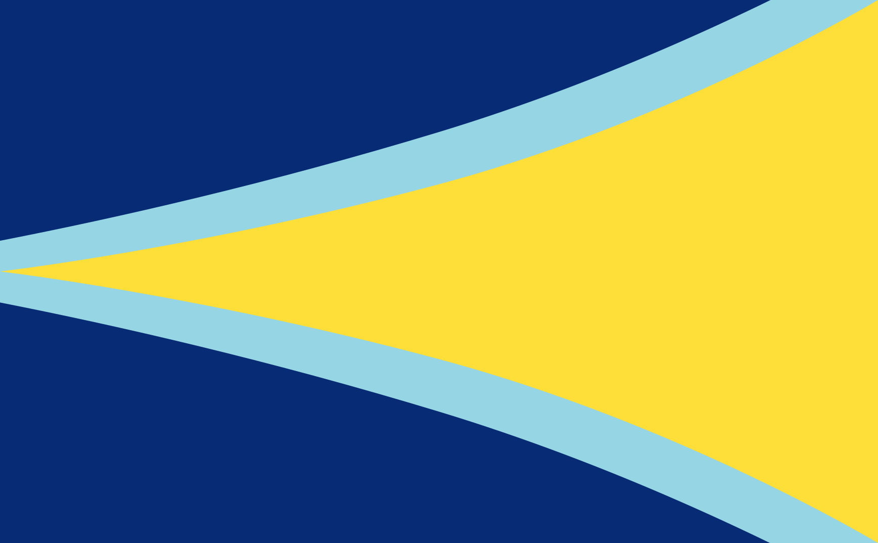
In the spirit of the Flag for Utilitarianism, I hereby propose this be the Flag for Longtermism:

Symbolism
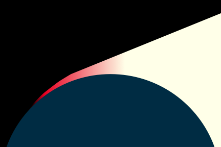
The flag is divided into three bars, representing the progressive stages of technological development. The color scheme is derived from the Flag of the East African Community, which is an homage to humanity's origins in that region.
Green Bar
The first, green bar represents Earth. It is the home of humanity, and its position at the bottom of the flag represents that it is the most foundation piece of humanity's future. However, it also represents the state of nature and its Malthusian nature—hence, it is unadorned and sparse.
Blue Bar
The blue bar, adorned with a rising sun, represents enlightenment. The light of scientific and technological progress drives newfound flourishing and capabilities. However, this stage of technological development is not an unambiguous blessing—the sun is colored red to illustrate the rising dangers this carries with it.
Black Bar
The Blue stands in stark contrast to the final, black band, which marks the precipice between our current stage of technological development and our terminal one.
The black band can have two meanings. On the one hand, the blackness can represent a void—an immense loss of value due to existential catastrophe. Its position atop the flag is meant to symbolize longtermists' awareness of existential risks. However, it can also represent outer space, and humanity's ultimate destiny as creators of an immensely valuable interstellar civilization.
The star—which symbolizes that sort of existentially safe interplanetary civilization—is the only thing that disambiguates the two interpretations. It is positioned at the top and center of the flag so as to make that sort of civilization the lodestar for longtermist efforts—the thing that guides us. It is yellow in honor of the Utilitarian Flag, wherein yellow represents happiness.
Meta: Is There Value in This?
I don't want people to take this too seriously. This was mostly just a fun idea I dreamed up one evening. There is a real risk of harmfully "rallying 'round the flag" and turning this into a partisan shibboleth that promotes ideological loyalty over all. I do not want that.
On the other hand, mature and successful movements usually have symbols. It is reasonable for longtermism to have one, so long as we do not allow their effects to stymie open and honest discourse about longtermism, including criticism thereof.
Resources
I declare a CC0 license on this work. Please use it as you like.
A perma copy of the flag is available at https://perma.cc/M33D-7W4J. It looks black because the image is very large.
Some other files are here. I made this using OmniGraffle, so the raw file is in .graffle format. An SVG file is available here.


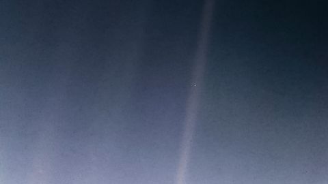
Continuing to play with the space, light cone, time, warning light, and blue dot elements, here's another. I'm not trying to symbolize longtermism specifically here, but I do think this arrangement fits something present.
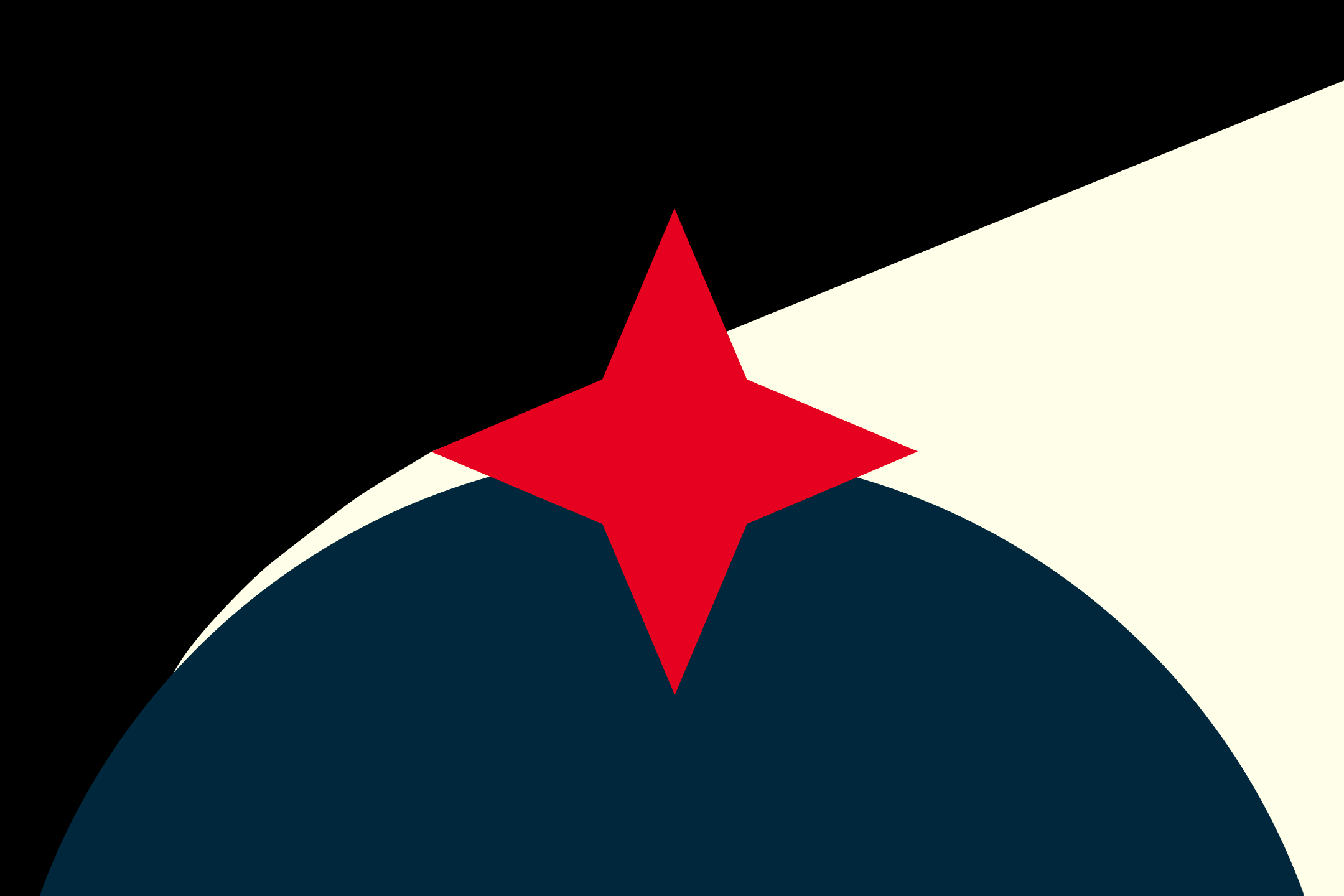
Colors
I like the thinking behind the color choices in the original, so I tried to do that too.
- Eigengrau instead of black: Eigengrau is the almost-black color humans see when we close our eyes in darkness, darkness as perceived by human vision. It's black with visual artifacts of uncountably many points of light. It rhymes with how we see space, and represents the eyes-closed opposite of enlightenment.
- pale yellow instead of white: stark white feels lifeless/barren/rhetorical, while sunlight is a human universal. Technically that color would be rather more blue, but I didn't want 3:1 in cold's favor, and our experience of sunlight is "warm".
- global blue : I like ocean blue, but global blue is traditional and recognizable.
- almost-red shocking pink: this color was tricky and unsatisfying. True traditional red is associated with the vigorous bloodshed of war. Amber felt slower, like plasma seepage and electronic running lights. But comparing them side by side, this weird in-between color feels more right. I don't know from whence it comes and it's troubling me, and that feeling seemed to fit, so I went with the red-pink. And disagreeing about whether this particular shade is red or pink would be the kind of moving-concepts-around time-wasting disagreement that so often distracts resources from problem-solving.
Shapes
Four-pointed star: a focus, or flaw that draws focus
- orienting star
(compass star, North star, Star of Bethlehem, LessWrong, Alcor, Quaker star)
- how stars or points of light appear to us, for reasons I'm not competent to explain
- Once I saw the bright "shadows" created by bubbles on the surface of water concentrating sunlight on the stone below, and at a certain depth the anti-shadows looked like curved four-pointed stars.
- the shape of a wound created by an X-shaped cut
Semicircle: the known world
- as a sphere: planet, sphere of influence
- as a hemispherical bubble: habitat, growth, celestial heavens of antiquity
- as an arc: arc of history/narrative, rise and fall
Arrangement/assembly/explication
The darkness is unknown. Can contain risk, ignorance, space, void, death, etc. as you like.
Enlightenment is a growing buffer between the world and the unknown. Can contain hope, mercy, knowledge, skill, empathy, consciousness, energy etc. as you like.
Darkness holds three corners, and light one. However, darkness holds less than half the area.
The expansion of hope/mercy/enlightenment has both a linear and a non-linear growth aspect.
This star/wound/pain/warning/flaw connects the three, or is in all three. It sometimes obscures what's going on between the other three. It's the central focus. It's in the middle of everything.
From left to right, there's a progression in time from the beginning in void to the post-world end where enlightenment dominates, yet cannot eliminate the unknown.
Does the story arc get interrupted, or obscured?
And is this burst of pain an event in time, or a constant element?
Is the wound in the middle opening or closing?
Does pain orient or distract?
Reflection
In retrospect, I may be guilty of being quite influenced by other brands I like. I was not consciously thinking of these when I was working on this design, so I'm not sure how much is my fault and how much is convergence/overlap.
- Black triangle on top-left, yellow on the right: I have previously considered myself anarcho-capitalist.
- red and black Quaker star: I don't know what the Quaker star symbolizes, but I like the connotations of humility, principles, service, and insistence on a kinder future. I don't "identify" as anything religious, but I occasionally attend the local Friends' Meeting.
The result also reminds me of Jordan Peterson's work: in a world made of chaos, order, suffering, and matter, one needs a negative motivation, a positive motivation, a foundation to stand on, and a direction in which to go. "Life is suffering," but what you do about that is up to you.
Made using Amadine. An editable SVG version is here in case you want to build on it further.
I was missing something important before about the aspirational nature of a flag. While the star held something true about there being actually hard, knock-out problems to solve along the way, I think the inevitability of the star-less version is more suitably aspirational.
There is not one singular problem to solve, there are many, and the other shapes already hold that. With the star, I had put an oppositional teleology before the indefinite striving for betterment, and that was out of order. That was more 'per ardua ad astra,' "through advers... (read more)