Net Promoter Score is a widely used method for determining consumer satisfaction, asking “How likely is it that you would recommend [brand] to a friend or colleague?” and the response is (usually) a number between 0 and 10. However, instead of an average, the aggregate score is a complex nonlinear function of the results. CEA has moved away from this complex function in favor of just simply taking the arithmetic mean. Briefly, this is because the results don’t replicate, NPS is not empirically supported, it requires larger sample sizes, and it violates survey best practices.
Summary
- NPS is widely used, but the research has failed to replicate, even when the replication was using the originally published data set (!).
- Measures of satisfaction are more predictive than NPS of outcomes such as firm growth and whether the respondent actually recommends the product to others.
- The American Customer Satisfaction Index is an alternative which has stronger empirical grounding, as well as a huge number of publicly available benchmarks. It uses 3 questions, on a 10 point scale, whose scores are averaged and normalized to a 0-100 scale:[1]
- What is your overall satisfaction with X?
- To what extent has X met your expectations?
- How well did X compare with the ideal (type of offering)?
- CEA mostly still asks the NPS question, but switched to taking the arithmetic mean of the results. We call this the “likelihood to recommend” (LTR).[2]
More information
- NPS was introduced in 2003 with the claim that it was the best predictor of growth across a data set of companies. This data set was small and subject to p-hacking. The raw data has not been published (including, ironically, the pieces the author says should always be published when reporting NPS scores). The original research methodology was:
“We then obtained a purchase history for each person surveyed and asked those people to name specific instances in which they had referred someone else to the company in question… The data allowed us to determine which survey questions had the strongest statistical correlation with repeat purchases or referrals….
One question was best for most industries. “How likely is it that you would recommend [company X] to a friend or colleague?” ranked first or second in 11 of the 14 cases studies”[3]
- Replication attempts (including ones which reverse engineered the original data set from published scatterplots) have failed to find significant predictive value from NPS. A wide variety of alternative statistical methods exist, some of which have stronger empirical grounding.
- Notably, NPS is worse at predicting whether the respondent will actually recommend the product.
- Replication attempts find alternate definitions of the NPS scale to be more predictive than the commonly used one, even if the question is kept the same (e.g. using a 7 point scale).
- The weird way NPS is calculated means that it requires substantially larger sample sizes.
- The NPS question disagrees with commonly accepted best practices in survey design (e.g. using an 11-point scale instead of a 5-point one).
- There doesn’t seem to be any particular reason to think that NPS is good, apart from it being widely used.
- So if it’s so terrible, why does everyone use it? This Wall Street Journal article implies that it is used precisely because it’s so easy to manipulate: “Out of all the mentions the Journal tracked on earnings calls, no executive has ever said the score declined.”[4]
Further Reading
- https://www.van-haaften.nl/images/documents/pdf/Measuring%20customer%20satisfaction%20and%20loyalty.pdf
- https://www.researchgate.net/publication/228660597_A_Longitudinal_Examination_of_Net_Promoter_and_Firm_Revenue_Growth
- https://www.researchgate.net/publication/239630908_The_Value_of_Different_Customer_Satisfaction_and_Loyalty_Metrics_in_Predicting_Customer_Retention_Recommendation_and_Share-of-Wallet
- https://community.verint.com/b/customer-engagement/posts/acsi-american-customer-satisfaction-index-score-its-calculation
- https://www.jmir.org/2008/1/e4/
- https://en.wikipedia.org/wiki/American_Customer_Satisfaction_Index
- https://pubsonline.informs.org/doi/10.1287/mksc.1070.0292
- http://www.tsisurveys.com/morgan-rego.pdf
- https://www.van-haaften.nl/images/documents/pdf/Measuring%20customer%20satisfaction%20and%20loyalty.pdf
- ^
- ^
We usually do this because we don’t want to take people’s time up by asking three questions. I haven’t done a very rigorous analysis of the trade-offs here though, and it could be that we are making a mistake and should use ACSI instead.
- ^
“ranked first or second in 11 of the 14 cases studies” should already be setting off alarm bells
- ^
Of course, this doesn’t explain why investors allow executives to tie their compensation to easily hackable metrics.

Hi Ben.
There are two broad reasons why I would prefer the ACSI items (considered individually) over the NPS (style) item:
Face validity
This depends on what you are trying to measure, so I’ll start with the context in the EAS, where (as I understand it) we are trying to measure general satisfaction with or evaluation of the EA community.
Here, I think the ACSI items we used (“How well does the EA community compare to your ideal? [(1) Not very close to the ideal - (10) Very close to the ideal]” and “What is your overall satisfaction with the EA community? [(1) Very dissatisfied - (10) Very satisfied]”) more closely and cleanly reflect the construct of interest.
In contrast, I think the NPS style item (“If you had a friend who you thought would agree with the core principles of EA, how excited would you be to introduce them to the EA community?”) does not very clearly or cleanly reflect general satisfaction. Rather, we should expect it to be confounded with:
I think some of these issues are due to the general inferiority of the NPS as a measure of what it’s supposed to be measuring:
And some of them are due to the peculiarities of the context where we’re using NPS (generally used to measure satisfaction with a consumer product) to measure attitudes towards a social movement one is a part of (hence the need to add the caveat about “a friend who you thought would agree with the core principles of EA”).
Some of the other contexts where you’re using NPS might differ. Likelihood to recommend may make more sense when you’re trying to measure evaluations of an event someone attended. But note that the ‘NPS’ question may simply be measuring qualitatively different things when used in these different contexts, despite the same instrument being presented. i.e. asking about recommending the EA community as a whole elicits judgments about whether it’s good to recommend EA to people (does spreading EA seem impactful or harmful etc?), whereas asking about recommending an event someone attended mostly just reflects positive evaluation of the course. Still, I slightly prefer a simple ACSI satisfaction measure over NPS style items, since I think it will be clearer, as well as more consistent across contexts.
Performance of measures
Since we included both the NPS item and two ACSI items in EAS 2020 we can say a little about how they performed, although with only 1-2 items and not much to compare them to, there’s not a huge amount we can do to evaluate them.
Still, the general impression I got from the performance of the items last year confirms my view that the two ACSI measures cohere as a clean measure of satisfaction, while NPS and the other items are more of a mess. As noted, we see that the two ACSI measures are closely correlated with each other (presumably measuring satisfaction), while the NPS measure is moderately correlated with the ‘bespoke’ measures (e.g. “I feel that I am part of the EA community”) which seem to be (noisily) measuring engagement more than satisfaction or positive evaluation. I think it’s ultimately unclear what any of those three items are measuring since they’re all just imperfectly correlated with each other, engagement and with satisfaction, so I think they are measuring a mix of things, some of which are unknown. Theoretically, one could simply run a larger suite of items, designed to measure satisfaction, engagement, and other things which we think might be related (such as what the bespoke measures are intended to measure) and tease out what the measures are tracking. But there’s not a huge amount we can do with just 5-6 items and 2-3 apparent factors they are measuring.
Benefits of multiple measures
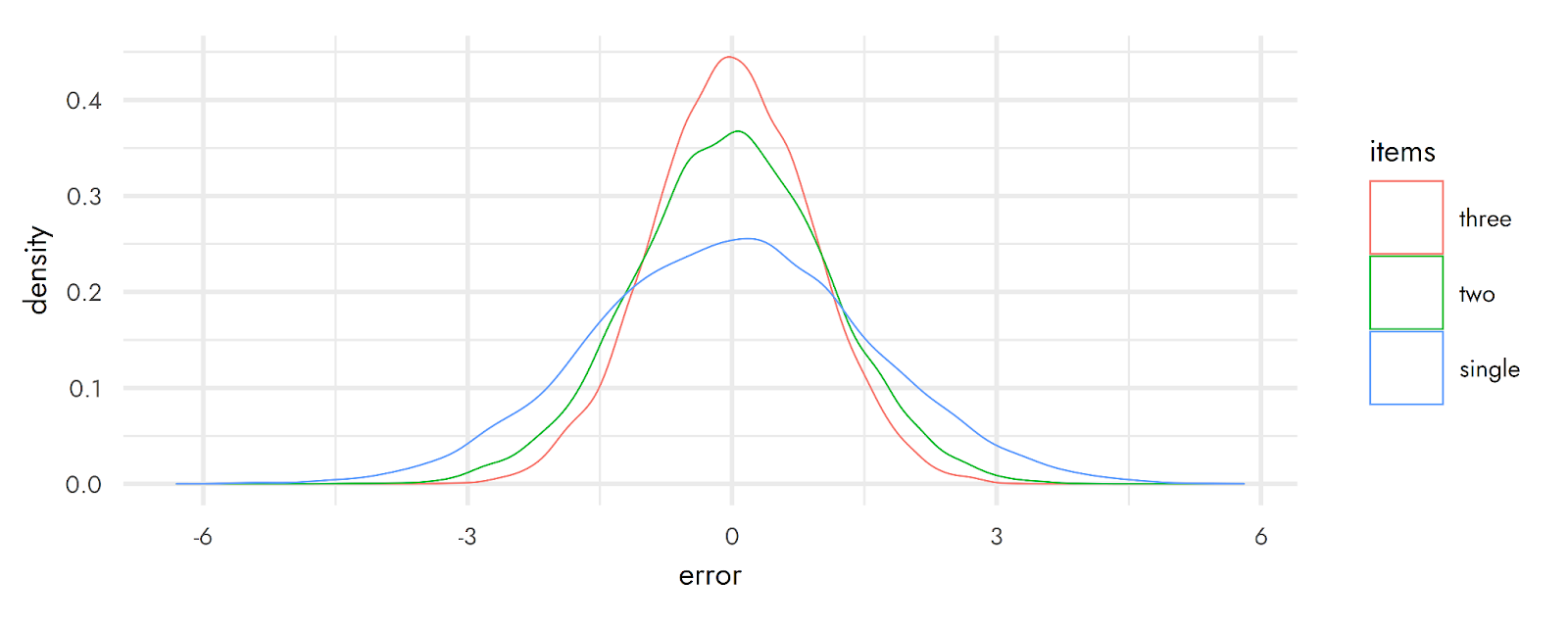
As an aside, we put together some illustrations of the possible concrete benefits of using a composite measure of multiple items, rather than a single measure.
The plot below shows the error (differences between the measured value and the true value: higher values, in absolute terms, are worse) with a single item vs an average made from two or three items. Naturally, this depends on assumptions about how noisy each item is and how correlated each of the items are, but it is generally the case that using multiple items helps to reduce error and ensure that estimates come closer to the true value.
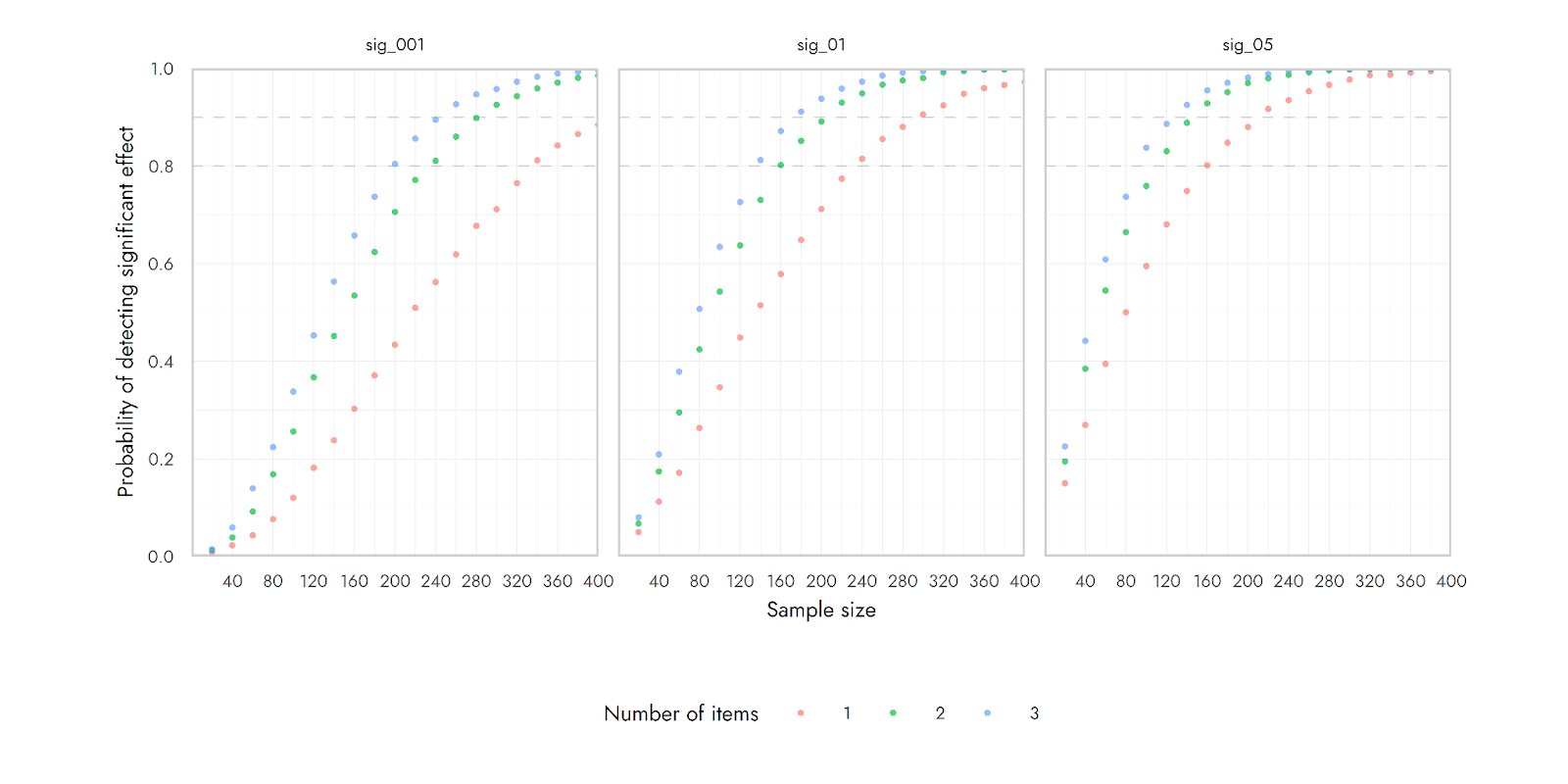
This next image shows the power to detect a correlation of around r = 0.3 using 1, 2 or 3 items. The composite of more items should have lower measurement error. When only a single item is used, the higher measurement error means that a true relationship between the measured variable and another variable of interest can be harder to detect. With the average of 2 or 3 items, the measure is less noisy, and so the same underlying effect can be detected more easily (i.e., with fewer participants). (The three different images just show different standards for significance)