We’ve redesigned effectivealtruism.org to improve understanding and perception of effective altruism, and make it easier to take action.
View the new site →I led the redesign and will be writing in the first person here, but many others contributed research, feedback, writing, editing, and development. I’d love to hear what you think, here is a feedback form.
Redesign goals
This redesign is part of CEA’s broader efforts to improve how effective altruism is understood and perceived. I focused on goals aligned with CEA’s branding and growth strategy:
- Improve understanding of what effective altruism is
Make the core ideas easier to grasp by simplifying language, addressing common misconceptions, and showcasing more real-world examples of people and projects. - Improve the perception of effective altruism
I worked from a set of brand associations defined by the group working on the EA brand project[1]. These are words we want people to associate with effective altruism more strongly—like compassionate, competent, and action-oriented. - Increase impactful actions
Make it easier for visitors to take meaningful next steps, like signing up for the newsletter or intro course, exploring career opportunities, or donating.
We focused especially on three key audiences:
- To-be direct workers: young people and professionals who might explore impactful career paths
- Opinion shapers and people in power: journalists, policymakers, and senior professionals in relevant fields
- Donors: from large funders to smaller individual givers and peer foundations
Before and after
The changes across the site are aimed at making it clearer, more skimmable, and easier to navigate. Here are some side-by-side comparisons:
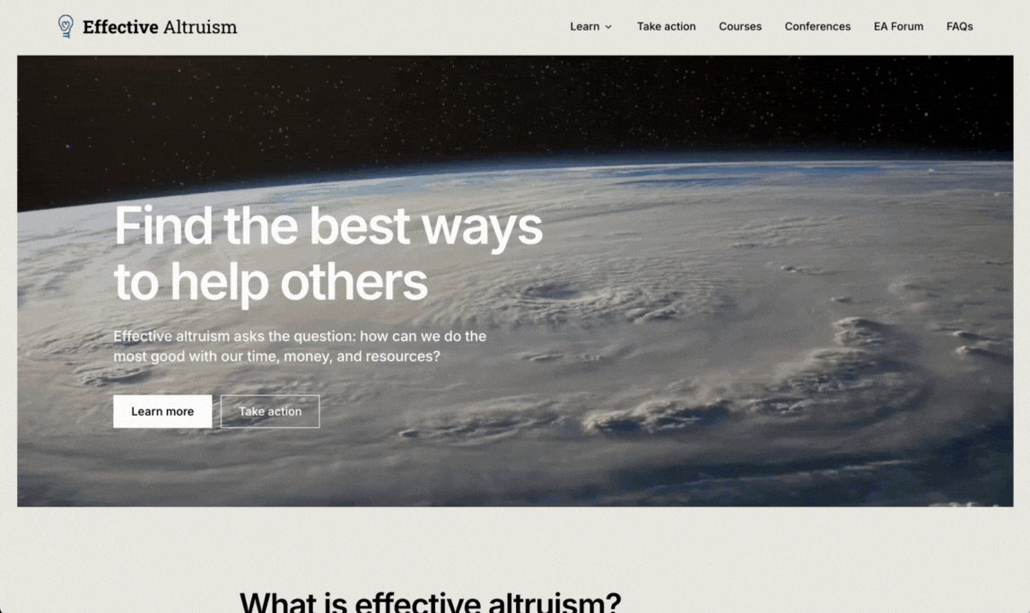
Landing page
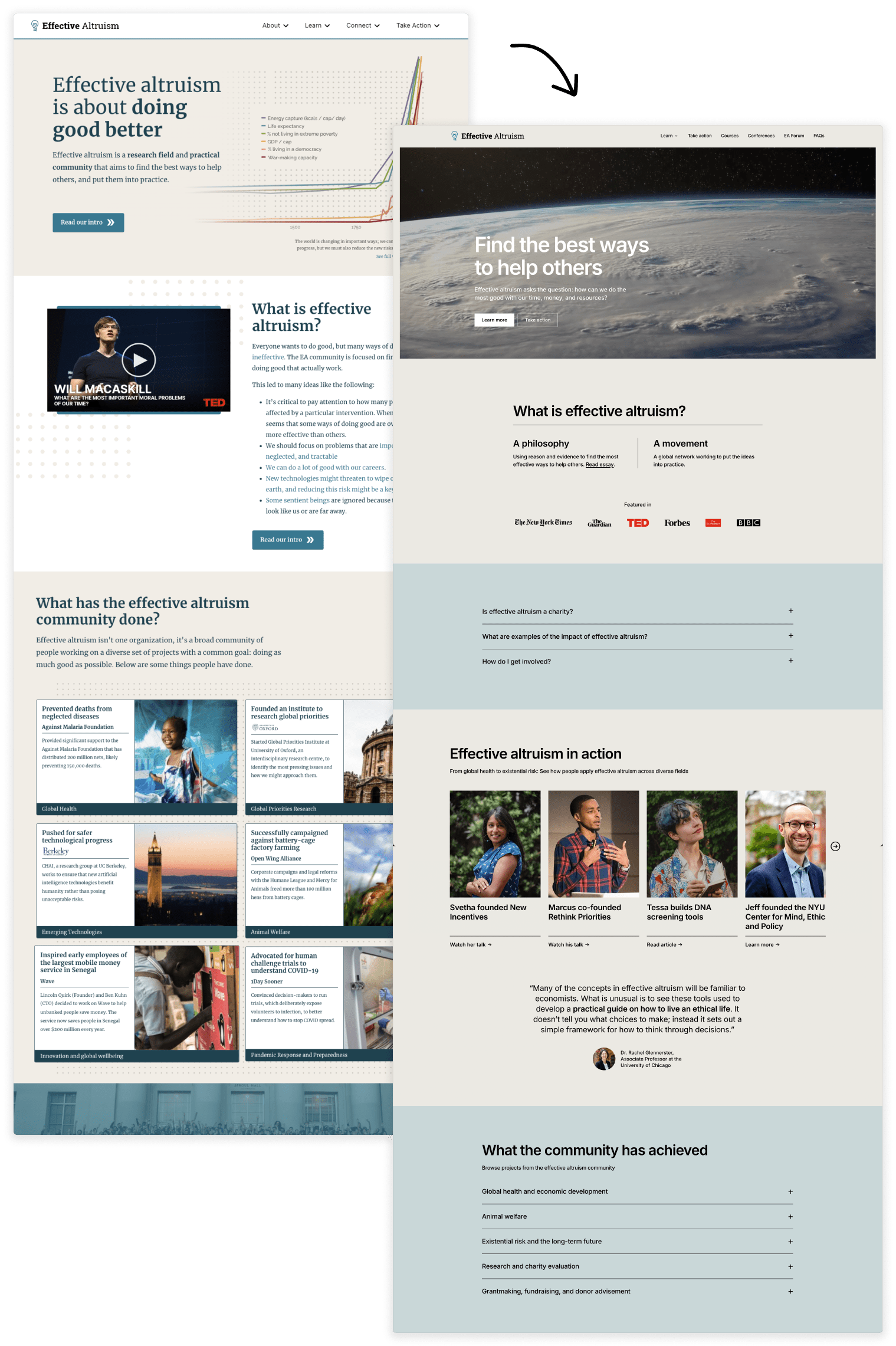
Some of the changes:
- Replaced the economic growth graph with a short video highlighting different cause areas and effective altruism in action
- Updated tagline to "Find the best ways to help others" based on testing by Rethink Priorities (interestingly, "Doing good better" performed the worst)
- Chose nouns that resonate more when describing effective altruism ("philosophy" and "movement" vs. "research field" and "practical community"). Also based on the testing done together with Rethink Priorities
- Added more real-world examples of people and organisations working on EA-aligned projects
- Surfaced common questions that new people often have
- Optimised for skimmability (people spend on average ~1 min on the landing page)
- Added a section to take action
…and lots of smaller improvements throughout.
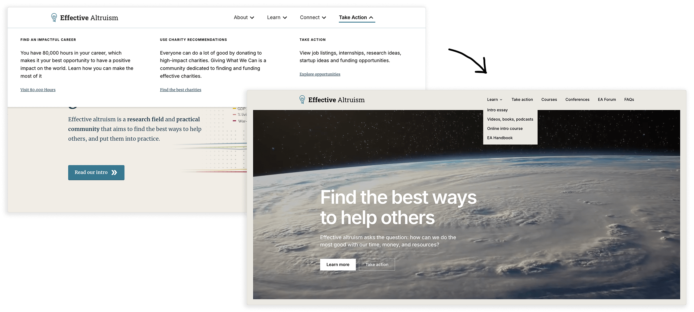
Site navigation
The old navigation came up frequently in user testing. People kept clicking around without finding what they were looking for, and few people ended up interacting with the links in the dropdown. I've significantly simplified it and moved away from using abstract words like "About" and "Connect" to instead naming concrete things like conferences, courses, and FAQs.
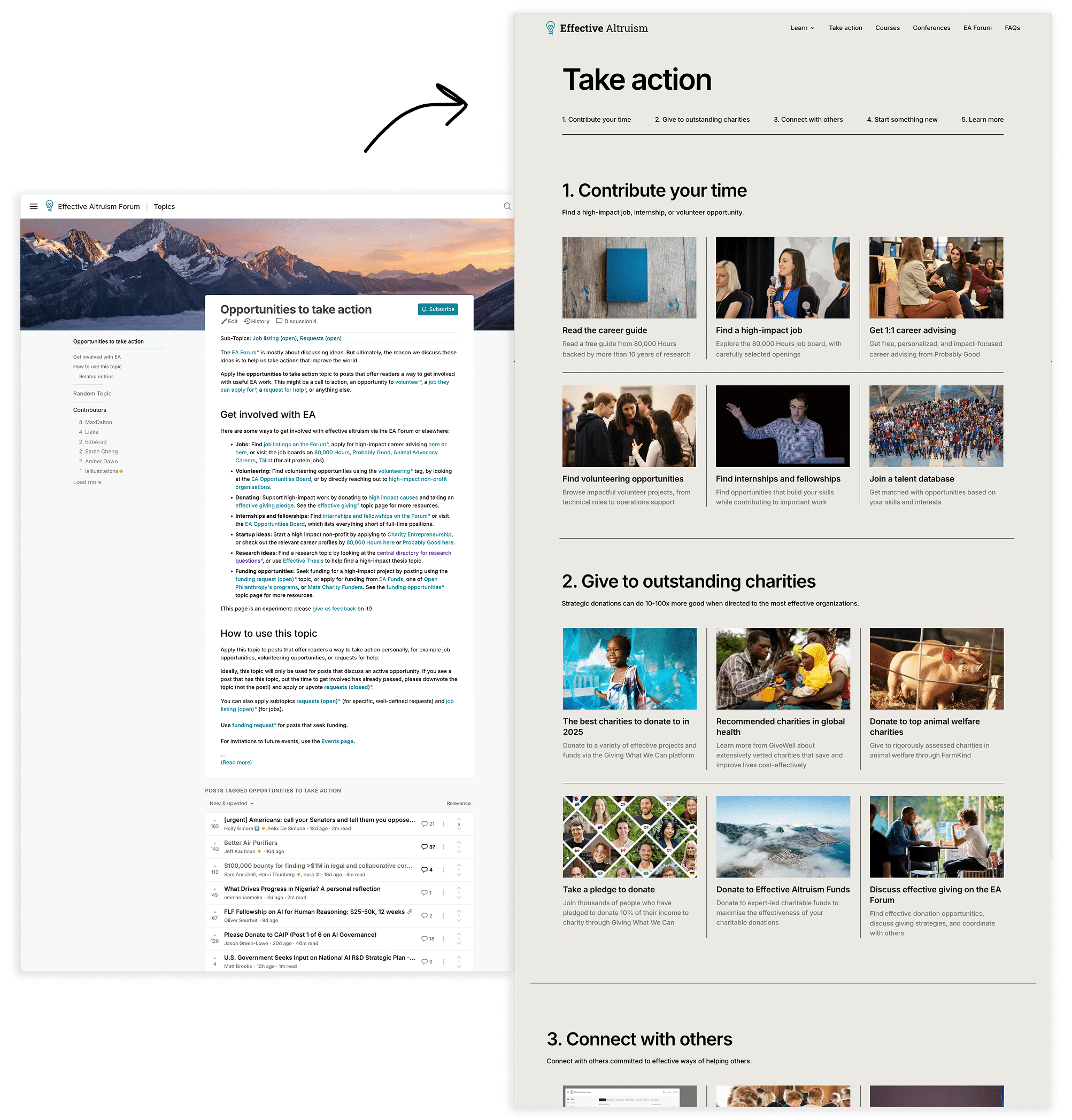
New "Take action" page
Previously, users were sent to this page on the Forum. Now common next steps are in one place, and the page is already seeing a lot of interaction.
Early results
To evaluate the redesign I ran surveys and user interviews on the old site, and am now running the same tests on the new site. We'll also run a few different A/B tests in the next couple of months.
It’s still early, but some promising signs so far:
- The "Take Action" page is getting good engagement, where people are mostly interacting with links related to donations and career
- More people than before continue on to the EA Forum, EA Global, and reading FAQs
I’m planning to write a follow-up when we have more data.
Share your thoughts
I'd love to hear your thoughts in the feedback form or as a comment on this post. I'm out of office for the next couple of weeks so may not be able to respond personally, but I'll read every comment!
- ^
The process for identifying the brand associations started with compiling input from a few sources, including external research, a stakeholder survey that received 28 responses and a survey by the communications firm And-Now in 2023 with 689 respondents from EA newsletter subscribers, 26 respondents from CEA staff, and 16 respondents from key external stakeholders. The group working on the EA brand identified the top associations across our target audiences and iterated on the desired associations individually and through group discussion.
Thanks for your work on this!
I think I mildly prefer the older landing page (sorry!).
The newer one feels more shiny, in a way that appeals to me a bit less. Trying to spell this out a bit more/ what it is that appeals to me less:
- In terms of the vibe it feels more professionalismy, status signallingy, corporate, respectable or something. (I don't think it's entirely fair to describe the new website as these things, but it does at least feel like the new website is more in this direction relative to the old).
- I'm remembering Sarah Constantin's article on Ra as I write this, which I think gestures towards what I like less.
- I feel a bit of an ick of the 'featured in' section (which has logos of eg. the BBC, NYT etc.). I'm not entirely sure why. Maybe because it feels like there's a subtle implication of 'if you respect these institutions/ brands, then you'll like this effective altruism thing'. And I'm like 'huh, I'm not sure how much I do respect these institutions/ brands'... idk. (also, featured in feels like a bit of an odd way to put it, as a bunch of these places have written things very unchartiable about EA).
- From the new website, I get a bit more of a sense that someone is trying to sell something to me somehow. Like, it seems like the kind of website that I expect to see from a corporation that wants me to buy their product, and less like the kind of website that I expect to see from something that wants to provide me information or something.
- It may just be that I am into boring websites. For example, my idea of a good time/ a good website is eg. Wikipedia, Stanford Encyclopedia of Philosophy, and Astral Codex Ten. I guess I'm just really into large walls of text. But doubling down on this, I think there is something good about the statement that large walls of text makes. It's like 'hey, what we're about is like thinking carefully and passionately impassionate reasoning, and so we're going to communicate with you via lots of words and explicit arguments and claims, and not with shiny images and vague associations with established institutions, because we think that in an ideal world people should be persuaded to get involved with a community/ philosophy on the basis of explicit arguments and claims, and not on the basis of shiny images etc.'
- I think the above comments might make it seem like I'm more anti the new website than I actually am. I think it's like if there was a content-to-shiny scale for websites, with Wikipedia at 1 and idk the Adidas website at 10, then I'd put the new website at like a 5.5, and ideally I'd want it to be a 3.5. Maybe even a 3. But also if I were king then I'd want all websites to move a couple of points down on this scale.
- I like the tagline change and other word changes! I also like that an essay to what EA is is linked early on and also highlighting actions that people have taken.
(Very much agree with the "Featured in" point!)