Epistemic status: Represents my views after thinking about this for a few days.
Motivation
As part of the Quantified Uncertainty Research Institute's (QURI) strategy efforts, I thought it would be a good idea to write down what I think the pathways to impact are for forecasting and evaluations. Comments are welcome, and may change what QURI focuses on in the upcoming year.
Pathways
Forecasting

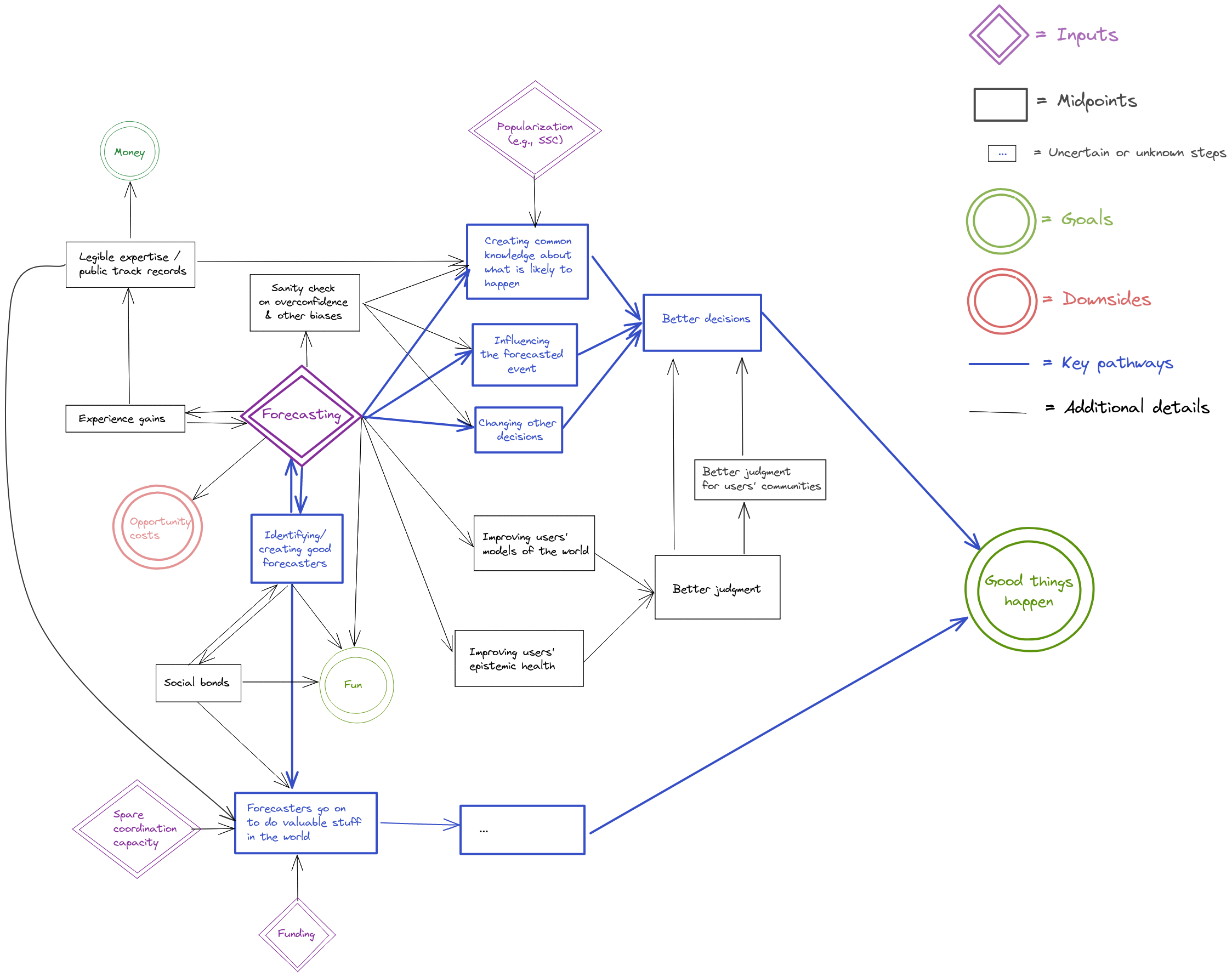
What this diagram is saying is that I think that the most important pathways to impact of forecasting are:
- through influencing decisions,
- through identifying good forecasters and allowing them to go on to do valuable stuff in the world.
There are also what I think are secondary pathways to impact, where legible forecasting expertise could make the judgment of whole communities better, or where individual forecasters could improve the judgment of whole communities.
Evaluations

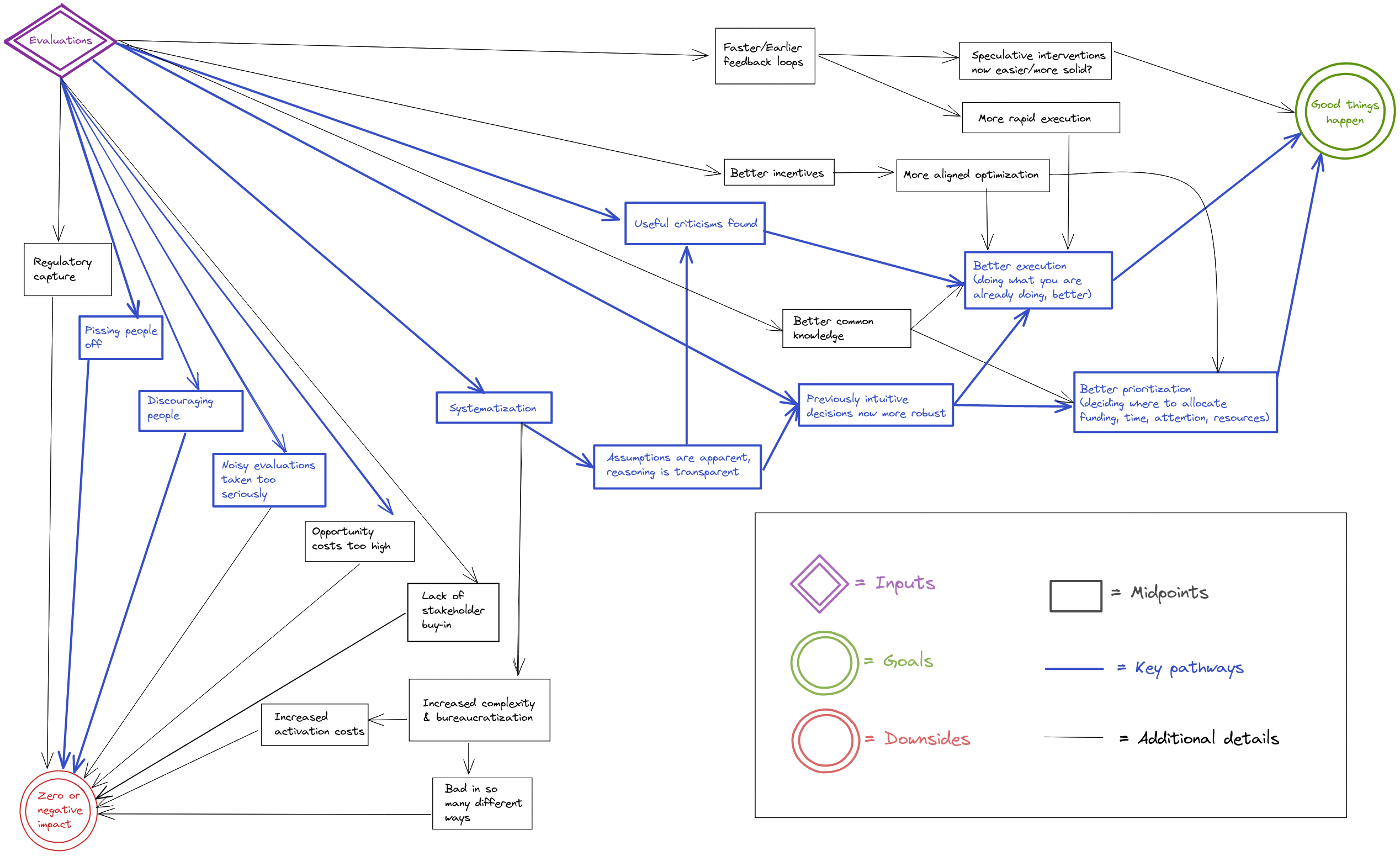
What this diagram is saying is that evaluations end up affecting the world positively through finding criticisms or things to improve, and by systematizing thinking previously done intuitively. This ends up cashing out in terms of better execution of something people were going to be doing anyways, or in better prioritization as people learn to discriminate better between the options available to them.
Note that although one might hope for the pathway “evaluation → criticism → better execution → impact”, in practice this might not materialize. So in practice, better prioritization (i.e., influencing the funding and labor which go into a project) might be the more impactful pathway to impact in practice.
But there are also ways in which evaluations can have zero or negative impact. The one that worries me the most at the moment is people taking noisy evaluations too seriously, i.e., outsourcing too much of their thinking to imperfect evaluators. Lack of stakeholder buy-in doesn't seem like that much of a problem for the EA community: Reception for some of my evaluations posts was fairly warm, and funders seem keen to pay for evaluations.
Reflections
Most of the benefit of these kinds of diagrams seems to me to come from the increased clarity they allow for when thinking about their content. Otherwise, I imagine that they might make QURI's and my own work more legible to outsiders by making our assumptions or steps more explicit, which itself might allow for people to point out criticism. Note that my guess about the main pathways are highlighted in bold, so one could disagree about that without disagreeing about the rest of the diagram.
I also imagine that the forecasting and evaluations pathways could be useful to organizations other than QURI (Metaculus, other forecasting platforms, people thinking of commissioning evaluations, etc.)
It seems to me that producing these kinds of diagrams is easier over an extended period of time, rather than in one sitting because one can then come back to aspects that seem missing.
Acknowledgments.
Kudos to LessWrong's The Best Software For Every Need for pointing out the software I used to write these diagrams. They are produced using excalidraw; files one can edit can be found on this Github repository. Thanks also to Misha Yagudin, Eli Lifland, Ozzie Gooen, and the Twitter hivemind for comments and suggestions.

I also drew some pathways to impact for QURI itself and for software, but I’m significantly less satisfied with them.
Software
I thought that the software pathway was fairly abstract, so here would be something like my approximation of why Metaforecast is or could be valuable.
QURI itself
Note that QURI's pathway would just be the pathway of the individual actions we take around forecasting, evaluations, research and software, plus maybe some adjustment for e.g., mentorship, coordination power, helping funding, etc.
I think the QURI one is a good pass, though if I were to make it, I'd change a few details of course.
I looked over an earlier version of this, just wanted to post my takes publicly.[1]
I like making diagrams of impact, and these seem like the right things to model. Going through them, many of the pieces seem generally right to me. I agree with many of the details, and I think this process was useful for getting us (QURI, which is just the two of us now) on the same page.
At the same time though, I think it's surprisingly difficult to make these diagrams to be understandable for many people.
Things get messy quickly. The alternatives are to make them much simpler, and/or to try to style them better.
I think these could have been organized much neater, for example, by:
That said, this would have been a lot of work to do (required deciding on and using different software), and there's a lot of stuff to do, so this is more "stuff to keep in mind for the future, particularly if we want to share these with many more people." (Nuno and I discussed this earlier)
One challenge is that some of the decisions on the particularities of the causal paths feel fairly ad-hoc, even though they make sense in isolation. I think they're useful for a few people to get a grasp on the main factors, but they're difficult to use for getting broad buy-in.
If you take a quick glance and just think, "This looks really messy, I'm not going to bother", I don't particularly blame you (I've made very similar things that people have glanced over).
But the information is interesting, if you ever consider it worth your time/effort!
So, TLDR:
[1] I think it's good to share these publicly for transparency + understanding.
As for "epistemic health," my update somewhat after ~6mo of forecasting was: "ugh, why some many people at GJO/Foretell are so bad to terribly bad. I am not doing anything notably high-effort, why am/are I/we doing so well?" Which made me notably less deferent to community consensus and less modest generally (as in modest epistemology). I want to put some appropriate qualifiers but it feels like too much effort. I judge this update as a significant personal ~benefit.
I don't get why this post has been downvoted; it was previously at 16 and now at 8.
I wonder if more effort should be put into exploring ways to allow authors to receive better feedback than the karma system currently provides. For example, upon pressing the downvote button, users could be prompted to select from a list of reasons ("low quality", "irrelevant", "unkind", etc.) to be shared privately and anonymously with the author. It can be very frustrating to see one's posts or comments get downvoted for no apparent reason, especially relative to a counterfactual where one receives information that not only dispels the uncertainty but potentially helps one write better content in the future.
(Concerning this post in particular, I have no idea why it was downvoted.)
See this comment on LessWrong.
Nice! Two questions that came to mind while reading:
They seem similar because being able to orient oneself in a new domain would feed into both things. One can probably use (potentially uncalibrated) domain experts to ask questions which forecasters then solve. Overall I have not thought all that much about this.
I'm fairly skeptical about this for e.g., national governments. For the US government in particular, the base rate seems low; people were trying to do things like this since at least 1964 and mostly failing.
Thanks, I found this (including the comments) interesting, both for the object-level thoughts on forecasting, evaluations, software, Metaforecast, and QURI, and for the meta-level thoughts on whether and how to make such diagrams.
On the meta side of things, this post also reminds me of my question post from last year Do research organisations make theory of change diagrams? Should they? I imagine you or readers might find that question & its answers interesting. (I've also now added an answer linking to this post, quoting the Motivation and Reflections, and quoting Ozzie's thoughts given below.)
I'm very much not a visual person, so I'm probably not the most helpful critic of diagrams like this. That said, I liked Ozzie's points (and upvoted his post). I'm also not sure what the proper level of abstraction should be for the diagram -- probably whatever you find most helpful.
A couple preliminary and vague thoughts on the substantive use cases of forecasting that insofar as they currently appear do so in a somewhat indirect way:
I don't have any immediate reply, but I thought this comment was thoughtful and that the forum can probably use more like it.
thanks!
I think that for forecasting, the key would be shifting users’ focus toward EA topics while maintaining popularity.
For evaluations, inclusive EA-related metrics should be specified.
This doesn't seem like much evidence to me, for what it's worth. It seems very plausible to me that there's enough stakeholder buy-in that people are willing to pay for evaluations in the off-chance they're useful (or worse, willing to get the brand advantages of being someone who is willing to pay for evaluations), but this is very consistent with people not paying as much attention/as willing to change direction based on imperfect evaluators as they ought to.