Comments

I really like the look and feel of the new website!
I really like the look and feel of the new website!
Congratulations on a new website that both looks attractive and communicates wisely and purposefully, based on good thinking!
Great work, Agnes! I also liked reading about the explanations for the changes.
Thank you for sharing the shortcomings of the old website and the reasonings for the changes. This is very helpful for others who are working on making their EA-related websites more successful.
In August we launched a redesign of the EA Funds website. The main goal was to improve overall perception and make the site feel modern, trustworthy, and more consistent with the effectivealtruism.org brand. We also wanted to aim the site more towards donors, increase transparency around grantmaking and evaluation, and improve overall usability.
View the EA Funds websiteWe've been making incremental improvements since launch and will continue to do so.
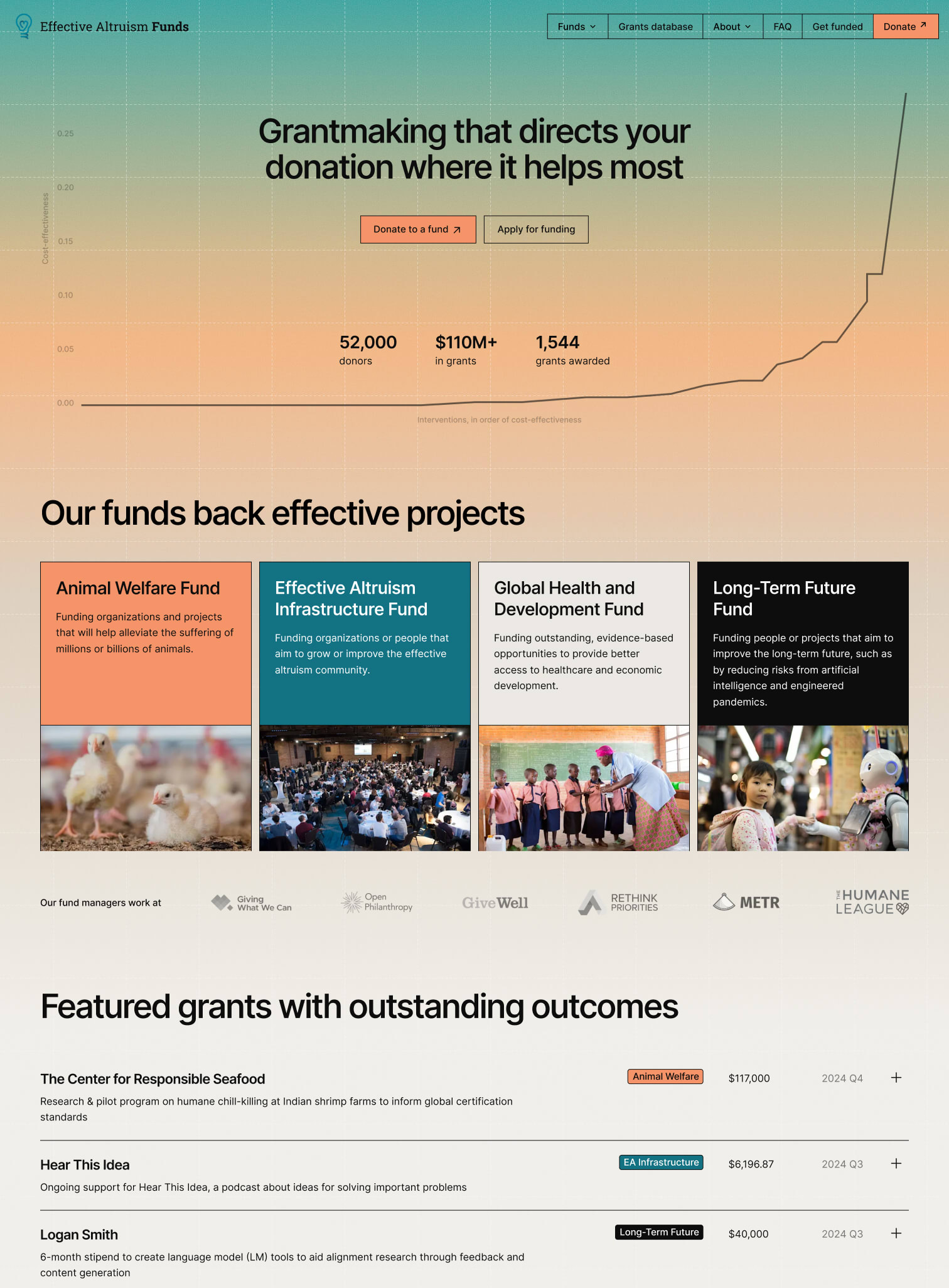
The update includes:
A key focus for EA Funds moving forward is increasing reasoning transparency. In that spirit, I’ve included an audit of the previous site along with the rationale behind design decisions in the new version.
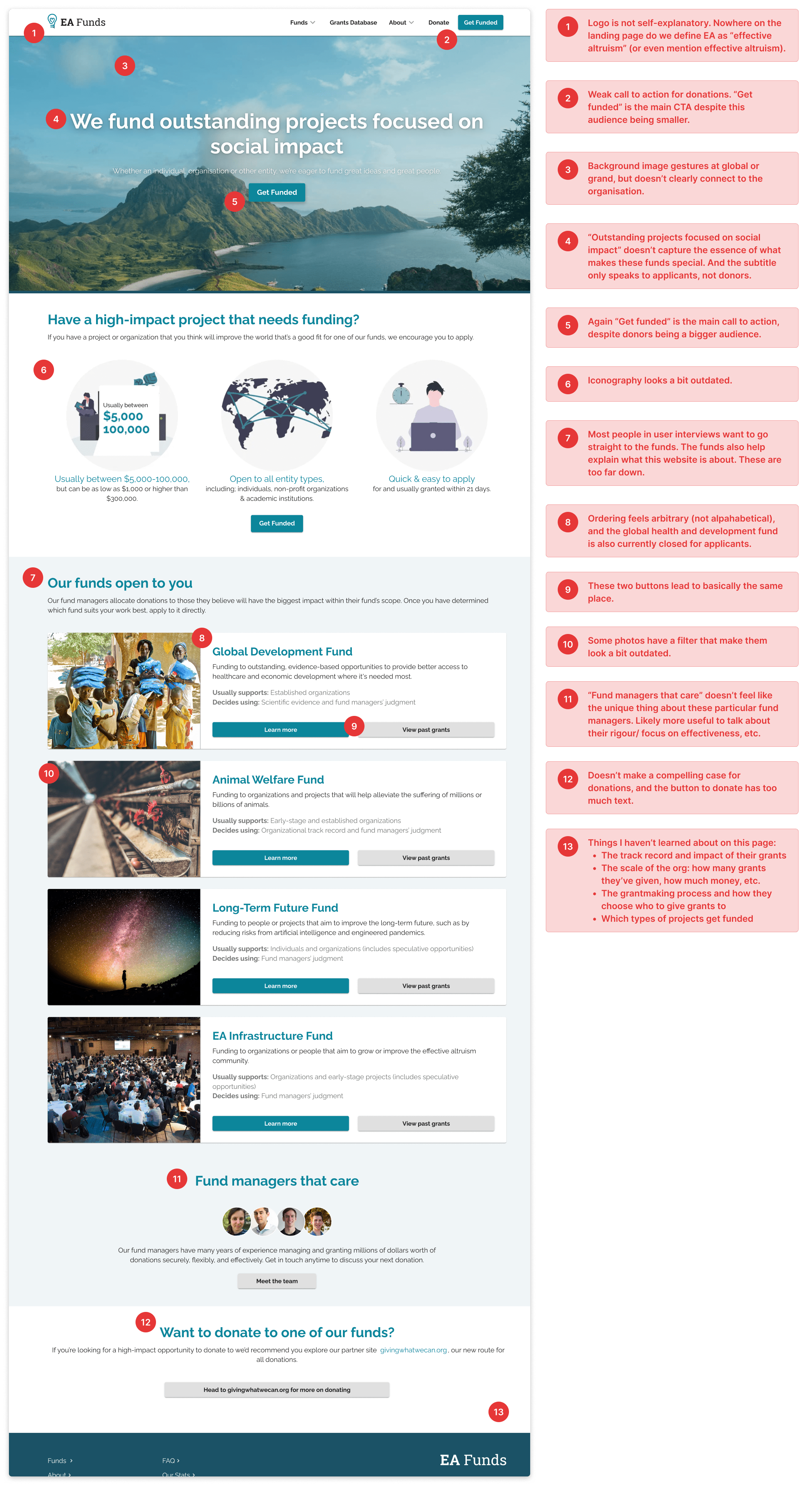
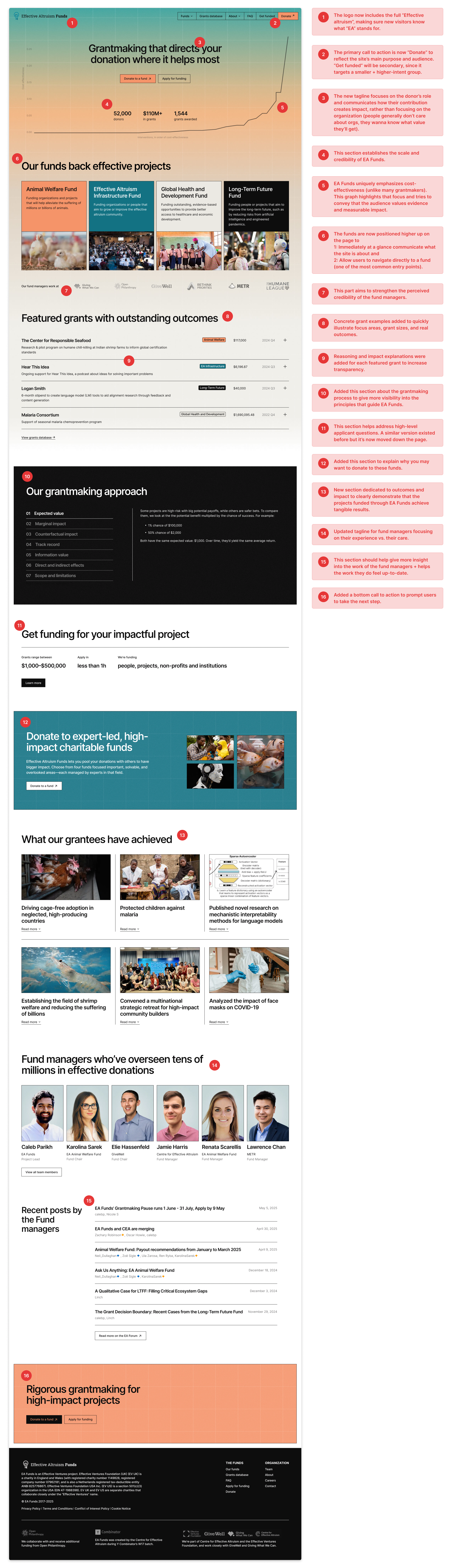
Since launch, bounce rate has decreased from 46% to 38% and time on site is up by 7%[1]. Users in interviews and surveys prefer the new version over the old. We haven’t yet seen a measurable increase in donations, but are are monitoring this and expect the redesign to pay off in future fundraising.
We're hoping to build out our own donation flow to allow us to optimize it and strengthen donor relationships. We're also looking to do more work to increase transparency and help both donors and applicants better understand how decisions are made.
Would love to hear your thoughts on the redesign: what am I missing, what would you like to see more of? Leave a comment or share your feedback anonymously here.
These numbers are based on an earlier version of the redesign, and are likely to change slightly.

I found it insightful to read your criticisms of the old website! And I really like the new website. Congrats on the launch! 🎉