Introduction and summary
Charitable donation (and earning-to-give) has been, and continues to be a prominent, prevalent, and impactful component of the Effective Altruism movement. The EA Survey has been distributed between 2014 and 2020, at roughly 15 month intervals. As a result, surveys were released at various points in the year, ranging from April to August, and no survey was released in 2016. In each survey we asked EAs about their charitable donations in the previous year, and their predicted donations for the year of the survey. Our work in this post/section reports on the 2020 survey (2019 giving), but our analysis extends to all the years of the EA survey.
In this post (and the accompanying bookdown supplement chapter), we consider donation responses, presenting both raw numbers, and descriptive, predictive, and causally-suggestive analysis. We present simple numbers, statistical comparisons, vizualisations, and descriptive and 'predictive' (machine learning) models. We cover a range of topics and concerns, including:
Our modeling work work considers how donations (total, share-of-income, and 'donated over 1000 USD') jointly relates to a range of characteristics. We first present 'descriptive' results focusing on a key set of observable features of interest, particularly demographics, employment and careers, and the 'continuous features' age, time-in-EA, income, and year of survey. We next fit 'predictive', allowing the 'machine learning' models themselves to choose which features seem to be most important for predicting donations.
Note: A 'dynamic version' of this document (an R-markdown/Bookdown), with folded code, margin notes, some interactive graphs and tables, and some additional details, can be found here. This may be helpful for anyone that wants to dig into this more deeply, and perhaps for those who are data, code, and statistics-inclined.
Note: In the narrative below, we simply refer to "donations" rather than "reported donations" for brevity. Unless otherwise mentioned, all figures simply add, average, or otherwise summarize individual responses from the EA Survey years mentioned.
Summary (some key results and numbers)
-
55.5% of EAs in the 2020 survey reported making a charitable donation in 2019, 13.7% reported making zero donations, and 30.8% did not respond to this question. (Thus, of those who responded, 80.3% reported making a donation in the prior year.)
-
Participants reported total donations of 10,695,926 USD in 2019 (cf 16.1M USD in 2018).
-
However, the number of survey participants has declined somewhat, from 2509 in 2019 (1704 of whom answered the donation question) to 2056 (1423 answering the donation question) in 2020.
- Over the past years, we see no strong trend in median or mean donation amounts reported.
-
The median annual donation in 2019 was 528 USD (cf 683.92 USD in 2018).
-
The mean (reported) annual donation for 2019 was 7,516 USD (cf 9,370 for 2018) or 8,607 USD excluding those who joined in 2020 (cf 10,246 USD for 2018 excluding those who joined in 2019).
-
The median annual donation in 2019 excluding those who joined EA in 2020 was 761 USD (cf. 990 USD for the comparable median for 2018/2019 and 832 USD for 2017/2018). (See 'donation and income trends in EA' for more details).
-
In 2019 1.3% of donors accounted for $6,437,404 in donations or 60% of the survey total. (Cf in 2018 1.3% of donors accounted for 57% of donations.)
-
The median percentage of income donated in 2019 was 2.96% (cf 3.23% in 2018).
-
However, if we impute "0 and missing incomes" at "group medians for student-status and country", the median percentage of income donated was 2.0% for 2019.
-
Mean share of total (imputed) income donated was 9.44% (imputing income where below 5k or missing) or 12.5% without imputation.
-
20% of EAs who answered the donation question reported donating 10% or more of their income in 2019 (if we impute income; otherwise 25.6% without imputation; this compares to 20% in 2018, without imputation).
-
The median percent of income donated by full-time-employed non-students who earned more than $10,000 was 2.92%, and of this group 23.9% donated 10% of their income or more in 2019 (cf 3.38% and 24% in 2018).
-
Overall, those taking the EA survey tend to report donating a substantially greater share of income than those in the general US population -- (web link).
-
While 69.2% of respondents answered the donation question, only 20.9% answered at least one question about where they donated.
-
Among these, the charity that the most EAs stated that they donated to was the Against Malaria Foundation (AMF), with 122 reported donations (out of a total of 1462 reported donations).
-
Global Poverty continue to attract the largest counts and amounts of donations. 62% of those who answered the relevant questions reported donating to this category. 26.9% of the total 'where donated' reports were to global poverty charities. We sum 1,703,870
USD in total donations reported as specifically going to Global Poverty charities.
-
This compares to 27.3% reporting donating, 10.5% of donation reports and 645,086 USD total donated for animal charities,
- 17.2%, 5.81% and 330,910 USD for EA movement/meta charities,
- and 18.2%, 5.61% and 418,403 USD for long term and AI charities, respectively.
-
Evidence is mixed on whether EAs' donations in a year tend to exceed or fall short of the amount they planned to donate (as they reported in previous surveys). For the small share that can be tracked across years, donations tend to exceed plans (by around 60 USD at median, but over 1000 USD at mean). However, the overall distribution of donations for a particular year (including all respondents) tends to fall short of the distribution of planned donations (by about 450 USD at median and over 2000 at mean).
-
While at median EAs tend to report planning to donate the same amount this next year that they donate in each particular year, the average (mean) plan for next year is significantly larger.
-
Our descriptive models basically find that:
- age, being in a named 'top EA' big city, having taken the GWWC pledge, and an Earning-to-Give career are positively associated with donations,
- while being 'not employed' (and to a lesser extent non-male gender and student status are negatively associated with this;
- donation are roughly proportionally associated with income (approximately 'unit elastic'),
- as well as with age and 'time in EA' (with elasticities around 0.54 to 0.63, respectively).
-
Our predictive (ML) models highlight the importance of income and (to a lesser extent) age (each positively related to donation incidence and amounts).
- These models perform moderately well, particularly in predicting 'whether donated 1k USD or more' (here it attains about 74% accuracy compared to 54% accuracy from simply 'guessing the most common outcome').
Why does the EA Survey ask about donations?
What does it tell us?
What is the "theory of change" for how learning about donation behavior will improve outcomes?
We present some reasons why this may be useful:
-
The magnitude of EAs' donations informs 'how much weight can we throw around' in asking charities etc to appeal to us as a community? While we have other measures (discussed below) of the overall amounts and largest donations, the EA Survey conveys additional information about the donations of 'large groups of moderate-income people who explicitly identify with EA.'
-
This may offer insight into 'what motivates and impedes donation behavior'.
-
Donation behavior may be seen as one measure of EA engagement; our evidence may thus offer insight into 'what motivates engagement'.
-
Observing changes in donation patterns across time may alert us to potential problems and important changes in priorities, values, and the nature of the EA movement. Being able to predict future donation behavior may also help EA organizations better anticipate, budget, and plan (in conjunction with their existing data and models).
-
Predicting and describing typical donation rates can inform decisions like "which EAs seem likely to have more impact if they choose to go into direct work versus earning-to-give".
-
Perhaps more controversially (and we are raising this idea but not promoting it), EAs' donation amounts might be seen as incentive-compatible 'votes' telling us what people in the movement want the EA movement to focus on? However, note people need not be truthfully reporting here, so if we allow for mis-statement, this is far from incentive compatible.
Total EA donations, magnitudes in context
Considering the magnitude of the donations...
The $10,695,926 USD in donations reported above seems likely to be a small share of total EA-affiliated giving, perhaps less than 1/4 of the total (excluding the super-rich and institutional givers), perhaps even a far smaller share (see extrapolations below).
Previous estimates suggest that, even among very highly-engaged EAs, only about 40% complete the EA survey. One might assume that people with a lower 'cost of time' (and, all equal, lower incomes) are likely to be over-represented in the EA survey. On the other hand, people with higher incomes tend to donate more, and those who donate more might be more likely to respond to these particular questions. Other estimates suggest that only about 20% of GWWC members complete the survey. As noted above, only 69.2% of survey respondents answered the 'past year donation' question in 2020. We present some extrapolations below, our own and others.
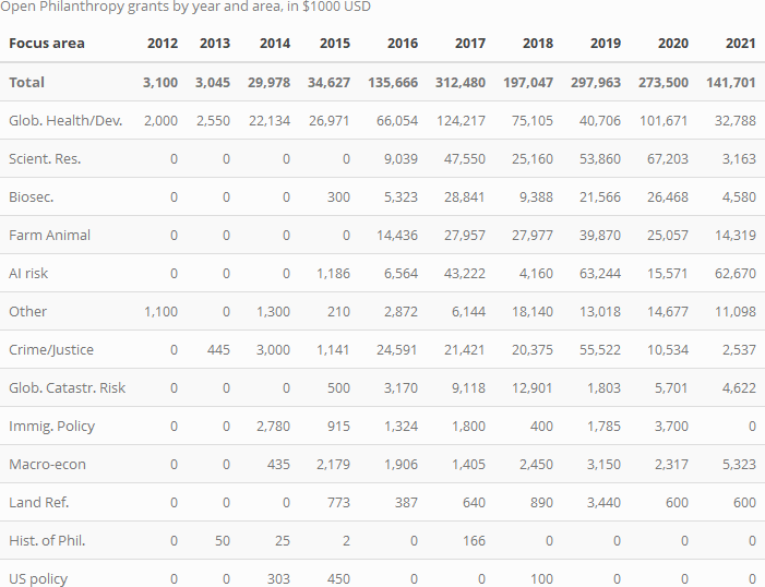
Even within the survey, the largest mass of donations are heavily concentrated among a few givers. We expect that the distribution of donations in EA overall is even more heavily skewed, with large donors and foundations (such as Tuna and Moskowitz of Open Philanthropy accounting for a lion's share. The table below uses data from Open Phil's Grants database, divided by year and cause area).
Extrapolations and further benchmarks:
-
Ben Todd's recent post estimates that the EA community is donating $420 million per year, which "has grown maybe about 21% per year since 2015", and "around 60% was through Open Philanthropy, 20% through other GiveWell donors, and 20% from everyone else."
-
A recent post by tylermaule estimates $263 million in 'funding 'global funding of EA causes'.
-
Giving What We Can reports roughly $70 million in donations per year, in recent years.
-
GiveWell reported "GiveWell donors contributed over $150 million to our recommended charities in 2019".
Of course, the above large donations/grant totals may not all be coming from donors aligned with EA, and may not entirely go towards the most effective charities. The donations also may not be well-described by the donations recorded in the EA survey.
In the fold/footnote, we consider the importance of EA-aligned donations in comparison to non-EA donations to similar causes. We return to this in a supplemental appendix section, specifically focusing on US nonstudents, comparing these to results from a national survey.
Our own rough extrapolations suggest, perhaps very conservatively, $43.6 million USD could be a reasonable central guess for the total amount of annual donations coming from non-billionaire EAs, i.e., the sort of EAs who respond to the EAS.
Career paths: Earning-to-give
Although there may have been a recent decline in earning-to-give (ETG), it continues to be a popular career path. (We discuss career paths further in the EA Survey 2020: Demographics post under 'Careers and education')
In the tables and graphs below, the apparent steep drop in the number indicating EtG from the 2019 to the 2020 survey seems likely to be overstated (as a result of a requested change in the question language and options provided). Still, the responses for non-students might be less sensitive to the changes in the survey question as they are more likely to be in a career path as their 'current career'. These responses also suggest some decline in EtG.
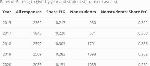
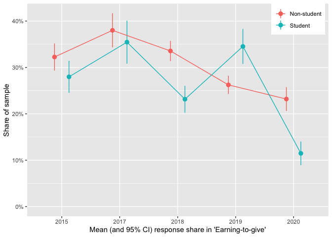
The decline in ETG is less dramatic among non-students (over 23% of non-student respondents still report ETG as their 'current career'), but it nonetheless appears to be fairly strong and consistent from 2017-present.
Donation totals: descriptives
Overall donations, totals by groups
Below, we present a histogram of positive reported 2019 donations by all respondents.
Note that:
- the horizontal axis is on a logarithmic scale,
- 13.7% of the 2,056 total respondents reported donating zero, and
- 30.8% of the total respondents did not report their donation amount.
- As noted above, we will often simply refer to 'donations' rather than 'reported donations', for brevity.
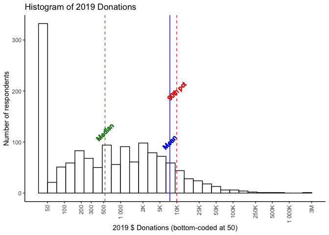
In 2019 we reported:
a donation of 1000 USD per year ... would place one in the top half of EA donors (specifically, the 55th percentile), whereas being in the top 10% of donors would require donating 11,000 USD and the top 1% 110,000 USD.
The results for 2020 (for 2019 donations) are comparable; the median donation (of those reporting) is 528 USD, a donation of $1000 puts you in the 59.5th percentile. Being in the top 10% requires donating $9,972 and being in the top 1% means donating $89,560.
As in previous years, the mean far exceeds the median, (and falls close to the 90th percentile!); a very small number of very large donations dwarf the size of most others. We illustrate this in the 'treemap' plot below, which divides the total reported contributions into groups by size-of-contribution.
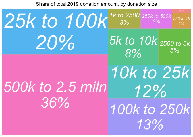
Over a third of total reported contributions reported for 2019 come from contributions over 500,000 USD, with another 20% coming from contributions between 25k and 100k. Contributions of under 2500 USD represent less than 5% of the total.
Next we consider 'which career paths are driving total donation totals?'; mapping the share of total 2019 donations similarly, accompanied by a table of their overall shares of respondents, for comparison.
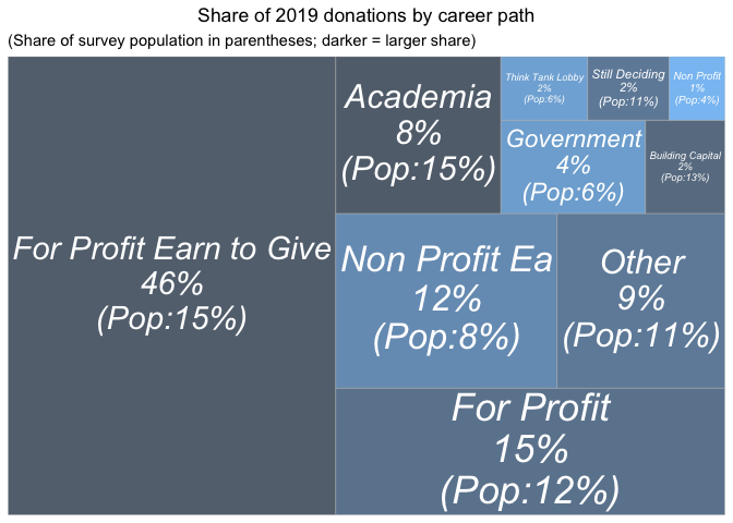
Those reporting 'for profit-earning to give' career paths represent the largest share, nearly half of the total donations, despite making up only about 15% of the sample (of those answering this question). Those with 'for profit' careers who do not say they are earning to give donate about 15% of the total, roughly in proportion to their 12% share of the sample. However all of these differences may reflect differences in income and wealth levels, as well as differences in underlying characteristics of people who choose different career paths.
Direct work does not seem to be obviously coming at the expense of donations. Those pursuing careers working at EA-affiliated non-profits account for a somewhat higher share of donations (12%) than their (8%) share of the sample. (However, we do not know how much these particular EAs would have given had they chosen a different career.)
Obviously, income levels are different between these career paths. We put this in perspective in the plot below.
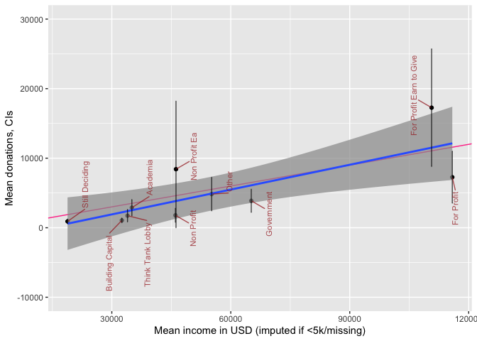
The plot above depicts mean income and mean donations by 'career group', with 95% CI's for the latter. We superimpose a 'line of best fit' (blue, with smoothed 95% intervals for this rough fit) and a '10% of income donation' line (red). Unsurprisingly, for-profit 'not-EtG' are below the fitted line, and 'for-profit EtG' above this line, although 95% CIs are fairly wide. We also note that among people in non-profit careers, there are similar average incomes whether or not the non-profit is EA-aligned, but the non-profit EA people seem to donate somewhat more (although the CI's do overlap).
Next, we present reported donation amounts by income groupings (imputing income where missing or below 5000 USD).
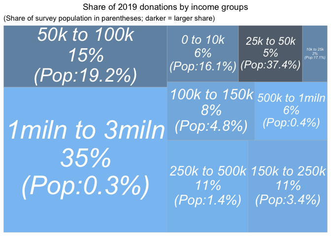
Compare the above graph to the 'donations by donations size' graph.
The largest earners (the 6 people earning 1 million USD or more) represent 35% of the donations (cf the largest donors represent 36% of the donations). However, the second-highest earners, the 8 people earning between 500k and 1 million USD represent only 6% of the donations (cf 20% from the second-highest donation group). In fact, the second largest share of total 2020 donations come from the second-largest (in population) income-group in our sample, the 395 people earning between 50K and 100K USD.
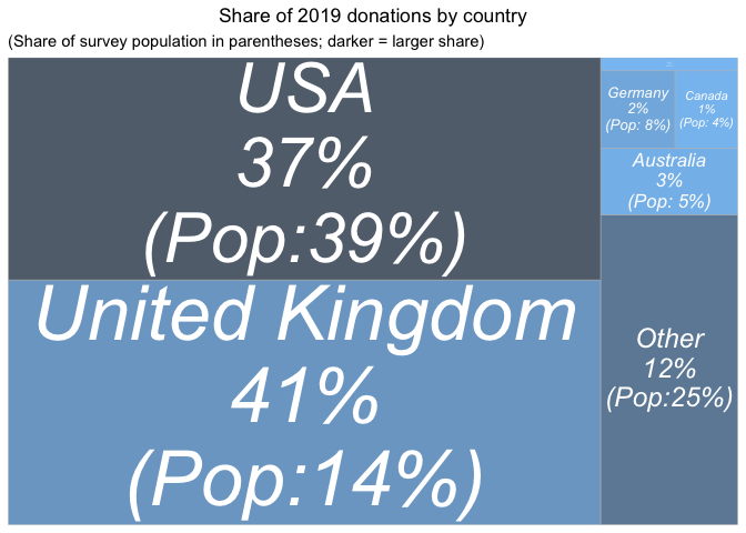
Finally, we report donation totals by country.
First for 2019 donations alone:
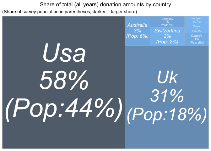
Next, pooling across all years of the EA survey (without any weighting or adjustment):
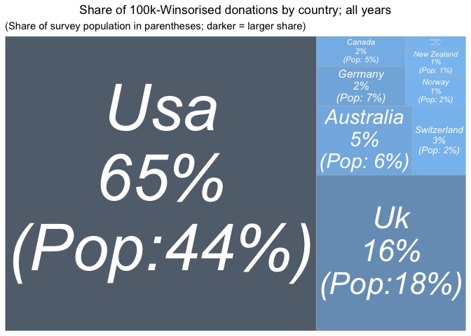
And again, 'Winsorizing' donations at 100K USD (setting larger donations at this value), to reduce the impact of outliers:
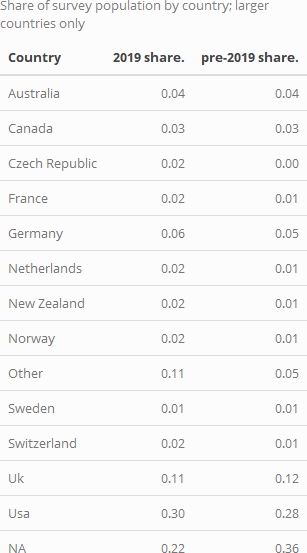
We report the shares (0-1) of the total survey population coming from each country below:
and we give a year-by-year animation of the shares of donations from each country:
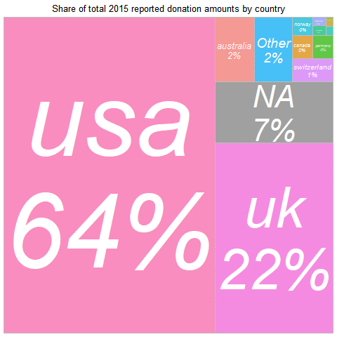
In 2019, the largest summed donation amount came from
Across all years:
-
the USA represents the largest amount of donations,
-
with the UK a close second,
Again, with the UK 'punches far above its weight.' Note that the UK share may be understated, if UK donors claim the matching 'Gift Aid' but do not report it as part of their donation.
Again, these raw difference may reflect differences in income and life circumstances among survey respondents from different countries. The outsized UK share also seems to be driven by a few large outlying donations -- when we Winsorise donations at 100K USD, the UK no longer overperforms.
We have shown 'where the donations were in 2019' (and across years). However, we are not suggesting that this provides direct evidence of differences in EA generosity by country. We return to presenting a 'controlled descriptive picture' in our modeling work.
Donation (shares) versus income and GWWC pledge
2018 post:
We also looked at the percentages of pre-tax income that EAs were donating, based on the 1,563 EAs who disclosed both income and donation data. As in previous years, most EAs were donating significantly less than the 10% Giving What We Can Pledge... However, as the graph below shows, there is a marked 'bump' in the donors giving at around the 10% figure, perhaps due to the Giving What We Can Pledge target around this amount, or due to the figure's wider popularity as a target (e.g. in tithing).\
Below, we depict donations as a share of income. The histograms below are first only for those with positive reported incomes, and next with the previously discussed income imputation. The blue vertical line depicts the share of total (imputed) income donated by all respondents, with the green line depicting the median and the red line the 90th percentile. These plots show similar patterns as in 2018.
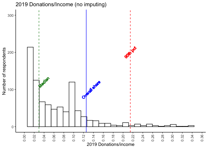
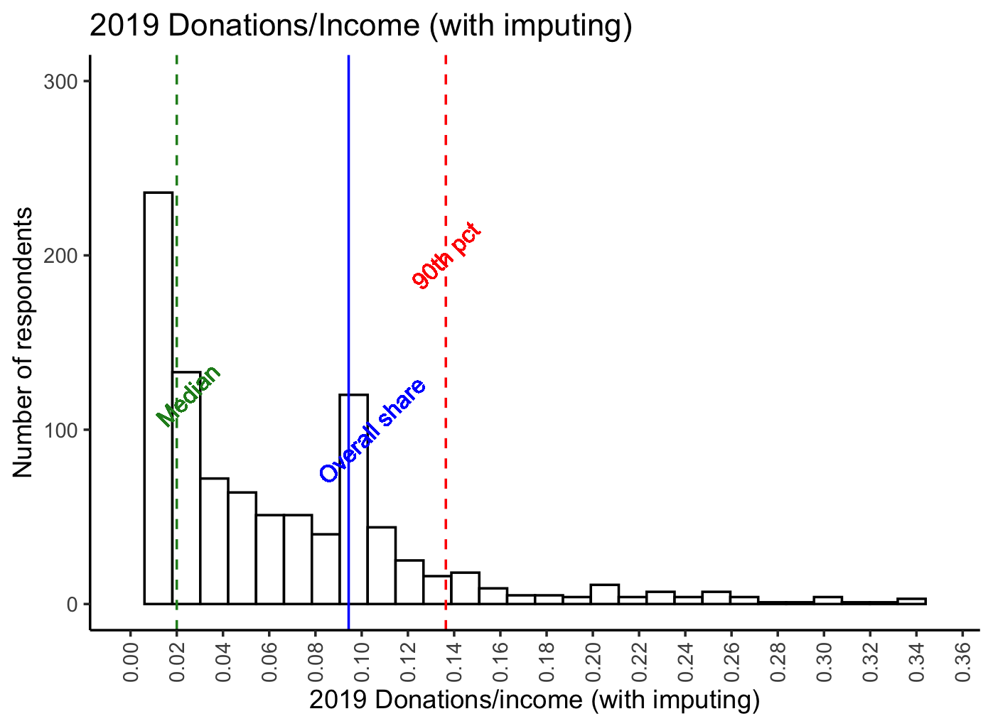
The noticeable spike at 10% likely reflects the GWWC pledge (we return to this further below). As noted above, 20% of EAs reported a donation at or above 10% of their (imputed) income in 2019. 36% reported an amount at or above 5%.
How do donations relate to income, and does this relationship differ between those who mention that they took the Giving What We Can (10%) pledge?
We give a scatterplot of reported donations against income, faceted by GWWC pledge, with separate locally-smoothed conditional means (and 95% confidence intervals for these conditional means). (The figure below is for 2019 donations only.)
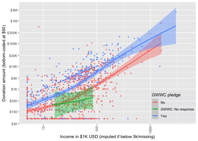
Unsurprisingly, those with higher incomes, and those who took the GWWC pledge tend to report donating more. On average, the GWWC pledgers report giving more throughout the whole range of income, and the 95% confidence intervals are distinct for most of the range.,
Next we plot donations as shares of income against income for non-GWWC pledgers (combined with non-responders) and GWWC pledgers. The median for each group is given by the dashed blue line, and the dashed red line represents 10 percent of income.
The relationship between income and 'share of income donated' dips down for the lowest incomes, but for the mass of 'substantial donors' the curve is fairly flat, and then seems to increase at higher incomes. As expected, GWWC pledgers tend to donate closer to 10% of income than do the rest.
In each year substantially larger shares of those who report having made a GWWC pledge report donating 10% or more. Below, we tabulate this by donation year and by 'whether they report having ever made a GWWC pledge, for individuals who report income over 5000 USD and who report zero or positive donations:
Among those who report having ever taken a GWWC pledge (and who report donations, and excluding those reporting incomes below 5000 USD), less than half report donating 10% in the past year. However, this may be an underestimate, as some people are reporting having pledged for this/next year, while donation reports are for the previous year. Our 2018 post report found a rate slightly higher than 50%. This is closer to the above figure for 'plan to donate in the current year', which hovers around 50%.
Employment and student status
We present income and donation statistics for those "statuses" with more than 50 respondents in the forest plot below (a full table of statistics for each group can be found in the bookdown appendix). In each of the forest plots in this subsection, the blue line presents a simple linear best-fit of these points, and the red line represents a 10% donation rate.
Donations generally track income by this aggregation, with some groups possibly 'under-performing' or 'over-performing'; we return to this in our descriptive modeling.
Donations by country
Donations and income by country
We report similar income and donation statistics for all countries with more than 50 respondents:


Above, we plot donations and income by country of residence for the countries with the largest number of EA respondents. We fit a simple best-fit (least-squares) line in blue, and add a red line depicting a 10% donation rate. Again, donations generally track income, with some under and over-performers (see later modeling). The UK clearly contains some notable donation outliers, leading to very large confidence intervals for the UK mean (truncated above at 30000 USD).
Donations, age and years in EA
Next, we consider how donations may increase or decrease with 'time-in-EA' (i.e., 'tenure'). As discussed in other posts and bookdown chapters, this may be reflecting differences in who stays in EA (and continues responding to the survey) as much as it reflects how people themselves change from year to year.
Below, we plot donations by tenure, breaking this down by age groups.
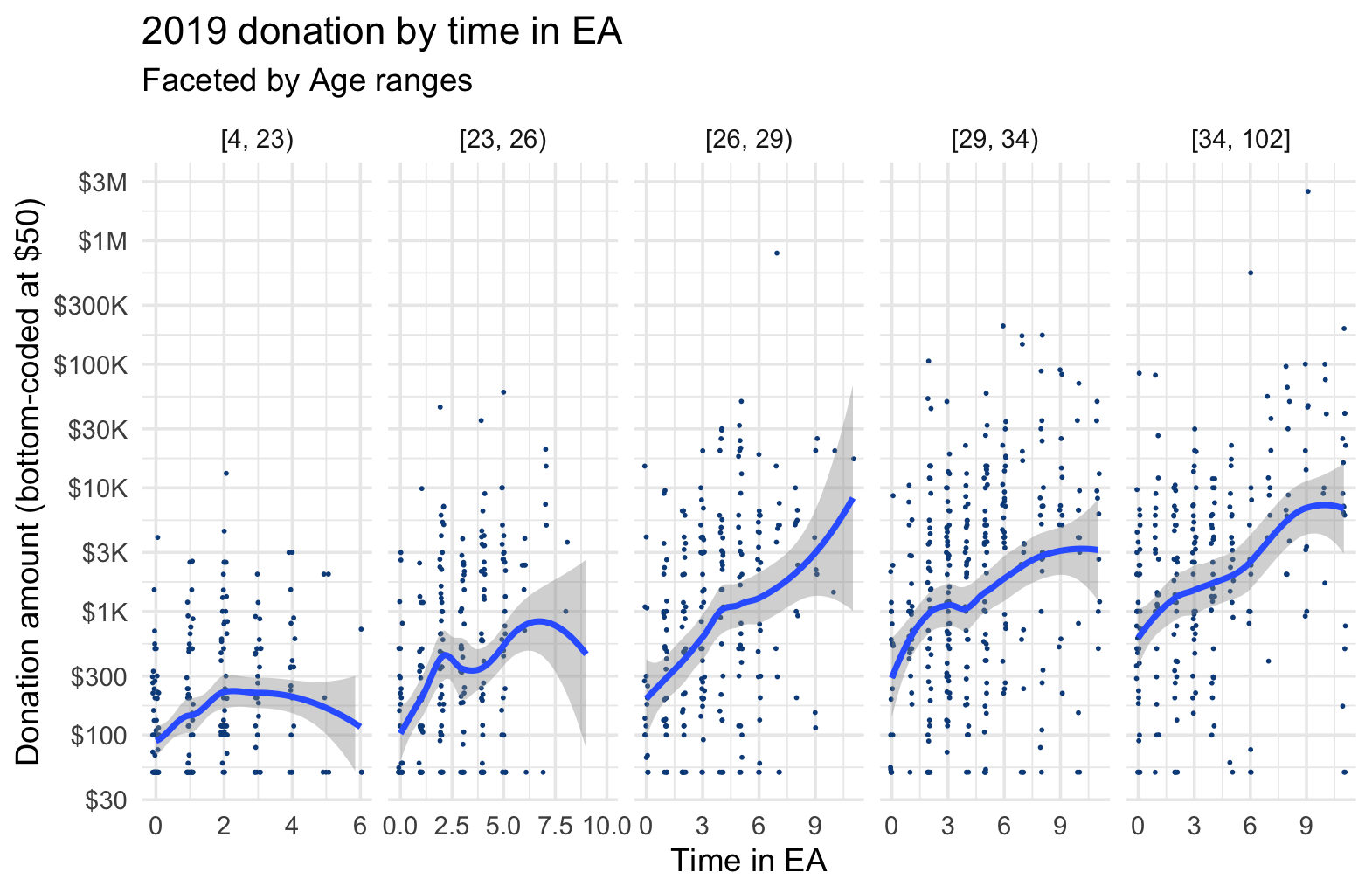
Donations appear positively associated with tenure for nearly all age groups, with perhaps some flattening out after 5 or so years, for some age groups. Donations also appear positively associated with age for each level of tenure. We return to this in our descriptive (and causally-suggestive) models.
We next report the comparable chart for donation as share of income:
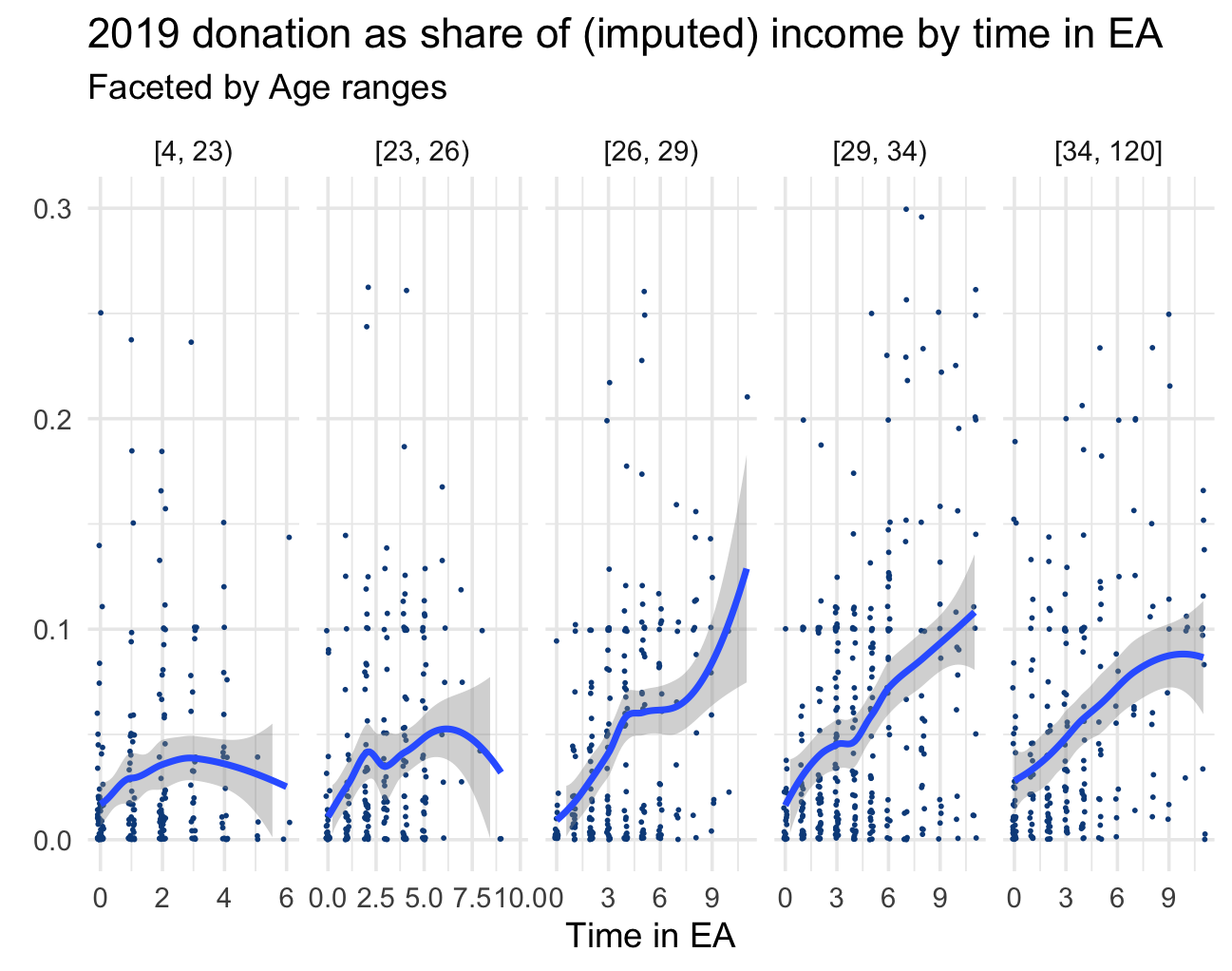
As a share of income, we again see donations positively associated with time in EA, at least for the older age groups.
By referrer
Next, we consider how donations vary by 'which referrer' (i.e., which link) took an individual to the EA survey.
Again, the blue line gives linear fit (for group means), and the red line the slope for donating 10% of income.
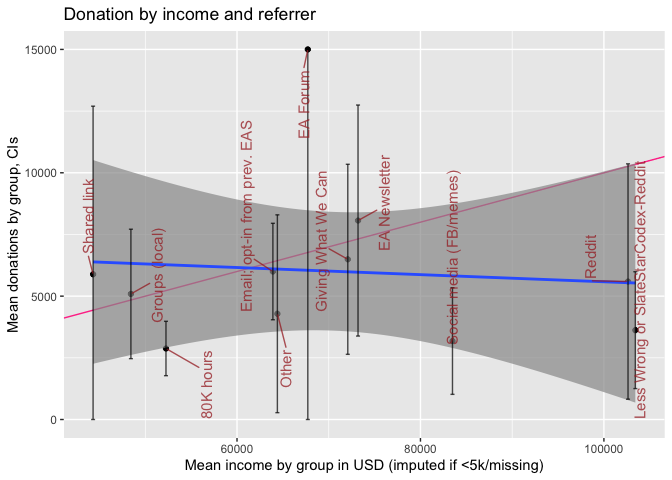
At the referrer level we see no strong association of income and donation, however, these confidence intervals are very wide. While 80000 Hours and social media appear to be 'under-performers', for most groups of referrers the confidence intervals are too wide to make very strong inferences. (Furthermore, as always, these differences may reflect other underlying differences between the samples collected from these referrers, such as differences in 'time-in-EA'.)
Donation and income for recent years
We can consider the reported amounts donated in each year of the EA survey (EAS), as well as the average reported. However, neither of these can be easily interpreted to tell us whether EAs (as individual or in total) have been donating more or less in recent years; neither as individuals nor in total. The year-to-year change in survey responses, and differential representativeness makes this challenging.
(Further discussion of this can be found in the Bookdown at this point).
Because of these limitations:
- we report both totals and averages below,
- we advise caution in interpreting the amounts and changes
- we return to this in a controlled model, which is also subject to similar limitations,
- we defer more detailed analysis of this question for future work.
The plot and tests below depict and consider the year-to-year changes in donations as reported in the EA surveys for each year.
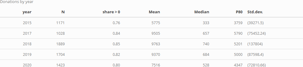
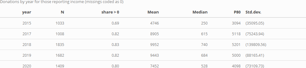
We first consider donation rates in each year for those who answer the donation question (reporting 0 or positive amounts). We give the share of positive responses, the mean, median, and 80th percentile donation, and the standard deviation for each year:
The above only considers people who did answer donation questions. At an extreme we could consider all non-responses as reflecting people who made (little or) no donations, for a lower bound on on donation rates. As a compromise measure, probably a tighter lower bound, we might assume that people willing to report their incomes are generally willing to answer financial questions. Thus if they do not report their donations it seems more reasonable to suspect that they did not donate in a big way. We thus consider the subset of the above who reported their income, considering similar statistics as above for a modified donation variable, coded as '0' where the donation was not reported.
Next, we present a combined scatterplot, violin plot, and stem and leaf plot, depicting the densities of donation amounts in each year. We present this first with level outcomes (but log scales) and then for the 'log (donation+1)' outcome.
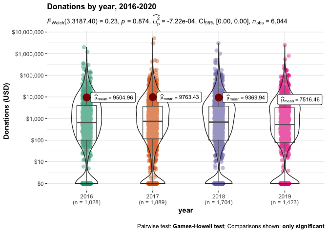
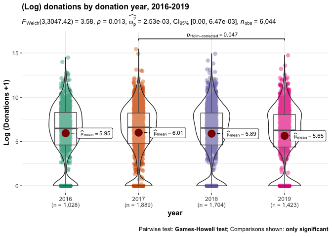
While the linear plots and tests of donation amounts suggest no substantial or significant differences in overall donations between these years, the log specification does suggest some year-to-year differences, with (log) 2019 donations being significantly lower than 2017 donations, even after accounting for multiple comparisons. We return to this, to some extent, in our descriptive modeling.
Which charities (causes and categories) are EAs donating to?
As noted in the introduction, only a small share of respondents report where they are donating. We group this into several categories summarized below, reporting for only those 429 respondents who indicated at least one category of donations.
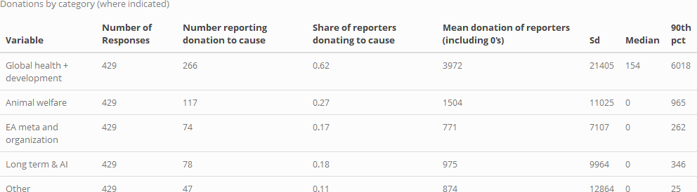
As in previous years, 'Global health and development' is the largest category, both in terms of number of reported donations, and in terms of mean (and median, and 90th percentile) donations (we give the mean including zeroes, for those who reported any specific category of donation).
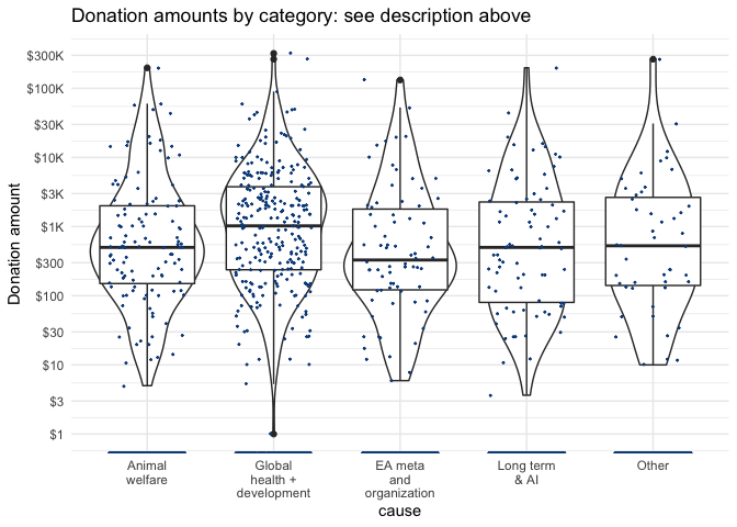
Below, we depict the amounts and density of donations for each category, with the vertical axis on a logarithmic scale. The width of the violin plot depicts the smoothed density. In the box, the horizontal lines represent medians for each, lower and upper margins of the box 25th and 75th percentiles, "whisker" lines extends from the box to to the largest (smallest) value no further than 1.5 × the inter-quartile range, and large dots represent outlying points beyond the edge of the whiskers.
We can also check whether donations to each cause (incidence and amounts) vary by whether the person (ever) took a GWWC pledge. Below, we present scatterplots + violin + box plots for donation (USD amounts) to each category, split by GWWC pledge status.
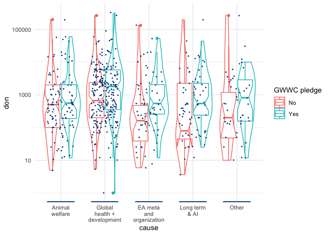
The details of these plots are similar to the previous plot ("Donation amounts by category...", see description above). However, here the lower and upper margins of the (now 'notched') box present an estimate of 95% confidence interval for medians (for those reporting at least one category of donations and reporting GWWC status). We see that these mainly overlap, but perhaps less so for "EA meta and organization", which GWWC pledgers seem to give more to.
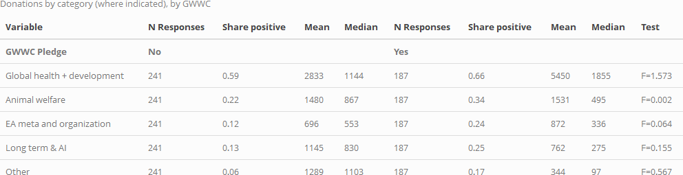
Below, we tabulate donations to each cause, for each of these groups. The final column in each table presents a statistical test for significant differences in mean donations for each donation category by GWWC status. (Note that 'no significance stars' implies a lack of statistical significance at the (p<0.10) level in two-tailed tests).
Next, as above, but for donation incidence (i.e., for 'whether someone reports a donation in a particular cause category'):
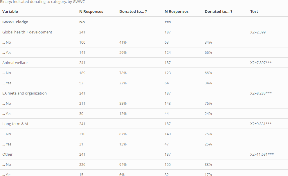
Here, the differences are substantial, and in some cases, statistically significant (three stars indicates statistical significance at the (p<0.01)) level in a two-tailed test).
As suggested in the first of the two tables above, among those who report a charity category, those who took the GWWC pledge tend to give as much or more on average to some of these categories, and less to others. However, none of these individual differences meet conventional statistical significance in simple F-tests (note that these tests are fairly low-powered due to small sample sizes). As the second table illustrates, GWWC pledgers are more likely to have donated to each of these categories, and this difference is statistically significant in standard chi-sq tests for all categories except 'Global Health and Development'. This can be seen seen in the χ2 tests in the "Donated to category" table, as well as in uncorrected Fisher's exact tests: p= 0.101 for 'Global Health and Development', p<0.01 for all other categories.
Donations: plans and aspirations versus actual (reported) donations
Do people meet or exceed the amount they intended or planned to donate for the next year? What factors relate to this? Our surveys provide some evidence.
In recent surveys, we have asked "In [current year] how much do you currently plan to donate?". We also ask "in [previous year], roughly how much money did you donate?".
The EA surveys have been released at various points in the year:
-
In 2017, the survey was released in April; thus the 'plan' was reported only about 1/3 of the way through the year (or slightly later, depending on response time).
-
In 2018, the survey was released in May.
-
In 2019, it was released in August, about 3/4 of the way throughout the year.
Thus, for each of these years, the year-to-year comparison may tell us something about whether people lived up to their plans. This could be particularly relevant for the 2017 and 2018 surveys, but also relevant for 2019-20, particularly if donations tend to be clustered at years' end (e.g., Christmas giving, Giving Tuesday in November).
In our 2019 post we wrote:
We also asked respondents how much they planned to donate in 2019. ... The median planned donation for 2019 was 1,074.98 USD among all EAs, and 3,000 USD among full-time employed non-student EAs.
Below, we compare this 2019 report of planned-2019 donation to reports from the 2020 EAS of actual 2019 donations. We report this for several different groupings below, as well as for other pairings of surveys.
2019 Planned vs. actual: Individuals present in both surveys
We first consider those 441 respondents who can be matched across the 2019 and 2020 surveys (through an anonymized email).
The plots below cover only respondents who appear in both samples and provide planned and actual donation values. These individuals make up 22.9% of the total respondents that appear in the 2020 sample and 15% of the total respondents across 2019 and 2020.
Below, we plot planned and actual 2019 donations for these respondents.
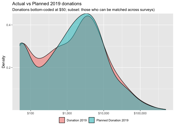
Reassuringly, these distributions largely overlap. We separate the above graph by whether the individual made a GWWC pledge:
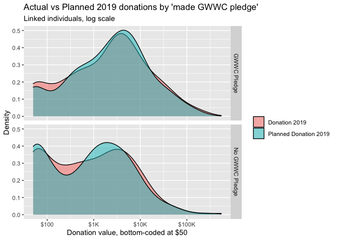
The above graphs do not suggest large differences in these distributions.
Donations versus plans (same individuals, linked)
While the graphs and figures above help us understand whether the distribution of planned and actual gifts differ, it does not tell us whether any individual's donation meets or exceeds his or her plan. As we are considering individuals present in both surveys, we can connect their donation responses across years.
The graph below shows the distribution over the difference in planned and actual 2019 donations for those matched across the years. Here a negative value corresponds to an actual donation being lower than planned.
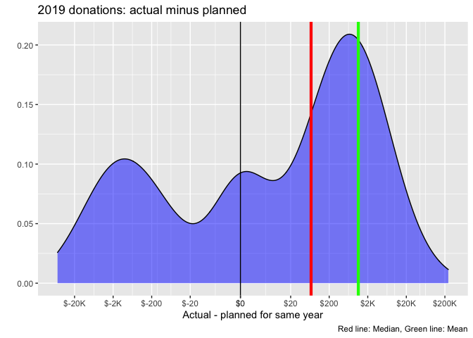
Planned and actual donations are highly correlated (ρ= 0.948).
While substantial shares report substantially less or more than their plan, this more or less balances out, with some tendency towards donating more than planned. In fact, the mean difference between donation and plan is 1,139 USD in excess of plan (the green line), while the median of the differences is 67.9 USD.
Considering that the zeroes might have been quick and uncareful mis-responses, we repeat the same plot for those who report positive planned and actual donations in the consecutive years, and we also compare these for GWWC pledgers versus non-pledgers:

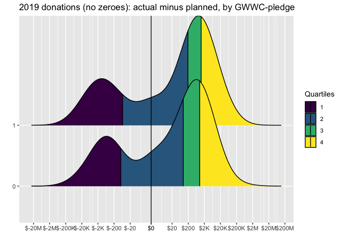
The results are similar -- substantial shares outperformed their plans, and substantial shares underperformed, but the positives seem to outweigh the negatives. For both GWWC and non-GWWC pledgers the median donation exceeds the plan (by around 200 USD).
We do not see striking differences between the GWWC pledgers and non-pledgers by this measure.
We next present a scatterplot of planned versus actual donations for 2019, for those who can be matched across surveys. In the figure below, the brightness of a color indicates the density of respondents (number of 'neighbors') with a particular combination of planned and actual donations.
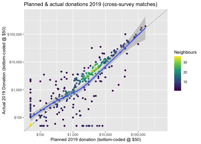
Overall, the plot is more or less centered around the 45 degree line of 'plans=actual'. There are noticeable departures in each direction, but these seem to balance out. Thus, we might loosely conclude that 'on average 441 individuals who can be matched across years tend to donate an amount close to what they planned'. However, there may nonetheless be important differences, so we test further.
Below, we plot donations for these linked individuals -- actual donations are on the left, and planned donations are on the right. We overlay a 'violin' density plot (widths depicts the frequencies). Medians are depicted in red dots, and the boxes depict 25th and 75th percentiles. The lines show each individual's donation (on the left) connected to her plan (on the right). The plot also reports on a Wilcoxon signed-rank test (for paired data).
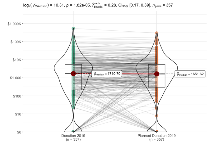
The nonparametric tests reported above find a statistically significant difference: actual donations tend to exceed planned donations in this sample, and this difference is unlikely to be due to chance. The 'pseudo-median' of this difference is estimated as 281 USD with 95% lower CI bound 162. The "matched-pairs rank-biserial correlation" is also bounded between about 0.17 and 0.41, suggesting that "actual donation exceeds planned donation" is more likely than "planned exceeds actual" (in the population that this is drawn from).
The results are similar if we focus on the subset of these who report a donation in both years (see bookdown robustness appendix).
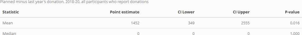
We also present simulation-based tests for whether the mean and median of the individual 'actual minus planned' donations exceeds or falls below zero. These are given in the table below.
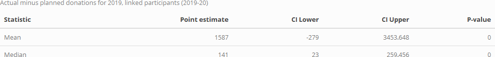
The mean of 'actual minus planned' donations is 1,587 USD, with simulation-based (bootstrapped) confidence intervals [-279, 3,454], with corresponding p-value 0.138. For the median of this difference we have point estimate 141 USD, with simulation-based (bootstrapped) confidence intervals [22.5, 259], with corresponding p-value 0.102. Thus, the evidence points towards 'actual donations exceeding planned donations for those EAs who can be linked across 2019-20'. However, (unlike in the Wilcoxon signed-rank tests) the differences are not strongly statistically significant in these simulation-based tests.
Planned vs. actual: All respondents (across relevant years)
Those who responded to both 2019 and 2020 surveys (and left emails both times) might tend to be the more engaged EAs. In particular, having fulfilled one's planned donation might make one more likely to want to complete the follow-up survey, and perhaps more keen to provide one's donation data in particular. This suggest the above figures may be biased towards more 'fulfilled plans'.
Thus, we next overlay the planned and actual donations for all respondents across both surveys. Here we compare the 'amounts planned for the year of a survey' to the 'amounts reported for the previous year, in the following year's survey'. We do this separately for each available year.
While this offers us a larger sample, and may be less vulnerable to the bias just-mentioned, it brings up other sample selection issues, and these comparisons should also be treated with some caution (see footnote).
 ,
,
For 2019 (2020 survey 'actual' and 2019 survey 'planned') and 2018 (2019 survey 'actual' and 2018 survey 'planned'), the histograms of planned and actual donations line up approximately (although planned donations tend to be a bit higher). However, for 2017 (2018 survey 'actual' and 2017 survey 'planned'), the planned donation distribution appears far lower. This seems likely to result from a different response and a different composition between the 2017 and 2018 responses.
Note that the number of EA survey respondents also declined in 2020, from 2,509 to 2,056. If the EA survey tends to select only the more engaged EAs, this would suggest that the extent 2019 donations under-performed plans may be even higher.
]
(Thus we will not include 2017 in our "planned versus actual" comparisons.)
As noted, for the remaining relevant donation years (2018 and 2019) the median donation is somewhat lower than the median planned donation, suggesting under-performance relative to plans. We investigate this further below.
Over 2018-19, how does the distributions of planned versus actual donations differ?
In spite of the caveats above, we consider and test whether the distribution of planned donations for a year exceeds or falls short of actual donations, pooling the 2018-2019 and 2019-2020 data (to consider donations vs plans in 2018 and 2019).
We do this separately both
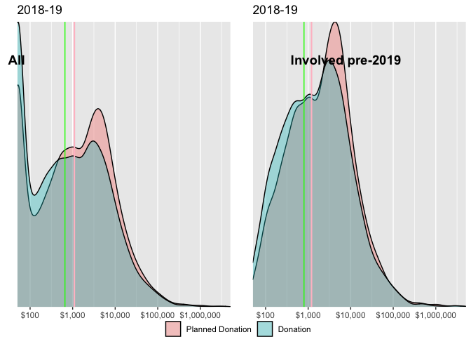
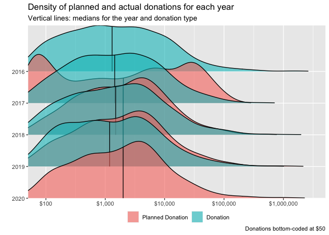
Above, we give the density of planned and actual donations, split by year-involved. Vertical lines represent medians for the group and donation type (green=donation, pink=planned donations). Donations are bottom-coded at 50 USD. Again, for both groups (where the survey entries are linked) the planned donation distribution appears to be somewhat higher than the actual distribution, although the difference is not dramatic.
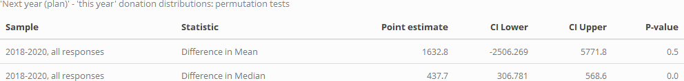
We present the results of simulation-based permutation tests below. (Explanation in fold/footnote).
In the table below we summarize the results of this test for means and medians, and for four distinct subsamples (this test is further discussed and illustrated in the hosted bookdown).
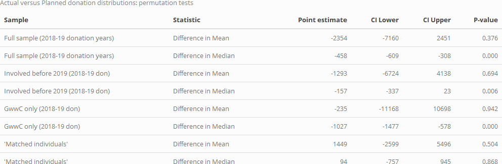
For the full sample, for the subset who have been in EA since before 2019, and for GWWC pledgers, both the mean and median donations fall short of the planned donations. Overall, the difference in medians is bounded between about 300 and 600 USD. Each of these differences (for the medians) are strongly statistically significant. Perhaps because of the large outliers, the differences in means are much more widely bounded, and thus this comparison is largely uninformative.
This contrasts with our results for individuals that can be matched across 2019 and 2020 surveys, for whom actual donations tend to exceed the reported plans in the prior year. As noted earlier, this contrast might be because people who have met or exceeded their donation plans are more likely to respond to surveys in subsequent years, and report donations in each.
Given these contrasting findings, further work might be warranted. If donations do tend to underperform plans, we might look for patterns of underperformance that might suggest ways of improving this.
Donations versus next year's plans
As noted, we can only match a subset of individuals across years. However, in each of the years where it was asked, most respondents who answered the retrospective donation question also answered the 'planned for this year' question. We can see how these tend to relate; we may particularly consider whether 2020 donations are expected to be higher or lower than 2019, in light of the pandemic (cf the Giving Tuesday report suggesting growth in overall US charitable giving in 2020). Below we overlay the distribution of 'last year's donations' and 'planned current year' donations for 2018-2020 surveys.
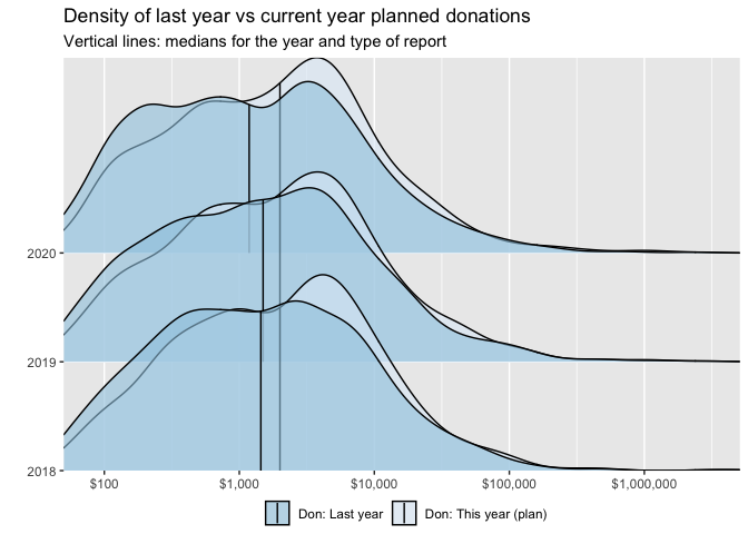
In each year, the median of planned donations exceeds that of actual donations. The distribution of each of these appears fairly constant across years, with no obvious substantial drop for 2020.
Next we plot this in two dimensions: for each individual we plot their planned current year's donation against their reported donation for the year prior to the survey.
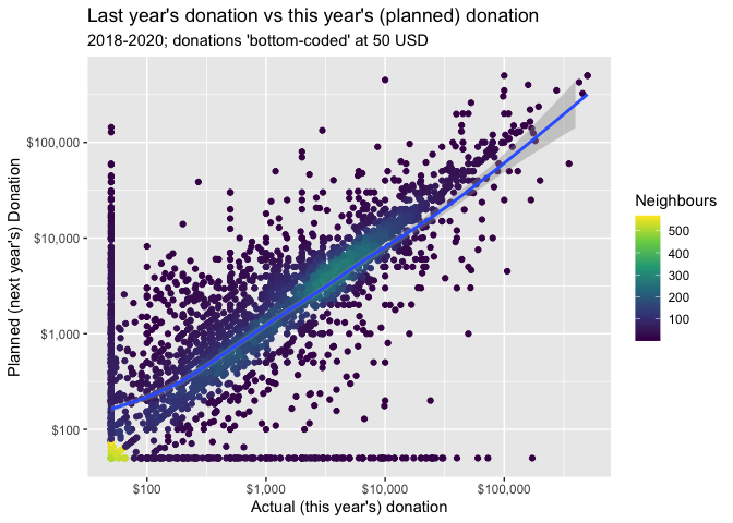
The graph's implications are not obvious. There is a large mass exactly along the 45 degree line, where the donation amount planned for the current year equals the amount reported for last year. There seems to be some substantial mass where planned donations exceed actual donations (above the 45 degree line), the smoothed curve is largely positioned at or below this line, perhaps because of the very small and zero entries for planned donations.
We repeat the above plot but only for those who report positive values for both 'the previous year' and for 'planned for this year':
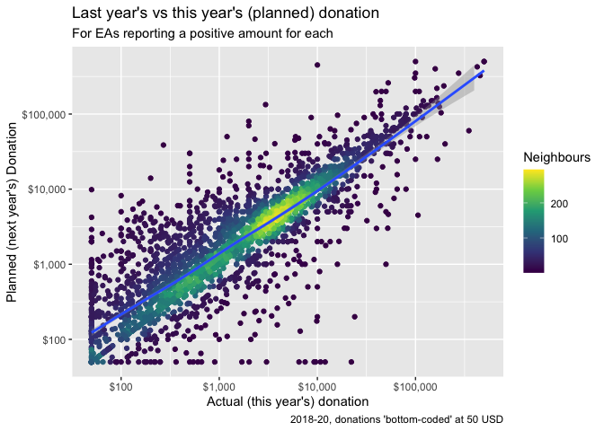
As in previous sections, we conduct simulation-based tests. Here we can separately consider both (i) the (unpaired) differences in the medians and means of distributions and (ii) the medians and means of the differences themselves.
First, considering the differences in these distributions:
The mean of the distribution of the current-years' planned donations is higher than the mean for the previousc year's, but we cannot reject equality (the p value is far above the conventional statistical threshold). However, the median is statistically significantly higher (by 438 USD point estimate).
Next, considering the differences by individual:
The median difference is clearly 0 -- the great middle mass of participants report the same donation planned for the current year as for the previous one, and this is the case in all resampling simulations. However, the mean difference is strongly and significantly positive: if we consider the magnitude of the differences, people tend to report a greater planned donation for this year than they reported last year. However, this does not necessarily indicate over-optimism and underperformance: it is possible that the individuals responding to individual survey in this period in fact did and do increase their donations from year to year.
Model of EA donation behavior
Modeling 'questions' and approaches:
As discussed in other posts and linked material, we broadly imagine three categories of modeling: (See discussion in the fold/footnote.)
-
Descriptive ('what relates to donation behavior'),
-
Predictive ('what will people with particular characteristics donate in the future'), and
-
Causal ('what factors actually determine the amount donated'; so if we changed these factors, donations would change).
We may care about causality
i. because we see potential to intervene and boost those variables that cause greater giving, and/or because
ii. a better understanding of what actually drives donation behavior may yield additional insights, helping us understand the world better.
However, we see little potential for very credible and convincing causal inference here. We thus first focus on description (and less so, prediction), while informally considering 'plausible causation'. We discuss (and implement) this in the next section. (Discussion in bookdown/fold HERE).
As mentioned in the introduction, being able to predict donations could be useful for several reasons. Thus, we follow our descriptive models with "predictive models", with different goals and approaches, including elements of machine learning (see further discussion below).
Descriptive (and causally-suggestive) models
2019 post:
The results of a regression analysis are again suggestive ... that those with higher incomes and GWWC members tend to donate more than those with lower incomes or who are students. ...
In this year's post we begin with a set of pre-specified models aimed at describing and providing suggestive inference about causal factors driving donations. (Further discussion in the Bookdown at this point) .
Choosing features and modeling targets
We construct several 'feature sets':
- "Key demographics, student status, and geography", used in all models
- "Career/Economics": (Income, employment status, top-6 university)
- "Pledges/commitments:" Whether ever taken a 'Giving What We Can Pledge', whether 'Earning to Give'
- "Controls" for age, time-in-EA, and survey-year (used in all models),
We focus on three key outcomes:
-
Amount donated (converted to US dollars)
-
Donation as a share of income
-
Whether donated more than 1000 USD
Note:
In the more extensive 'bookdown' version we report the summary statistics for the data used in the models. See HERE.
Constructing models
We focus on the following modeling specifications:
-
Proportional-effects 'Quasi-Poisson' model for 'amount donated' outcomes (allowing the expected donation to be an exponential function of the features).
-
Fractional logit (Papke and Wooldridge, 2008) 'donation as a share of income'
-
Logit regression for the binary 'donated over 1000 USD' outcome
Models (Tables and plots of results; years 2018-20 combined)
We put together forest plots of (normalized) coefficients from the distinct set of models outlined above, where these can be compared on the same scales. Specifically, we consider,
- for each of the three key outcomes ('amount donated (averaged)', 'donation as a share of income', 'donated over 1000 USD'),
- models with three specific sets of features, yielding nine models in total (plus robustness checks in the appendix).
The feature sets, which we will refer to in the forest plots below, are:
1. "Base" (baseline model)
Demographics: Log age, Gender, Student, Race/ethnicity, Where live, City
Career-related: Employed PT, Not Employed, Top-6 Uni.
Controls: Years in EA (log), Year of survey
Where "imp" denotes that income is imputed where missing, "log" notes that the natural log was taken (allowing a proportional 'elasticity' relationship).
Note that for the Logit models we use standardizations instead of logged continuous variables.
2. "Robust controls": Including all of the features in Base as well as a second term for each of "Years in EA (log), Log age" that takes a positive value only where these exceed their respective sample medians, and is otherwise set to zero. These represent 'adjustment terms' allowing us to see whether and how time-in-EA, age, and income may have a different relationship with donations at higher values of each of these.
3. "Base + ETG + GWWC": Including all of the features in Base as well as the binary variables "GWWC (ever), EtG", i.e., whether reported ever having taken the Giving What We Can Pledge, and whether they report their career as 'earning-to-give'.
Note that we report models with each of the three feature sets in each of the forest plots below. However, each forest plot reports on a single outcome and a single 'theme', e.g., focusing on reporting just the coefficients on demographics from across each of the above three model feature sets (with some repeated coefficients across plots).
These themes are
- Demographics (including age and time-in-EA)
- Employment/career, GWWC, EtG, Income
- "Non-response" to particular questions (in the appendix)
However, it is important to remember that the reported estimates in each forest plot come from models that 'control for' other features (as reported).
Note that we exclude the 'two-part' coefficients (in the 'Robust controls' models) from the forest plots. We present the coefficients on 'Age, Time in EA, Income, and nonlinear adjustments for each of these' in a separate set of tables.
Model theme: Demographics
Below, we plot the estimates and (heteroskedasticity-robust) 95% confidence intervals for key demographic coefficients for each of the three models. Again, we want to emphasize that each these are from models which also 'control' for a wide set of characteristics (e.g., income, age, and time-in-EA), as cataloged above.
We first present the results from our Quasi-Poisson model of donation amount (expressed as the average of current and planned donation in a year, or whichever is noted). This model allows effects to be "proportional", as described and interpreted below.
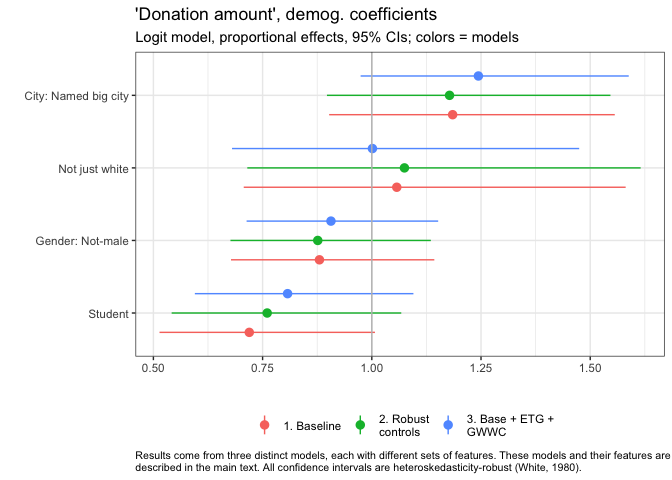
In the figure above, the vertical bar at "1" represents the coefficient of "no difference in donation between these groups, all else equal". As all of the 95% confidence intervals cross this line (for City, just barely), we cannot rule out 'no difference' by conventional frequentist null-hypothesis testing.
Still, the evidence suggests that (all else equal), individuals from big cities named in the EA survey donate substantially more.
Point estimates imply they donate about 18-19% more on average (considering our baseline model and our model with robust controls), or about 25% more on average, when we also adjust for earning-to-give and GWWC status.
Ethnicity seems to have very little relationship to donation here, or at least we have little evidence to suggest a relationship. The coefficients on "Not just white" are close to zero, with wide 95% confidence intervals.
The gender coefficients weakly suggest that women and nonbinary people donate somewhat less, all else equal. Students seem to donate substantially less, perhaps only 70-80% as much as nonstudents. Still, in a conventional sense (95% confidence interval), we cannot rule out that any of these differences observed in our sample are due to chance, and that in fact, the differences in the relevant population are zero, or in the opposite direction. (Also, see caveats in other post about potential non-representativeness, recall bias and measurement error, etc.)
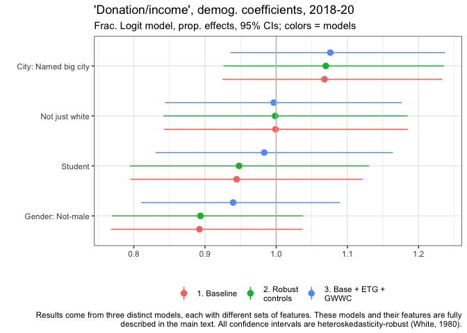
Above we plot the estimates, for the same features, for our (Fractional Logit) models of the 'share of income donated' (where income is imputed where 0 or below 5000, as explained above).
We find generally similar results as in the models of donation amounts, with perhaps a slightly more important role for gender (non-males donating a lower share all else equal), and a slightly less important role for student status. However, none of these coefficients are statistically significant in a conventional sense.
EAs living in named cities donate a substantially higher share of their income, all else equal -- a roughly 6.8% greater share in our baseline model.
Again, we have little evidence that ethnicity is related to this outcome. Non-males seem to be donating a somewhat lower share of income, 89.2% as high a share in our baseline model. Students also seem to donate lower shares, 94.4% as high in our baseline model.
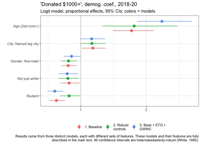
The final outcome variable is 'whether an individual donated $1000 or more'. Here we also present the normalized age coefficient.
Age has a strong relationship with this outcome: a two standard deviation increase in age (about 19.6 years older) is associated with a near-doubling of the probability of donating 1000 USD or more in our model. (1.78 times as high in our baseline model.)
Again, in our baseline model...
-
EAs living in named big cities are more likely -- roughly 18.4% more likely,
-
Non-males are about 80.9% as likely as males,
-
'Not-just-white' people about 82.3% as likely as white people,
-
and students 62.9% as likely as nonstudents...
...to donate at least 1000 dollars, all else equal.
The graph suggests that each of these results are similar across the three models. Most of these coefficients are statistically significant in a conventional sense
Model theme: Employment/career, GwwC, EtG, (income)
Next we consider employment and career-related features.
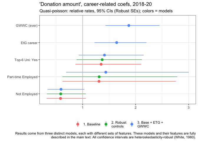
Unsurprisingly, those who report ever having taken the GWWC pledge, and those who report being in an Earning-to-Give career also report donating substantially more, all else equal. However, the magnitudes are strikingly large: they donate nearly twice as much, and over 50% more, respectively.
Those who attended global top-6 universities (defined above) also donate substantially more, about 34.8% more in our baseline model point estimate.
Those part-time-employed seem to donate somewhat more, all else equal, although confidence intervals are very wide. Those who are not employed tend to donate less.
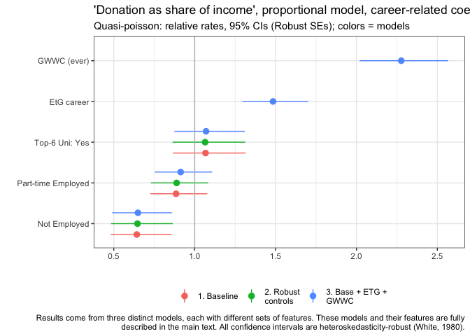
Similarly to above, those who report ever having taken the GWWC pledge, and those who report being in an Earning-to-Give career tend to donate a much larger share of income than the rest, all else equal. Specifically, over twice as large a share for GWWC, and over 50% more for EtG.
We see similar patterns as above for top-6 university and for those who are not employed. However the results for part-time employer contrast to the previous plot. While the part-time employed tend to donate somewhat more overall, they tend to donate a lower share of their income than the base group (the full-time employed), all else equal. (Again, recall that this already controls for income and other factors.)
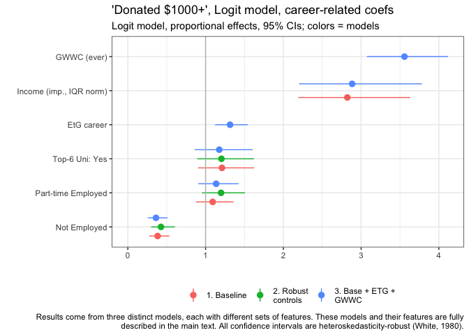
We see similar patterns for our logit models of "whether donated at least 1000 USD", with some notable exceptions. Similarly, GWWC pledgers are much more likely to donate at least this amount. EtG people show a less dramatic difference, only being about 31.5% more likely than the base group, all else equal.
Here (for models without the two-part controls) we also present the relationship to income. Unsurprisingly, income has a strong positive association with the probability of donating 1k or more: An income that is 56,125 USD greater (the 25-75 'interquartile range') is associated with a 2.82 times greater probability of this.
Those from top-6 universities and the part-time employed appear slightly (but not 'significantly') more likely to donate 1k or more, all else equal. The not-employed are substantially less likely to donate 1k or more.
Age, time-in-EA, Income, Year; possible nonlinearity
We next present the estimates, from six of the nine models (excluding models involving GWWC and earning-to-give), for the continuous-valued features (age, income, and years-in-EA) as well for the survey-year categorical feature. We present these for both the baseline and the 'Robust control' models; the latter allow us to consider distinct patterns where values are above-median. We present these in tables rather than forest plots, as the interpretation is subtle.
We first consider the models of amount donated, using the proportional (Quasi-Poisson) specification. Below, the coefficients are reported in a way that allows them to be considered as elasticities (discussed below). The coefficient on the survey year dummies are presented in a way that allows the 'proportional change' interpretation, as presented in previous plots.
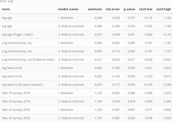
In the Baseline model, we see that, unsurprisingly, donations clearly and strongly increase in income, all else equal; in the parlance of Economics, donation seems to be a 'Normal good.' The estimated income elasticity is 0.948, suggesting that, all else equal, on average, as income increases in our data by some share 'X', donations increase by slightly less than this share. I.e. donations increase slightly less than proportionally with income, suggesting that donation are not a 'luxury good' in the strict Econ-1 sense. However, the upper confidence interval is still somewhat above 1 (and the usual caveats about sample selection, unobservable factors, and causality apply).
In model 2 we include an adjustment coefficient to allow nonlinearity, allowing the elasticity of donations in income to be distinct for income levels above the median. This coefficient is positive (very loosely suggesting that, for above-average levels of income, greater income leads to proportionally greater donations) but it is very small, and we cannot rule out zero difference. Arguably, the fact that even the upper confidence interval for this adjustment is rather small speaks against a very strong nonlinearity, and in favor of a 'proportional donations' model as a starting point.
Age has a positive relationship to donation; the baseline coefficient suggests that as age doubles, contributions increase by of 53.8% on average, all else equal. Model 2 suggests that this 'age relationship' is approximately proportional in this way, with only a small (and statistically insignificant) positive adjustment for ages above the median (age 28).
Time-in-EA is strongly related to donations, even 'controlling for age, etc.' (and vice versa). A doubling of years in EA is associated with a 62.8% greater donation. The nonlinear adjustment term is again fairly small and statistically insignificant.
Each of the 'survey year difference' estimates (for 2019 and 2020, with 2018 as the base year) are fairly close to 1 (representing 'no difference'). However, 95% confidence intervals are rather wide, suggesting a lack of statistical power to discern a difference.
We next present the corresponding coefficients for our fractional logit models of 'donations as a share of income'.
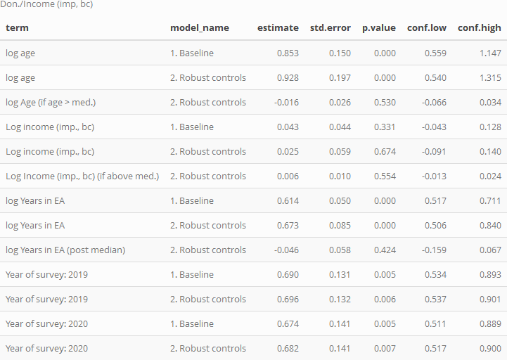
The baseline models suggest that donation as a share of income is roughly constant, or slightly increasing in income. For every doubling of income, the share of income donated is seen to increase by 4.26%. While the 95% confidence intervals include small decreases or increases in this share as income doubles (from about -5% to +13%), the evidence suggests approximate proportionality. Model 2 suggests this pattern continues at larger incomes, with little apparent nonlinearity above median income (and fairly tight bounds on this).
Age is very strongly positively associated with 'donation as a share of income', with a doubling of age approximately relating to a 85.3% increase in share of income donated (i.e., more than a doubling of this share, on average, all other observables held constant).
Years-in-EA also shows a very strong association to share of income donated, with a doubling of this 'tenure' approximately relating to a 61.4% increase in share of income donated.
The adjustment coefficients for each of these are small and fairly-tightly bounded, suggesting perhaps only small differences in the above relationships for values of age and tenure above the medians.
In these models we do find some statistically significant associations between survey year and share-of-income donated, all else equal, with 2019 and 2020 generally having lower values than 2018. However, we do not want to read too much into this, given possible differences in survey response composition, as discussed in other posts.
Finally, we consider the models of 'donated 1k or more':
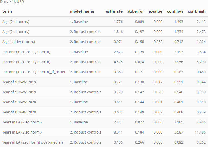
Here we present exponentiated coefficients, representing relative proportional rates of this outcome for the distinct groups.
Age is strongly positively associated with this outcome (as for the other donation outcomes), with a 2 sd difference in age (about 20.1) years associated with a near doubling of the probability of making a 1k donation. Unsurprisingly, income is also strongly associated with donating 1k or more.
The coefficients for the 2019 and (especially) 2020 EA survey year dummies are substantially below 1, suggesting donating 1k or more is becoming less prevalent among otherwise-similar individuals. However, as noted above, we are cautious about these 'year coefficients' because of potential changes in EA survey promotion and response that may not reflect actual changes in the EA population.
The 'years in EA' coefficients are also extremely strong. These suggest that a 2 sd increase in tenure in EA (4.89 years) is associated with a 2.45 times greater relative chance of donating 1k or more relative to the base group), all else equal.
Predictive models
We use elastic-net and random-forest modeling approaches with validation (these are standard in the modern 'machine learning' tooklit), to derive a model that 'predicts well'.
We discuss what these models may or may not be useful for in the bookdown (see margin note and fold HERE).
We fit these models/approaches, starting with a wide set of potential features, to explain each of the three main outcomes considered above. The features include (nearly) all of those considered above, as well as 'where first heard of EA' responses. Below, we plot the seven most 'important' features (aka variables) for predicting the log of donation amount (average of planned and actual, where available) according to the random forest and elastic net ('regression') models.
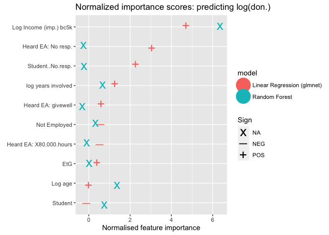
Above, we report the 'importance scores' for the ten most important features ('variables') for two distinct approaches to predicting log (average) donation..
These importance scores are technically defined here. For the elastic net ("linear reg") approach, we depict the coefficients' signs with a "+" or "-"; for tree/forest-based modeling this is less straightforward.
Income (normalized, bottom-coded at 5000 USD, and logged) is the most important predictor in for each model, by a wide margin. After this, the relative importances vary. E.g., the random forest model deems age and student status to be particularly important, while linear model does not; in turn the linear model puts substantial importance on non-response to the student status question, but the random forest modeling does not. Both put substantial importance on years involved and 'not employed' statuses. Considering 'where one first-heard of EA', the linear model finds nonresponse and (to a lesser extent) GiveWell to be positively related and important, and 80000 hours to be negatively related to the predicted donation. It also finds Earning to Give to be somewhat important (and positively relGated), but perhaps to a lesser extent than we might have expected.
As they are difficult to interpret, and probably not useful for future predictions, we will basically not discuss the non-response features further.
As our data exhibited some large donation amount outliers, (which is naturally tied to high income), we re-trained models on a subset of the data with only respondents who earned less than $500,000, with importance scores reported below.
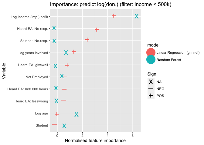
The results are very similar. Again income is still the most important predictor for both models. The ranking of variables, and the importance scores are generally similar to the 'unfiltered' model above.
Note:
In the more extensive hosted 'bookdown' version we present further details and results from the elastic-net regression-based models (for this and other feature sets). See HERE.
Predictive model: Shares of income donated
Next we consider the shares of income donated, with income imputed and bottom-coded as mentioned in previous sections.
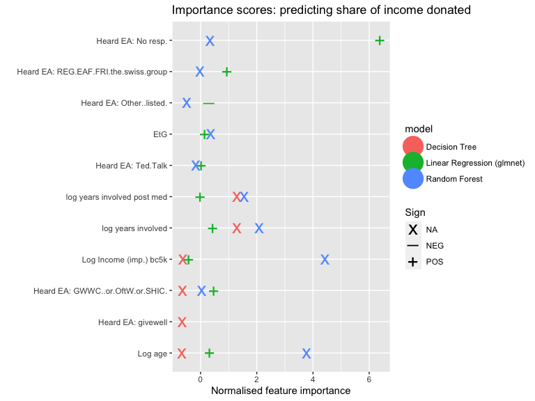
(Log) Income is deemed highly important as a predictor of share of income donated, in the random forest models but not in the regression models.
Both types of models assign some importance to age and years involved; but this is much stronger in the random forest (in the linear models these have positive signs but only middling importance). On the other hand, while both also assign importance to reporting that one 'could not remember or determine where they first heard of EA'; this is much stronger in the linear model (where it is deemed the most important feature, and it has a positive sign). Overall, the importance scores are rather divergent. The linear models assign some importance (and positive sign) to people indicating that they first heard of EA through 'Raising for Effective Giving, EA Funds, the Foundational Research Institute or the "Swiss group"', through GWWC and related 'pledge/charity orgs', and, to a much lesser extent, through GiveWell or through a Ted Talk.
Note:
Further details and figures can be found in the 'Bookdown' version about HERE.
Predictive model: Donated 1k USD or more
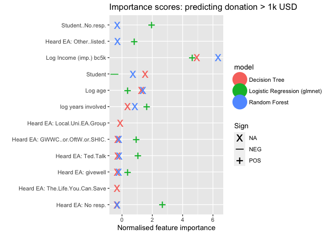
Both approaches deem (logged, imputed, bottom-coded) income to be the most important predictor of donating 1k USD or more. Both also consider (log) years involved and age to be substantially important. The logistic regression elastic-net model assigns importance to several sources of 'learning about EA', with 'Ted Talks', 'GWWC and related', and (less so) Givewell (as well as nonresponse) deemed particularly important, with positive signs . The random forest (but not the linear model) also deems student status to be a somewhat important associated feature.
Note:
Further details and figures can be found in the 'Bookdown' version about HERE.
Note: In the hosted 'bookdown' we further discuss 'how well these models predict' (see final subsection of linked section). Overall, these models offer some predictive power. E.g., note that about 46% of the relevant sample reports over 1k in donations. Our logistic regression model can correctly predict 75% of these outcomes with a false-positive rate of around 25%.
Summary of modeling results -- see the introduction
At the end of the introduction 'summary' section we give an overall characterization of our modeling results in bullet points; we do not repeat it here.
Appendix: Extra analysis and robustness checks
See bookdown appendix for further analysis and robustness checks.
Works cited
Gelman, A., 2008. Scaling regression inputs by dividing by two standard deviations. Statist. Med. 27, 2865–2873. https://doi.org/10.1002/sim.3107
Mullainathan, S., Spiess, J., 2017. Machine learning: An applied econometric approach. Journal of Economic Perspectives 31, 87–106. https://doi.org/10.1257/jep.31.2.87
Papke, L.E., Wooldridge, J.M., 2008. Panel data methods for fractional response variables with an application to test pass rates 145, 121–133. https://doi.org/10.1016/j.jeconom.2008.05.009
Silva, JMC Santos, and Silvana Tenreyro. "The log of gravity." The Review of Economics and statistics 88.4 (2006): 641-658.
Credits

The annual EA Survey is a project of Rethink Priorities. This post was written by David Reinstein; the statistical analysis was done jointly with Oska Fentem. Thanks to Peter Wildeford and David Moss for comments, Nick Vetr for tips on permutation tests, and Hamish Huggard for markdown parsing support.
We would also like to express our appreciation to the Centre for Effective Altruism for supporting our work. Thanks also to everyone who took and shared the survey.
If you like our work, please consider subscribing to our newsletter. You can see all our work to date here.

As noted above, a 'dynamic version' of this document (an R-markdown/Bookdown), with folded code, margin notes, some interactive graphs and tables, and some additional details, can be found HERE, along with some other 'chapters' linked to EA Forum EA Survey posts and overall discussion.
"Why go there?"
This dynamic presentation may be helpful for anyone that wants to dig into this more deeply, and perhaps for those who are data, code, and statistics-inclined.
"Why stay and read/comment on it here (in EA Forum)"?
Nicer and more sparse format here