Note: This post was crossposted from the Coefficient Giving Farm Animal Welfare Research Newsletter by the Forum team, with the author's permission. The author may not see or respond to comments on this post.
Subtitle: On vegan advocacy, effective altruism, and FIFA
I turn 40 today. Here are some hot takes.
On factory farming
1. Our biggest challenge is salience. If factory farming led the evening news, it wouldn’t last lo...
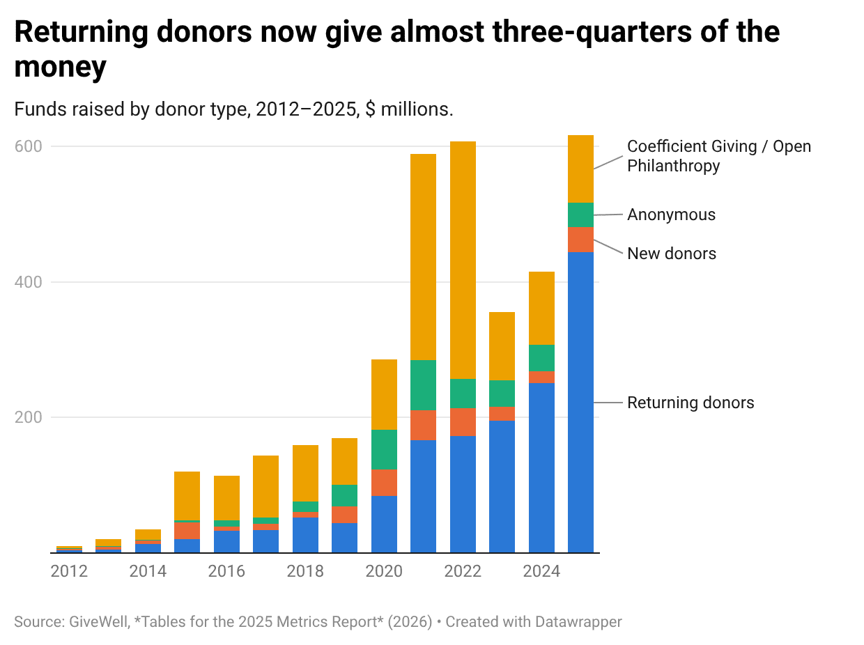
Previously: GiveWell raised less than its 10th percentile forecast in 2023 · GiveWell fundraising up 17% in 2024
GiveWell has published its...


Forum team update: Shortform is now called “Quick takes”, has a section on the Frontpage, and changed in some other smaller ways.
Here’s what’s new:
Rationale/context:
In some cases, Forum users want to share (and read) less polished ideas or other content that doesn’t seem like a full post on the Forum. Shortform was designed years back to fill this gap, but the Shortform feature was tucked away, hard to read, and had a name that most users didn’t understand.
Over the past few months, we’ve been exploring ways to encourage lower-barrier discussions, culminating in this latest version of Quick takes.
As always, we’d love feedback on these changes. You can comment on my Quick take (or email us if you prefer). We’ll also monitor how this feature gets used and improve it over time.
This seems like an improvement to me. Thanks!
Feedback on a minor pain point for me. When I'm looking at quick takes on the front page and want to go to the permalink for the relevant take (e.g. to see all the discussion under it), I often look around for a big title to click on for a while before remembering that I'm supposed to click on the icon on the top right, which is small, doesn't stand out much, and feels too me like it's somehow violating an implicit expectation I have for where to find this for this kind of content.
I have no clue whether this is just me, whether this is worth addressing, or what a good solution would be. (It does make sense to me that quick takes don't have big titles like a normal top level post would.)
The top right is a divergence from lesswrong, right? it used to be clicking the timestamp would permalink, and I think lesswrong is still that way.
This is a good design because it’s quite standard across a few websites (social media and fora) that timestamps are links to permalinks.
I love this, and all the recent tweaks and small changes! Thank you so much!