Comments

Should we fund people for more years at a time? I've heard that various EA organisations and individuals with substantial track records still need to apply for funding one year at a time, because they either are refused longer-term funding, or they perceive they will be.
For example, the LTFF page asks for applications to be "as few as possible", but clarifies that this means "established organizations once a year unless there is a significant reason for submitting multiple applications". Even the largest organisations seem to only receive OpenPhil funding every 2-4 years. For individuals, even if they are highly capable, ~12 months seems to be the norm.
Offering longer (2-5 year) grants would have some obvious benefits:
- Grantees spend less time writing grant applications
- Evaluators spend less time reviewing grant applications
- Grantees plan their activities longer-term
The biggest benefit, though, I think, is that:
- Grantees would have greater career security.
Job security is something people value immensely. This is especially true as you get older (something I've noticed tbh), and would be even moreso for someone trying to raise kids. In the EA economy, many people get by on short-term grants and contracts, and even if they are employed, their organisation might itself not have a very steady stream of income. Overall, I would say that although EA has made significant progress in offering good salaries and great offices, the job stability is still not great. Moreover, career security is a potential blind spot for grantmakers, who generally do have ~permanent employment from a stable employer.
What's more, I think that offering stable income may in many cases be cheaper than improving one's salary and office. Because some people have, for years, never been refused a grant, and would likely return any funds that turn out not to be needed. And despite the low chance of funding being "wasted", they still have to apply annually. In such cases, it seems especially clear that the time savings and talent retention benefits would outweigh any small losses.
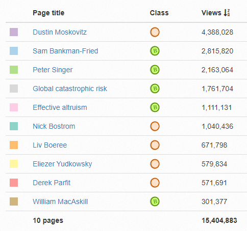
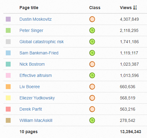
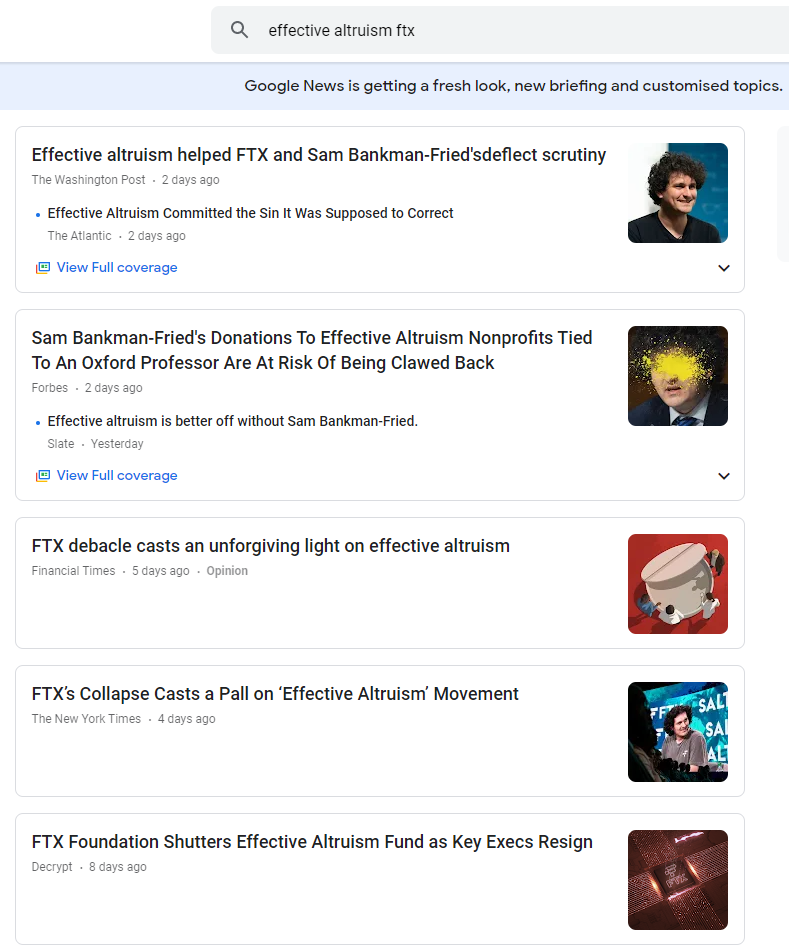
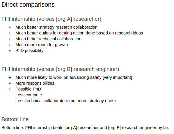
The new EA Forum frontpage layout is unserious. My concern is simple: where is the list of the latest posts? The screen is so overwhelmed by "featured posts" and "comments" and "quick takes" that the centerpiece of the whole thing is completely gone. Now I can't see what is going on in EA, or whether there is something that I want to read, which defeats the point of visiting the website. And moreover, hiding such key information gives the appearance of a forum that doesn't care about supporting serious discussion, it sets the wrong tone for the community.
You can see a comparison to LessWrong and Hacker News below.
Current EA forum
Current Lesswrong
Current Hacker News
Hey Ryan, thanks for the feedback.
I kind of launched the page and then had to take two months off. I'm phasing back into work now (as of today) and I'm keen to launch V2 of the featured page as soon as I can prioritise it.
Would your problem be solved by making new&upvoted your default homepage? It's just the classic Forum experience, so you should be able to totally ignore the featured page. Or is the issue deeper than your own reading experience?
I definitely don't want to give the impression that we aren't supporting serious discussion - it's precisely what I'd like to do. The aim is more to highlight the best of the Forum so that readers with less time will spend that time on the most important posts.
(edit: and therefore to reward and incentivise the most important/ best posts with more attention)
Hi Toby, on mobile (iphone 17e), if I'm scrolling the forum and I click 'New and upvoted,' then click one of those posts, then click back, 'New and upvoted' is still underlined, but I'm back to the 'featured' view. This is pretty clearly a bug but in the context of this conversation it sure feels like the forum is trying (unconsciously? is the forum an agent? I have totally become unmoored on the question of where 'intent' resides) to steer me back to featured.
I also wrote a post today that I think is pretty good and I don't see it now under the new and upvoted section until the very bottom of the page. I guess I'd like to see more of an emphasis on 'new' in 'new', considering many of the other posts there are from days or weeks ago.
Ah yes this is a bug I've heard of a few times, we'll sort it out. Personally during the testing period I was only aiming for 30% of visits to include the featured page - I don't actually want it to become the dominant frontpage.
Relatedly, as far as I know, the new & upvoted algorithm has not changed - this is the classic frontpage. I'll double check to make sure we haven't tweaked the weighting towards upvoted over new too much - that'd be the simplest explanation for your issue.
I also have this bug on mobile (Safari, iPhone 17) - I think a lot of the reason I don't like the featured section much is I often look at the Forum on mobile, but never bother to log in, so it defaults to Featured whenever I go to the home page (and I'd prefer no images / more text density generally).
Agree with this, some more points
* Articles have visuals with a broad range of quality and without any visual consistency, aspect ratios, ... so making the visuals front and center will always look chaotic
* The visuals take attention away from the titles. When I go to a front page I want to scan content and the visuals make that really hard
* It looks a bit like vibe-slop (claude tends to add these colored bars on the side of tiles like the blue bars on the frontpage now), it's also not clear why some tiles have this and some don't, is it unread?
* There seem to be some bugs: I just clicked on an article from featured, then clicked back, and the featured showed me list not tiles even though I had it set to tiles before. I think it actually showed me the New and upvoted section then but marked Featured bold
You may enjoy switching to "list view" instead of "card view", for an experience more like LessWrong.
I think the forum team has generally shown good judgement on which posts to feature. But still, it is hard to see how this doesn't give too much authority to too few decision makers on what content does and doesn't get boosted. A major benefit of a public forum is that it can help surface new ideas by casting a wide net; but centering featured posts this much privileges established authorities.[1]
Some amount of featuring is good, particularly of old posts that can get buried (Lesswrong does this well!) or when it can concentrate the forum on one topic, as it has effectively during debate weeks. The balance is just off with the current design.
It's already the case that the weighted upvote system has this effect.
Totally agree. I always use the New & upvoted tab instead of the Featured tab now for these reasons.
It's not for frequent visitors, it's for people visiting for the first time. This makes sense to me, as repeat visitors will know where to go inside the forum.
But even the new and upvoted tab is filled with 1-2 week old posts for me. I'm not sure if that is intentional. Tbh it is probably the correct amount of content and ideal for most busy EAs. Unfortunately I started checking daily, (I do not think this is good) and discovered the "all posts" page. So I just click over to there immediately now.
The forum is slow enough to be manageable for daily readers. I suppose eventually it might speed up and I can go back to the upvoted and filtered page.
It took me a few minutes to realize that the "New and upvoted" tab is where you can find something resembling the "classic" look.
There's a lot of people in between those two, right? Like say I'm visiting for the 3rd time and I see all the same posts as the last two times I visited. That's not a good experience.